What Is Postmodernism: A Full Guide to the Postmodern Graphic Design

Infographic of Postmodernism Graphic Design Style. Generated using mew.design.
What Is Postmodernism
Imagine a design world where the rigid, clean grid of modernism is suddenly shattered. Where typography is expressive and playful, not just functional. Where mixing historical styles, bold colors, and chaotic layers isn’t a mistake—it’s the entire point. This is the energetic, eclectic, and liberating world of Postmodernism.
The postmodern graphic design style was a direct, often witty, rebellion against the strict, “less is more” philosophy that had dominated design for decades. It declared that design could be complex, personal, and fun again. While its pioneers deconstructed layouts by hand and with early digital tools, today’s AI design tools like Mew Design allow you to generate graphics that capture the expressive and rule-breaking spirit of the postmodern design style in seconds.
As one of the most intellectually playful graphic design styles in our ultimate guide, understanding Postmodernism is key for any designer who wants to challenge conventions and create work with personality. This article explores its rebellious origins, its key characteristics, and its lasting impact on contemporary design.
The Origins of Postmodernism: A Rebellion Against “Good Design”
The Postmodernism graphic design movement began to take shape in the late 1970s and exploded throughout the 1980s. It was a spirited backlash against the rigid, universalist doctrines of Modernism and the Swiss Style. A new generation of designers felt that the modernist mantra of “form follows function” had become sterile, corporate, and restrictive.
Influenced by postmodern philosophy, which questioned universal truths and embraced complexity and contradiction, designers began to intentionally break the rules. They created work that was layered with meaning, historical references, and a healthy dose of irony, bringing personality and expression back to the forefront of design.

Collage showcasing early Postmodernism design with layered typography, eclectic patterns, and bold rule-breaking compositions from the late 1970s–1980s. Generated using mew.design.
The Visual Hallmarks: Key Characteristics of Postmodernism Graphic Design
To identify the postmodern design, look for complexity, eclecticism, and a deliberate rejection of order and simplicity. The aesthetic is often described as a “controlled chaos.”
1. Postmodernism Typography: Expressive and Deconstructed
Wolfgang Weingart’s typography experiments are a cornerstone of the style. Postmodern typography is expressive and often deconstructed. Designers would mix different fonts, weights, and styles, play with letter spacing, and shatter text into abstract shapes. Legibility was often challenged in favor of creating an emotional or visual impact.

Postmodern typography experiments with form, mixing fonts and deconstructing letters to create visual impact over legibility. Generated using mew.design.
2. Postmodernism Color Palette: Bold, Clashing, and Playful
The Postmodern color palette is fearless. It often features bright, highly saturated, and sometimes clashing colors. The Italian design collective, the Memphis Group, famously used a palette of vibrant pastels and primary colors in unconventional combinations, a hallmark of 80s graphic design trends.
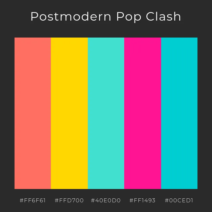
Postmodern Pop Clash uses daring hues and clashing tones to reflect Memphis Group aesthetics and playful 80s design energy. Generated using mew.design.
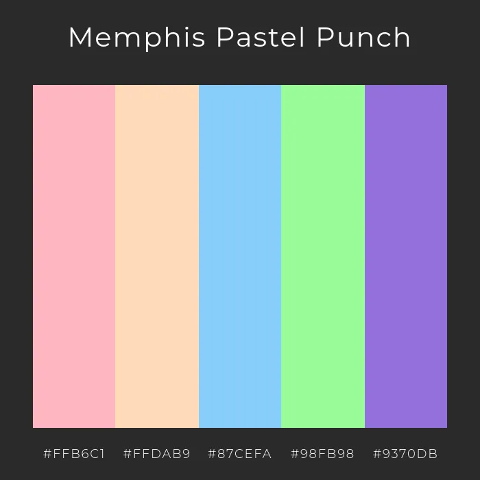
Memphis Pastel Punch combines soft pastels with vibrant contrasts—signature Postmodern design color play. Generated using mew.design.
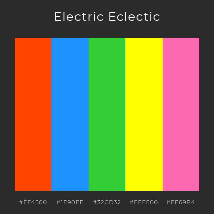
Electric Eclectic celebrates bold saturation and high-contrast combinations for true Postmodern impact. Generated using mew.design.
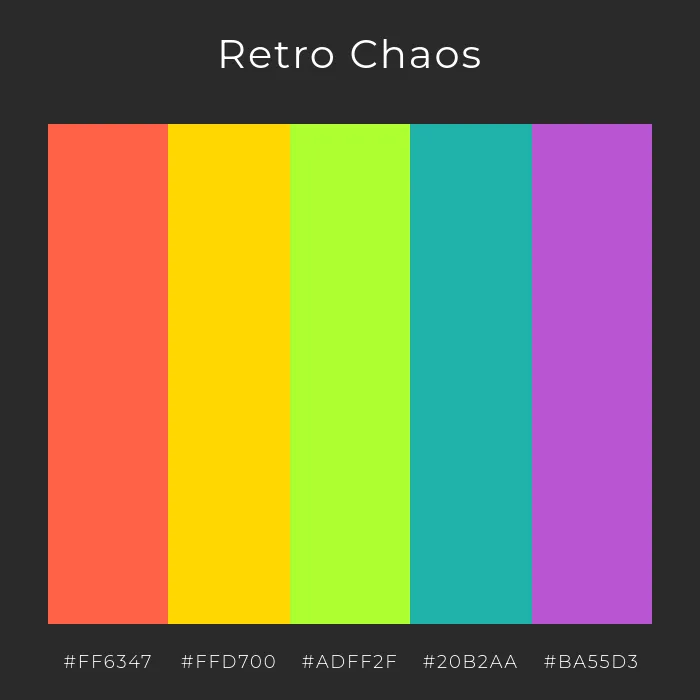
Retro Chaos channels 80s Memphis-style color freedom with fearless juxtapositions and lively tones. Generated using mew.design.
3. Postmodernism Layout & Composition: Breaking the Grid
The most fundamental act of Postmodernism was to break the grid that the Swiss Style had held sacred. Layouts are often layered, asymmetrical, and feel chaotic. Elements float, overlap, and are placed at odd angles, creating a sense of dynamic, deconstructed energy.

Editorial spread in Postmodern design style, where images and text blocks overlap at odd angles, some tilted, some floating. Generated using mew.design.
4. Postmodernism Imagery & Motifs: Eclectic and Collage-Like
Postmodernism loves to mix and match. Imagery is often eclectic, combining historical references with modern elements, or high art with low-brow culture.
- Collage: Combining different textures, photos, and illustrations is a common technique.
- Geometric Shapes: The Memphis Group design style introduced playful, abstract geometric shapes and squiggly patterns.
- Historical Pastiche: Appropriating and recontextualizing older art and design styles in a new, often ironic, way.

Eclectic imagery, historical references, and Memphis-style motifs create Postmodernism’s iconic collage aesthetic. Generated using mew.design.
Postmodern Graphic Designers and Master Artists
Postmodernism was championed by designers who felt constrained by modernism’s rules and sought new avenues for personal expression and experimentation.
1. Wolfgang Weingart
Often called the “father” of New Wave or Postmodern typography, Weingart was a Swiss designer and teacher who encouraged his students to stretch, bend, and break the rules of Swiss Style typography. His layered, experimental work was highly influential.
- Key Work: His experimental posters from the 1970s and 80s, which feature complex layers of text and texture, redefined what typography could be.
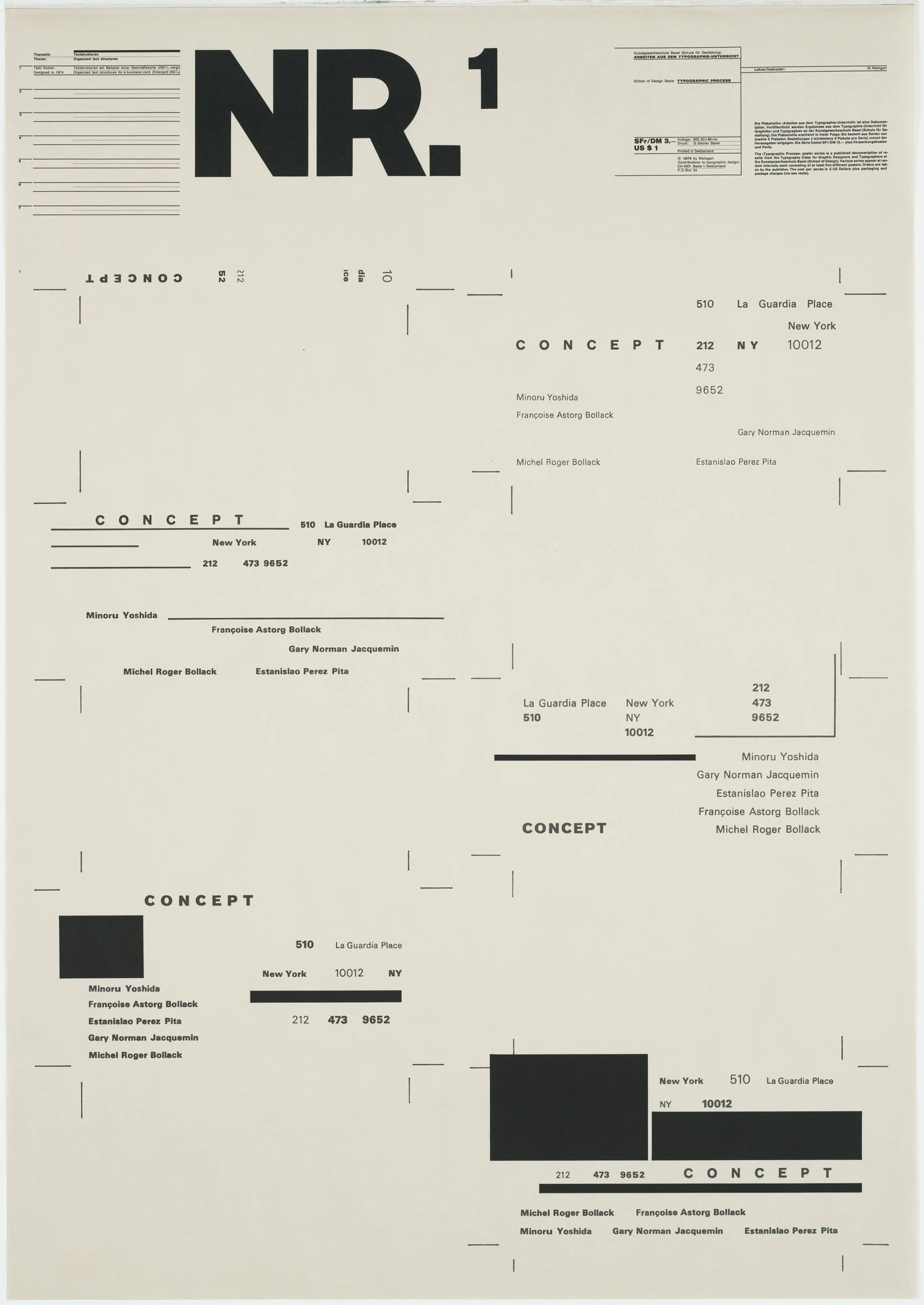
Wolfgang Weingart - Typographic Process, Nr 1. Organized Text Structures, 1974. Source: moma.org
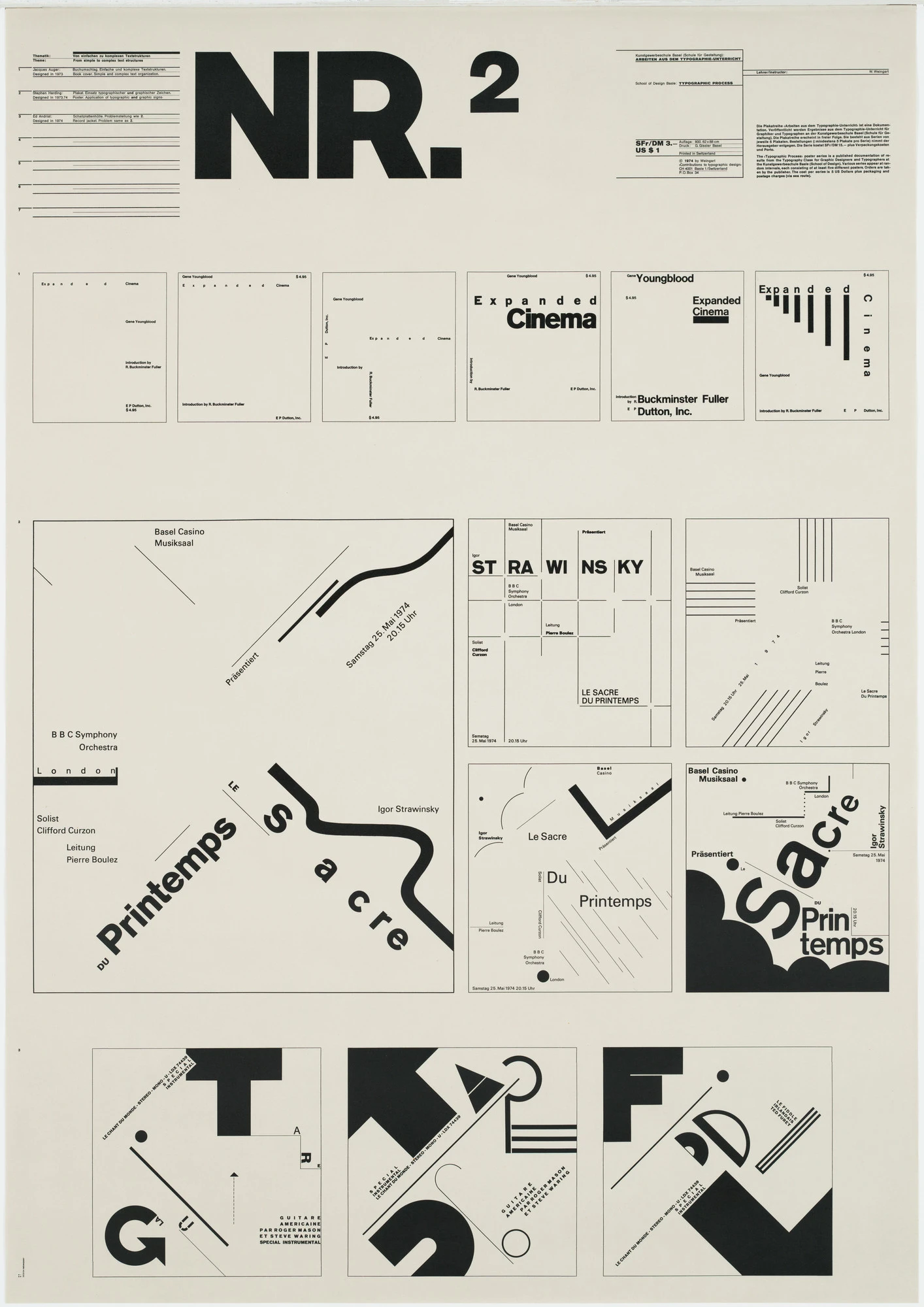
Wolfgang Weingart - Typographic Process, Nr 2. From Simple to Complex, 1973. Source: moma.org
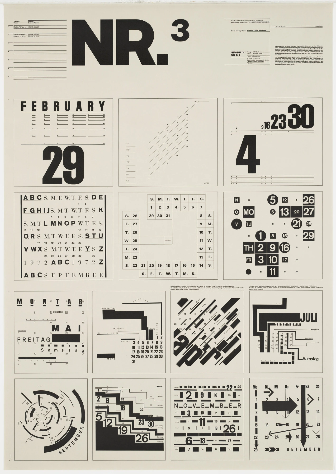
Wolfgang Weingart - Typographic Process, Nr 3. Calender Text Structures, 1971-1972. Source: moma.org
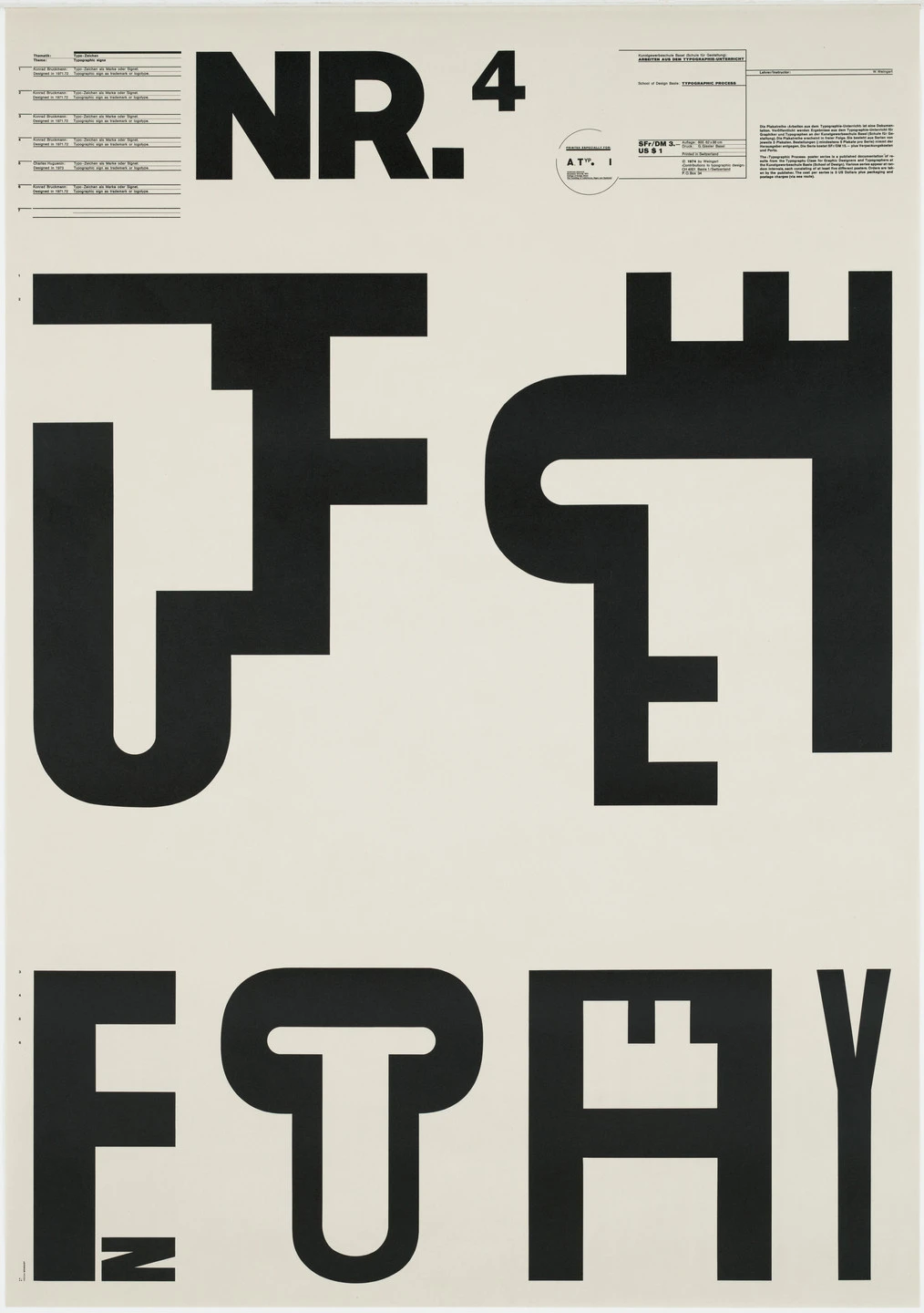
Wolfgang Weingart - Typographic Process, Nr 4. Typographic Signs, 1971-1972. Source: moma.org

Wolfgang Weingart - Typographic Process, Nr 5. Typography as (Painting), 1971-1974. Source: moma.org
2. April Greiman
An American designer and a pioneer of digital art, Greiman was one of the first to embrace the computer as a design tool. She used early Macintosh computers and software to create a new visual language of layered, pixelated, and deconstructed digital imagery.
- Key Work: Her 1986 issue of Design Quarterly, a life-sized, digitally-collaged self-portrait poster, was a landmark moment for digital design.

April Greiman - ‘does it make sense?’ Design Quarterly #113, 1986. Source: aprilgreiman.com
3. Paula Scher
A legendary American designer, Scher’s work often embodies a Postmodern spirit, particularly her iconic, type-driven posters for The Public Theater in New York. She uses typography as a powerful, expressive, and often playful tool for visual identity.
- Key Work: Her posters for The Public Theater, with their bold, street-style typography, are instantly recognizable and have become an iconic part of New York’s cultural landscape.

Paula Scher - The Public Theater, 95-96 Season, 1995. Source: moma.com
Postmodernism in the Modern World: Contemporary Applications
The rule-breaking spirit of modern Postmodernism is alive and well, especially in creative fields that value individuality and expression over corporate uniformity.
- Zine Culture & Independent Publishing: The DIY, layered, and eclectic aesthetic of Postmodernism is a perfect match for independent magazines and zines.
- Experimental Web Design: While mainstream web design favors usability, more artistic and experimental sites often embrace Postmodern principles like broken grids and deconstructed text.
- Branding for Creative Industries: Brands in music, fashion, and art often use Postmodern aesthetics to appear bold, unconventional, and culturally aware.

Mood board of modern Postmodernism: zine cover, experimental web design, and indie music branding showing eclectic and expressive style. Generated using mew.design.
How To Create a Postmodern-Style Design With AI
Ready to break the grid and create something truly expressive? Mew Design can help you channel the controlled chaos of Postmodernism.

Mew Design is an AI design agent that makes it easy to explore the eclectic nature of Postmodern style without getting lost in the details.
- Crisp text rendering — even when distorted or angled.
- Editable layouts — perfect for mixing unexpected design elements.
- Style-aware rendering — captures vibrant colors, collage effects, and bold contrasts.
- Asset uploads — include patterns, photos, or illustrations to layer into your composition.
- Export-ready files — ideal for web, social, or print.
A Step-by-Step Prompt Guide
Step 1 – Sign Up or Log In
Create a free account or log in to Mew Design to start building your Postmodern design.
Step 2 – Enter Your Prompt and Generate
Write a descriptive prompt highlighting key Postmodern traits—collage, playful typography, and a mix of retro and futuristic elements.
Example Prompt: Create a Postmodern-style zine cover titled ‘Urban Chaos’. Use clashing colors—neon pink, acid green, and electric blue—with layered cut-and-paste textures and bold, misaligned typography. Add a small subtitle ‘Issue 01 | Summer 2025’ at the bottom right corner. Include a collage of city fragments and abstract patterns.

Step 3 – Refine Using Follow-Up Prompts
Adjust typography placement, tweak colors, or rearrange graphic elements without losing the original style.
Example Follow-up Prompts: Make the subtitle ‘Issue 01 | Summer 2025’ a bit larger. Or, overlap the headline with one of the geometric shapes.

Step 4 – Export or Share
Download your final design in high resolution or share it directly to Mew Design’s showcase community.
Ready to Create a Postmodern Graphic Design?
Whether you’re designing an event poster, a magazine cover, or a bold social media graphic, Mew Design helps you produce professional designs that capture the expressive freedom of Postmodernism.
Try Mew Design for Free
Conclusion
Postmodernism gave designers permission to be playful, expressive, and even illogical again. It shattered the rigid dogma of modernism and opened the door to a world of infinite stylistic possibilities. Its legacy is the understanding that there is no single “correct” way to design, and that sometimes, the most interesting work comes from breaking the rules.
Now that you’ve explored the eclectic chaos of Postmodernism, see how its opposite—extreme simplicity—is expressed in Minimalism in our Ultimate Guide to Graphic Design Styles.