Mid-Century Modern Graphic Design: A Guide to 1950s Optimism & Charm

Infographic of Mid-Century Modern Style. Generated using mew.design.
What Is Mid-Century Modern Style
Imagine the playful opening credits of a classic Hitchcock film, the friendly, colorful illustrations in a 1950s children’s book, or the iconic, minimalist shell of an Eames chair. This world of charming characters, organic shapes, and boundless optimism is the heart of the Mid-Century Modern style.
Mid-Century Modern was the friendly, accessible face of modernism, capturing the spirit of a post-war world brimming with confidence and excitement for the future. While its masters once brought character to life with ink and paper, today you can use AI design tools like Mew Design to create graphics that capture the unique retro charm of the Mid-Century Modern style.
As one of the most beloved and enduring graphic design styles in our ultimate guide, understanding Mid-Century Modern is key for any designer looking to create work that feels friendly, nostalgic, and full of character. This article explores its optimistic origins, its key visual traits, and its lasting appeal in modern branding.
The Origins of Mid-Century Modern: Designing for an Optimistic Future
The Mid-Century Modern graphic design style flourished in the United States from roughly 1945 to 1965. In the prosperous years following World War II, a sense of optimism and excitement swept the nation. Families were moving to the suburbs, consumer culture was booming, and there was a widespread fascination with the future, space exploration, and the “atomic age.” This retro design style captured that mood perfectly. It moved away from the rigid formalism of European modernism and embraced a warmer, more playful, and organic approach that was perfectly suited for advertising, publishing, and the new medium of television.

A colorful 1950s TV advertisement poster with bold typography and futuristic flair. Generated using mew.design.
The Visual Hallmarks: Key Characteristics of Mid-Century Modern Graphic Design
To identify the what is Mid-Century Modern style, look for a unique blend of clean modern lines and playful, organic charm. It’s a style that feels both simple and full of personality.
1. Mid-Century Modern Typography: Friendly and Expressive
Mid-Century Modern typography is often clean and legible, but with a touch of personality. While sans-serif fonts were common, they were often used in playful ways—staggered, bounced along a baseline, or mixed with friendly, informal script fonts. The goal was approachability rather than cold neutrality.
2. Mid-Century Modern Color Palette: Bright and Contrasting
The Mid-Century Modern color palette is one of its most defining features. It’s known for its bright and optimistic hues, often pairing vibrant colors like atomic orange, turquoise, and sunny yellow with deep, earthy tones like olive green, brown, and charcoal gray for a signature high-contrast look.
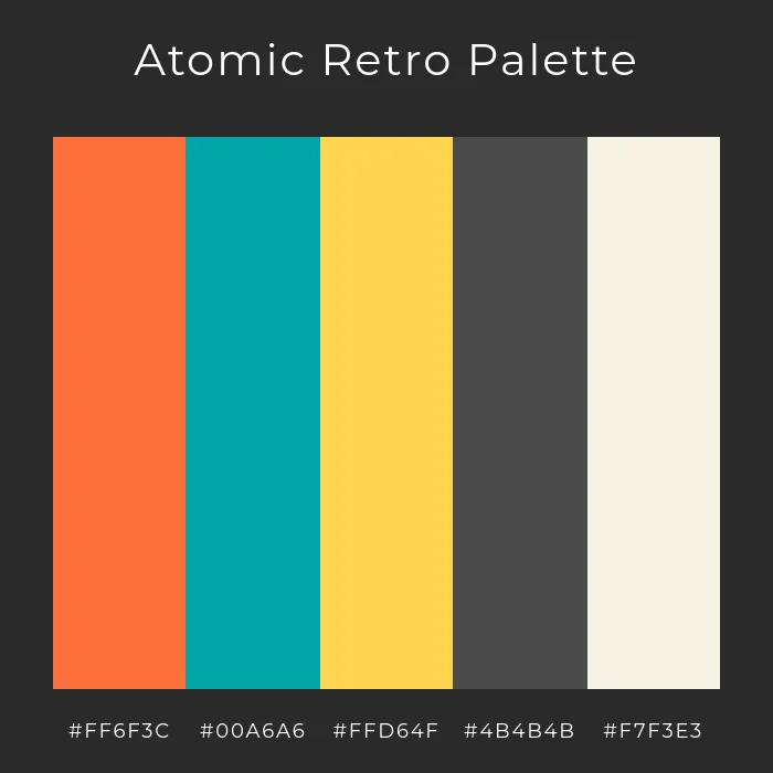
A bold and vibrant Mid-Century Modern color palette featuring atomic orange, turquoise, and deep charcoal for striking retro appeal. Generated using mew.design.
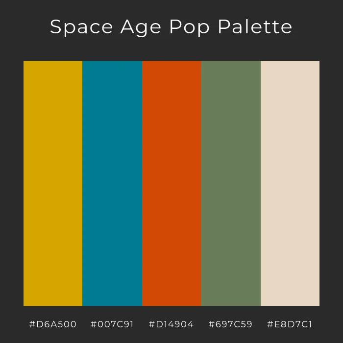
Inspired by the optimism of the Jet Age, this Mid-Century Modern color palette blends golden tones, teal, and earthy greens. Generated using mew.design.
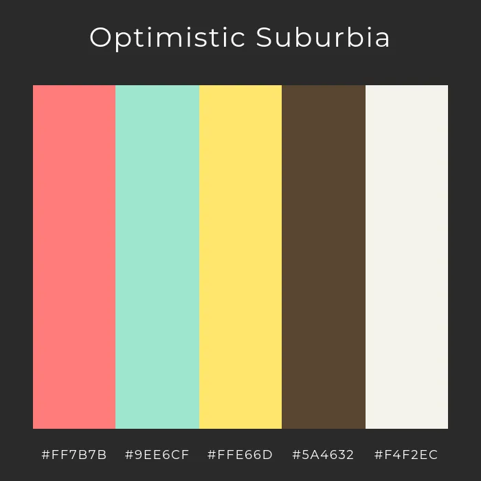
Reflecting the cheerful spirit of 1950s suburbia, this Mid-Century Modern palette pairs soft pastels with warm earthy hues. Generated using mew.design.
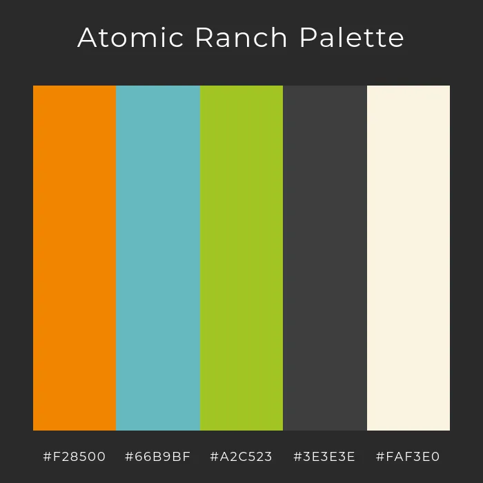
A sophisticated Mid-Century Modern palette inspired by vintage ranch homes, mixing vibrant orange and teal with muted neutrals. Generated using mew.design.
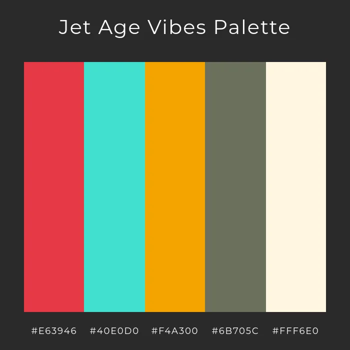
A high-energy Mid-Century Modern palette that captures the sleek optimism of the Jet Age with red, turquoise, and golden hues. Generated using mew.design.
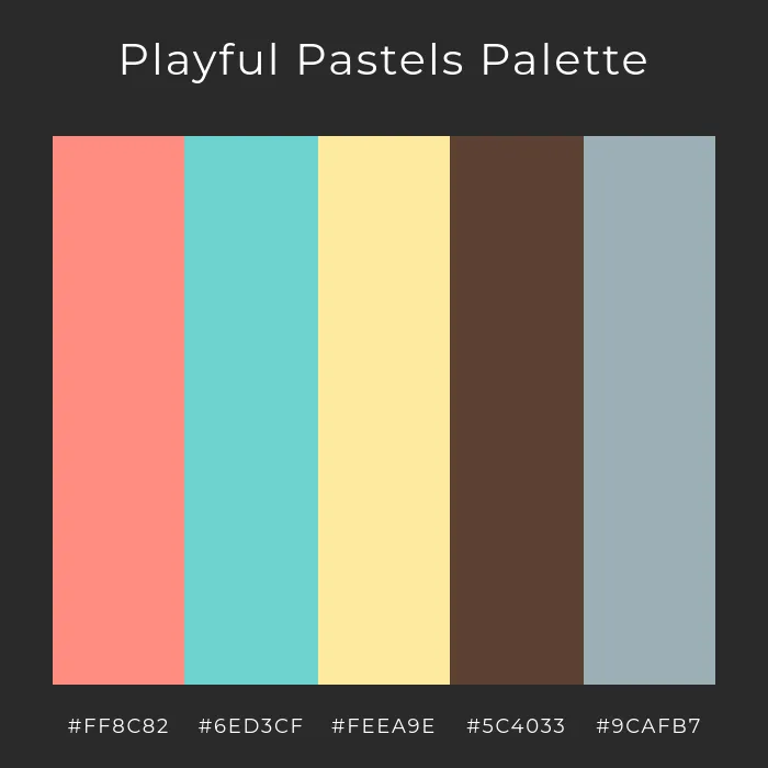
A softer take on Mid-Century Modern design, using pastel pink, teal, and yellow for a playful yet refined retro look. Generated using mew.design.
3. Mid-Century Modern Layout & Composition: Asymmetrical yet Balanced
Unlike the strict symmetry of earlier styles, the layouts of Mid-Century Modern graphic design are typically asymmetrical. However, they are always carefully balanced, using the size, color, and placement of elements to create a composition that feels dynamic and harmonious, but never chaotic.
4. Mid-Century Modern Imagery & Motifs: Playful and Abstract
Mid-Century Modern illustration is the heart of the style. It rejected realism in favor of simple, stylized, and often quirky illustrations. Key elements include:
- Simple, abstract geometric shapes (like starbursts and boomerangs, reflecting the “atomic age”).
- Playful, cartoon-like characters with simple features.
- Organic, free-form shapes that feel spontaneous and lively.

A playful Mid-Century Modern book cover featuring bold shapes and space-age optimism. Generated using mew.design.
Mid-Century Modern Graphic Designers and Master Artists
The Mid-Century Modern era was defined by legendary American designers who reshaped corporate and entertainment design with their wit and visual intelligence.
1. Paul Rand
A giant of American graphic design, Paul Rand was a master of creating corporate logos that were not only simple and memorable but also full of wit and charm. He believed that a logo’s primary goal was to be a universal symbol, and he used simple, playful forms to achieve this.
- Key Work: His iconic logos for IBM, UPS, ABC, and Westinghouse are perfect examples of Paul Rand logos that are both modern and deeply personable.

Some of the logos designed by the MCM graphic designer – Paul Rand. Source: pixartprinting
2. Saul Bass
Saul Bass revolutionized film advertising and title sequence design. He transformed movie openings from a simple list of credits into a short, symbolic film that captured the entire mood of the movie to come.
- Key Work: His groundbreaking title sequences for films like Anatomy of a Murder, Vertigo, and The Man with the Golden Arm are masterpieces of the Saul Bass posters and motion style, using cut-out shapes and bold typography to create suspense and drama.

Saul Bass, Anatomy of a Murder poster, 1959. Source: sfmoma.org
Mid-Century Modern Graphic Design in the Modern World: Contemporary Applications
The warmth and charm of Mid-Century Modern make it an incredibly popular choice for contemporary brands looking to feel friendly, trustworthy, and a little nostalgic.
-
Branding & Illustration: Modern MCM branding is a popular choice for tech startups, creative agencies, and direct-to-consumer brands. Its illustrative style helps humanize technology and make brands feel more approachable and authentic.

Contemporary brand identity using Mid-Century Modern illustrations, bold typography, and retro shapes for a warm, approachable feel. Generated using mew.design.
-
Packaging: The style’s friendly characters and bright colors make it perfect for a wide range of product packaging, from coffee bags to children’s toys.

Product packaging in Mid-Century Modern style, featuring playful graphics, nostalgic hues, and geometric layouts. Generated using mew.design.
-
Posters & Publishing: It remains a go-to style for book covers, event posters, and editorial illustrations that need a touch of retro charm and character.

A vibrant poster and book cover design showcasing Mid-Century Modern’s signature color blocking and retro charm. Generated using mew.design.
How To Create a Mid-Century Modern-Style Design with AI
Want to capture the retro charm and optimism of the 1950s? Mew Design’s AI Design Agent can help you create delightful Mid-Century Modern graphics with ease.

Key Features of Mew Design
- Flawless Text Rendering – No more broken or misspelled text in your visuals.
- Editable Layouts – Generate designs you can refine, not just static images.
- Style-Accurate Outputs – From Mid-Century Modern to Bauhaus, layouts match authentic design principles.
- Follow-Up Prompt Refinement – Adjust colors, fonts, or composition with quick updates.
- Creative Community – Share and explore designs from other creators for inspiration.
A Step-by-Step Prompt Guide
-
Sign Up or Log In to Mew Design: Create a free account or log in to start your project.
-
Enter Your Prompt and Generate: describe the Mid-Century Graphic design style clearly.

Example Prompt: Create a Mid-Century Modern poster. Use muted tones like mustard yellow, teal, and warm gray. Incorporate abstract geometric shapes, clean lines, and sans-serif fonts. Add a bold headline at the top: “Retro Design Night,” with the date “October 18, 2025” below.
-
Refine Using Follow-Up Prompts: Adjust layout, colors, or typography. You can ask for more texture, different shapes, or a warmer palette to fine-tune the vintage feel.

-
Export or Publish to the Mew Design Community: Download your finished Mid-Century Modern Graphic design in high resolution or share it directly with the Mew Design community.

Ready to Design with Retro Charm?
Whether you’re creating a friendly brand mascot, a charming social media post, or a nostalgic event poster, Mew Design helps you produce professional graphics that capture the optimistic spirit of Mid-Century Modern.
Try Mew Design for Free
Conclusion
Mid-Century Modern graphic design proved that modernism didn’t have to be cold or impersonal. By infusing clean lines with character, warmth, and wit, it created a visual language that remains beloved for its optimism and timeless appeal. Its legacy is a reminder that good design can be both smart and friendly.
Now that you’ve explored the playful world of Mid-Century Modern, see how design took a wild turn with the Psychedelic movement of the 1960s in our Ultimate Guide to Graphic Design Styles.