Skip to content

Design Style

17 posts with the tag “Design Style”

Grunge Graphic Design: A Guide to the Raw, Distressed Art of the 90s

grunge graphic design style infograhic

Infographic of Grunge Graphic Design Style. Generated using mew.design.

What Is Grunge Style?

Imagine the raw energy of a 90s rock show, the worn-out texture of a vintage band t-shirt, and the chaotic, cut-and-paste look of an underground zine. This unfiltered, anti-establishment, and deeply authentic aesthetic is the heart of Grunge design.

Born from the flannel-clad alternative music scene of the early 1990s, Grunge was a gritty rebellion against the slick, polished, and corporate-driven design trends of the 1980s. It embraced imperfection, chaos, and a raw, human touch.

While Grunge’s pioneers used physical methods like photocopying and tearing paper, today’s AI technology like the AI design agent – Mew Design, allows you to generate graphics that capture the textured, deconstructed spirit of the Grunge style in minutes.

As one of the most attitude-filled graphic design styles in our ultimate guide, understanding the Grunge graphic design style is essential for any designer looking to create work that feels edgy, authentic, and unapologetically real. This article explores its musical origins, its key visual characteristics, and its lasting impact on design.

The Origins of Grunge Graphic Design: The Sound of Rebellion Becomes a Look

The Grunge graphic design style exploded into popular culture in the early 1990s, directly mirroring the rise of grunge music from Seattle. Bands like Nirvana, Pearl Jam, and Soundgarden rejected the polished glamour of 80s rock, and the design world followed suit.

The most influential force was designer David Carson through his work as the art director for Ray Gun magazine. He took the DIY ethos of punk rock and zine culture and brought it to a mainstream audience, creating a deconstructed layout style that was messy, emotional, and completely broke from the rigid grids of modernism. It was a visual representation of the angst and authenticity of Generation X.

grunge graphic design origins 1990s rebellion style

The origins of grunge design in the 1990s, inspired by music, zines, and rebellion. Generated using mew.design.

The Visual Hallmarks: Key Characteristics of Grunge Graphic Design

To identify the Grunge style, look for visuals that feel tangible, worn-out, and intentionally imperfect. It is a style that values texture and emotion over clean perfection.

1. Grunge Typography: Messy and Illegible

Grunge typography is famous for being hard to read. Designers treated text as a visual texture rather than just a carrier of information. They used overlapping letters, mixed different fonts, and often distorted or “dirtied” the type to make it feel less perfect. The infamous use of the Zapf Dingbats font for an entire article in Ray Gun is a prime example of this rule-breaking approach.

grunge typography messy fonts

Grunge typography using overlapping, distorted, and chaotic fonts inspired by Ray Gun magazine. Generated using mew.design.

2. Grunge Color Palette: Muted, Gritty, and Moody

The Grunge color palette is typically dark, muted, and moody. It avoids bright, cheerful colors in favor of sludgy, earthy tones, washed-out colors, and a lot of black and white. The high-contrast, black-and-white look of a photocopier was a major influence.

urban decay grunge color palette

An urban decay grunge color palette with dark greys, black, and muted red, reflecting the gritty mood of 1990s grunge design. Generated using mew.design.

rusted grunge color palette

A rusted memories palette blending brown, sepia, silver, and off-white, echoing distressed textures and worn-out grunge aesthetics. Generated using mew.design.

monochrome grunge palette

A smudged monochrome grunge palette inspired by photocopier contrasts, with layered greys, black, and white for raw graphic energy. Generated using mew.design.

faded underground grunge color palette

A faded underground palette featuring dark brown, ash grey, and muted neutrals, capturing the distressed and authentic spirit of grunge. Generated using mew.design.

3. Grunge Layout & Composition: Deconstructed and Chaotic

Grunge graphic design completely rejects the grid. Layouts are layered, chaotic, and often feel unbalanced. Elements overlap, images are cropped in unusual ways, and the entire composition can feel like a messy collage. This intentional chaos was a way to create visual energy and reject corporate slickness.

grunge chaotic collage layout

A deconstructed grunge layout with overlapping layers, cropped images, and chaotic composition. Generated using mew.design.

4. Grunge Imagery & Motifs: Distressed and Authentic

Distressed textures in design are the core of the Grunge aesthetic. Designers went out of their way to make their work look worn, old, and handmade. Common elements include:

  • Torn paper edges, tape, and staples.
  • Gritty, grainy, and out-of-focus photography.
  • Stains, dirt, and smudges.
  • Handwritten or typewriter-style text.

grunge elements and imagery

Distressed grunge imagery with torn edges, tape, stains, and grainy textures. Generated using mew.design.

Grunge Graphic Designers and Master Artists

The Grunge style was largely defined by a few key designers who dared to break every rule they had been taught, creating a new and influential visual language.

1. David Carson

Often called the “father of grunge,” David Carson’s work as the art director of Ray Gun magazine in the 90s is the definitive example of the style. He is famous for his experimental, intuitive approach to design and his belief that legibility should not always be the primary goal.

  • Key Work: Any issue of Ray Gun magazine from 1992-1995 serves as a masterclass in the David Carson style of deconstructed, expressive graphic design.

a collage of ray gun magazine covers

A collage of Ray Gun magazine covers.

2. Neville Brody

An influential British designer, Brody’s work in the 1980s for magazines like The Face and his experimental typography were major precursors to the Grunge movement. He pushed the boundaries of typography and layout, paving the way for the rule-breaking ethos of the 90s.

  • Key Work: His album cover for Cabaret Voltaire’s Micro-Phonies and his work on The Face magazine showcased a new, edgy approach to design.

album cover for cabaret voltaire micro-phonies by neville brody

Album cover for Cabaret Voltaire’s Micro-Phonies, designed by Neville Brody, 1984.

Grunge in the Modern Design: Contemporary Applications

The modern grunge aesthetic continues to be a powerful choice for brands and artists who want to convey an authentic, edgy, and non-conformist identity.

  • Music and Entertainment: The modern Grunge design style is still deeply connected to its roots and is widely used for album art, concert flyers, and branding for rock, punk, and alternative artists.

    modern grunge album cover design

    A modern grunge album cover styled as a distressed Polaroid, featuring a rock band in 1990s-inspired fashion. Generated using mew.design.

    modern grunge music flyer design

    Modern grunge music poster and flyer with distressed textures and chaotic typography. Generated using mew.design.

  • Fashion: Streetwear and alternative fashion brands often use grunge graphics on clothing and in their marketing to project a rebellious, DIY attitude.

    modern grunge streetwear fashion design

    Streetwear graphics in modern grunge style with DIY textures. Generated using mew.design.

  • Branding: While not common for large corporations, smaller brands, especially those targeting a youth audience (like skate companies or coffee shops), use grunge elements to appear more authentic and anti-corporate.

    modern grunge skate branding logo design

    Modern grunge branding for a skate brand. Generated using mew.design.

How to Create a Grunge-Style Graphic Design with AI

Ready to get your hands dirty and create something with a raw, authentic feel? Mew Design helps bring the grunge aesthetic to life while maintaining control over layout and text. Its features ensure that even chaotic designs remain structured and editable.

mew design ai design agent

Key Features for Grunge Design:

  • AI text to design tool—generate graphics in seconds, no design experience required.
  • Crisp text handling—no warped letters, even over textured backgrounds.
  • Editable layouts through follow-up prompts to adjust layers, text, and images with precision.
  • Style-aware rendering to achieve authentic distressed textures, overlays, and patterns.
  • Upload reference images, product photos, or logos for seamless integration.

Steps to Create a Grunge-Style Design in Mew Design

Step 1 – Sign Up or Log In

Create a free account or log in to Mew Design to start building your Grunge graphic design.

Step 2 – Enter Your Prompt and Generate

Describe your desired visual style and click the Generate button.

Example Prompt: A gritty, DIY-style grunge music poster. The poster announces the band “Faded Static” for their concert tour named “Sounds from the Underground”. The event is held at “The Grime Pit, Seattle” on “Saturday, Nov 9th, Doors at 9 PM”. The design should feature a heavily distressed, photocopied texture with ripped paper edges. The main image is a grainy, high-contrast, black and white photo of the band looking nonchalant. Typography is a mix of chaotic, smudged, typewriter-style and handwritten fonts. The overall color palette is muted with dirty yellows and blacks.

enter your ai grunge style graphic design prompt

Step 3 – Refine Using Follow-Up Prompts

Tweak texture intensity, rearrange graphic elements, or adjust typography placement to achieve the perfect gritty look while keeping it readable and balanced.

Example Follow-up Prompts: Add some pieces of transparent tape holding the photo. Or, make the font look even more smudged and blurry.

edit the ai generated grunge graphic design with prompt

Step 4 – Export or Share

Download your high-resolution design for print or web, or share it directly to Mew Design’s creative community. export ai generated grunge style music poster

🚀

Ready to Create a Grunge Graphic Design?

Whether you’re designing a band poster, a zine cover, or edgy social media content, Mew Design helps you produce professional graphics that capture the raw, authentic spirit of Grunge.

Try Mew Design for Free

Conclusion

Grunge was a powerful and necessary reaction that brought a much-needed dose of human imperfection back into the increasingly digital design world. It proved that design doesn’t have to be clean to be effective and that emotion can be just as important as legibility. Its legacy is the freedom for designers to be messy, to be authentic, and to create work with a raw, beating heart.

Now that you’ve explored the raw energy of Grunge, see how designers are breaking rules in a different way with the digital chaos of Glitch Art in our Ultimate Guide to Graphic Design Styles.

Maximalist Graphic Design: A Guide to the 'More is More' Philosophy

maximalism graphic design infograhic

Infographic of Maximalism Design Style. Generated using mew.design.

What Is Maximalism

In a design world long dominated by white space and clean lines, a vibrant rebellion has taken root. It’s a style that fills every corner with color, pattern, and personality. It rejects restraint in favor of glorious, unapologetic excess. This is Maximalism, and its motto is simple: “more is more.”

Maximalism design is a celebration of creative freedom, a style that draws from a rich history of ornamentation and combines it with modern, eclectic flair. It’s about layering, mixing, and creating an immersive visual experience. While orchestrating this controlled chaos might seem daunting, today’s AI design tools like Mew Design make it possible to instantly generate rich, layered graphics that capture the expressive spirit of Maximalism style.

As a bold and exciting counterpoint to minimalism in our ultimate guide to graphic design styles, understanding Maximalism is key for any designer looking to create work that is energetic, eye-catching, and full of life. This article explores its diverse origins, its key characteristics, and its growing influence in contemporary design.

The Origins of Maximalism: A Joyful Rebellion Against Simplicity

The answer to what is maximalism lies in its role as a direct response to the long reign of minimalism. While it feels like a very contemporary trend, its philosophical roots are ancient. It echoes the decorative richness of historical styles like the Baroque and Rococo, the playful geometry of the Memphis Group from the 1980s, and the immersive sensory overload of Psychedelia.

maximalism design historical roots

The four artistic roots of Maximalism—Baroque, Rococo, Memphis Group, and Psychedelia. Generated using mew.design.

The modern Maximalist graphic design style is a digital-age collage, a joyful rejection of corporate sterility that pulls from art history, diverse cultures, and individual expression to create something new, exciting, and deeply personal.

The Visual Hallmarks: Key Characteristics of Maximalism Graphic Design

To identify maximalist design, look for an abundance of visual information. It’s a style defined by its complexity, richness, and fearless combination of elements.

1. Maximalist Typography: Eclectic and Expressive

Maximalist typography is a playground of fonts. The style freely mixes bold serifs, elegant scripts, and chunky sans-serifs all within a single design. Type is often treated as a textural or illustrative element, overlapping with images, filling shapes, and demanding attention through its expressive and unconventional arrangement.

maximalist typography mixing serif script sans-serif

Eclectic typography mixing bold serifs, scripts, and sans-serifs. Generated using mew.design.

2. Maximalist Color Palette: Vibrant, Clashing, and Fearless

Maximalist color palettes are all about bold and unexpected combinations. Forget muted tones; think vibrant, highly saturated hues, neon accents, and clashing colors used with confidence. The goal is to create energy and visual excitement through color.

Here are some Maximalist color palette examples to inspire your creative projects:

neon carnival maximalist color palette

A neon maximalist color palette for vibrant designs. Generated using mew.design.

electric pop maximalist color palette

A pop-inspired maximalist color palette with bold energy. Generated using mew.design.

jungle fever maximalist color palette

A jungle-themed maximalist color palette with tropical vibes. Generated using mew.design.

retro disco maximalist color palette

A retro disco maximalist color palette full of flashy contrasts. Generated using mew.design.

psychedelic dream maximalist color palette

A psychedelic maximalist color palette for surreal, eye-catching style. Generated using mew.design.

cosmic pop maximalist color palette

A cosmic maximalist color palette with futuristic energy. Generated using mew.design.

3. Maximalist Layout & Composition: Layered and Complex

Maximalism rejects negative space in favor of filling the canvas. Layered graphic design is a key technique, with patterns, images, text, and shapes overlapping to create a sense of depth and complexity. Compositions are often dense and intricate, inviting the viewer’s eye to wander and discover hidden details.

layered maximalist layout with overlapping elements

Layered maximalist composition filled with patterns, text, and images. Generated using mew.design.

4. Maximalist Imagery & Motifs: A Mix of Everything

This eclectic design style has no rules when it to comes to imagery. It fearlessly mixes:

  • Multiple, often competing, patterns.
  • A combination of photography, illustration, and abstract shapes.
  • Repetitive elements that create a hypnotic, wallpaper-like effect.
  • A rich variety of textures, from organic to digital.

maximalist imagery with patterns illustration photography

Eclectic mix of patterns, textures, and visual motifs. Generated using mew.design.

Maximalist Graphic Designers and Master Artists

Maximalism is not a formal historical movement with established founders, but a contemporary and fluid trend led by a diverse group of modern creatives.

1. Paula Scher

A true heavyweight in the design world, Paula Scher fundamentally changed brand identity with her revolutionary use of typography. As a partner at Pentagram, she injected the “more is more” philosophy into the mainstream, proving that a complex, expressive style could have immense commercial power and artistic impact.

  • Key Work: The identity and posters for New York’s The Public Theater. Here, bold, sans-serif typography is layered in energetic compositions that fill the entire space, becoming a landmark of maximalist branding.

the public theather 95-96 season by paula scher

The Public Theather, 95-96 Season, Paula Scher. Source: moma.org

2. Kehinde Wiley

No one merges classical portraiture with contemporary urban culture quite like Kehinde Wiley. His work subverts traditional art history by elevating Black subjects to a new status, placing them against intensely ornate and complex backgrounds in a perfect embodiment of maximalism in art.

  • Key Work: The official presidential portrait of Barack Obama. It depicts the former president against a lush, dense backdrop of symbolic flowers and leaves, making it a globally recognized icon of his signature maximalist portraiture style.

the official portrait of president barack obama by Kehinde wiley

The Official Portrait of President Barack Obama, Kehinde Wiley. Source: kehindewiley.com

3. Camille Walala

A French designer based in London, Walala is famous for her large-scale, vibrant, and geometrically patterned installations and interior designs. While not exclusively a graphic designer, her bold use of color and pattern in the Camille Walala style has had a massive influence on the maximalist aesthetic in branding and design.

  • Key Work: Her colorful takeovers of building facades and public spaces, like her “Walala Lounge” installation, are perfect examples of joyful, immersive maximalism.

a camille walala style lounge

A Lounge in the London Street, Camille Walala. Source: dezeen.com

4. Hassan Hajjaj

A Moroccan artist, Hajjaj’s work is a vibrant fusion of pop art, high fashion, and his North African heritage. His portraits are rich with color, pattern, and texture, often framed with commercial products like soda cans.

  • Key Work: His “Kesh Angels” series of photographs perfectly embodies the maximalist spirit of mixing cultures, patterns, and bold colors to create a unique and powerful statement.

kesh angels series by hassan hajjaj

An Example of the Kesh Angels series, Hassan Hajjaj. Source: dezeen.com

5. Leta Sobierajski & Wade Jeffree

This New York-based design duo defines maximalism in the digital age with their surreal, colorful, and humorous work. Spanning art direction, photography, and installation, their creations build a world that rejects mediocrity by embracing bizarre juxtapositions and saturated visual elements.

  • Key Work: The “Complements” project. This series of self-portraits, featuring them in strange and colorful interactions with various objects, is a prime example of their unique, high-saturation, and compositionally dense approach to maximalist art direction.

the complements project by leta sobierajski and wade jeffree

An Example of the Complements Project, Leta Sobierajski & Wade Jeffree. Source: nytimes.com

6. Gustav Klimt

As a standard-bearer of the Vienna Secession movement, Gustav Klimt is an undisputed master of historical maximalism. During his “Golden Phase,” he filled every corner of the canvas with gold leaf, ornate motifs, and decorative patterns, merging figures and ground into a dazzling and sensual tapestry.

  • Key Work: “The Kiss” (1907-1908). In this masterpiece, two figures are enveloped in richly patterned robes against a flat, golden background, making it an immortal icon of maximalist aesthetics through its stunning abundance of detail and texture.

the kiss by gustav klimt

The Kiss, Gustav Klimt. Source: gustav-klimt.com

Maximalism in the Modern World: Contemporary Applications

The bold and expressive nature of maximalism makes it a powerful choice for modern brands that want to stand out from the minimalist crowd and project an energetic, confident personality.

  • Branding & Packaging: Bold branding using maximalist principles is perfect for consumer goods, especially in the food and beverage industry, where it can grab attention on a crowded shelf. It’s also popular with creative and lifestyle brands.

    modern maximalism branding packaging design for consumer goods

    Modern maximalist branding and packaging design that grabs attention on crowded shelves. Generated using mew.design.

  • Hospitality & Interior Design: Hotels, restaurants, and bars use maximalism to create immersive, memorable, and highly “Instagrammable” experiences for their guests.

    modern maximalism interior design for hotels, restaurants, and bars

    A maximalist interior design concept for hospitality spaces that feels immersive and Instagrammable. Generated using mew.design.

  • Fashion & Events: The fashion industry and music event promoters often use maximalist graphics in their advertising and branding to convey energy, creativity, and excitement.

    modern maximalism fashion and event poster for high-energy campaigns

    Modern maximalist fashion and event branding showcasing vibrant energy and creativity. Generated using mew.design.

How To Create a Maximalist-Style Graphic Design with AI

Ready to embrace the “more is more” philosophy? Mew Design can help you orchestrate a beautiful chaos of colors, patterns, and layers.

mew design ai design agent

Mew Design is an AI design agent that makes it simple to explore the rich and layered nature of Maximalism graphic design without losing control of your layout. It helps you build complex designs with precision and ensures that even the busiest compositions feel intentional and visually balanced.

Key Features for Maximalist Projects

  • Crisp text rendering—no warping or distortion, even in busy layouts.
  • Editable layers for fine-tuning colors, textures, and placements.
  • Style-aware rendering to handle ornate details and vivid contrasts.
  • Option to upload product images, logos, and reference art for integration.
  • Export-ready files for high-resolution print or web use.

Steps to Create a Maximalist-Style Graphic Design in Mew Design

Step 1 – Sign Up or Log In

Create a free account or log in to Mew Design to start your Maximalist design journey.

Step 2 – Enter Your Prompt and Generate

Write a prompt describing vibrant color palettes, bold typography, layered visuals, and decorative patterns—hallmarks of Maximalism.

Prompt Example (for a poster): Create a poster for a “Summer Solstice” music festival. Use a bold, maximalist graphic design style. The background should be a vibrant pink and orange gradient. Layer a black-and-white photo of a crowd on top of a geometric pattern. Add large, playful, bubble-style typography for the headline. Scatter small, hand-drawn flower illustrations throughout the design.

enter your ai maximalism graphic design prompt

Step 3 – Refine Using Follow-Up Prompts

Move text, adjust color saturation, or add more graphic details while preserving the bold, high-energy aesthetic.

Example Follow-up Prompts: “Add another layer with a leopard print pattern at 50% opacity.” or “Make the headline font a different, clashing color.”

edit the ai generated maximalism graphic design with prompt

Step 4 – Export or Share

Download your design in high resolution for print or digital use, or share it directly with Mew Design’s creative community.

🚀

Ready to Create a Maximalism Design with AI?

Whether you’re designing an eye-catching event poster, dynamic social media content, or unforgettable branding, Mew Design helps you produce professional graphics that capture the joyful energy of Maximalism.

Try Mew Design for Free

Conclusion

Maximalism is a joyful and confident rebellion against the idea that design must be quiet to be effective. It proves that complexity, expression, and even a little bit of chaos can be incredibly beautiful and compelling. Its legacy is a celebration of creative freedom, reminding designers that sometimes, the boldest statement is to use all the colors in the box.

Now that you’ve explored the vibrant world of Maximalism, see how its opposite—Minimalism—finds power in simplicity in our Ultimate Guide to Graphic Design Styles.

Minimalist Graphic Design: A Guide to the 'Less is More' Philosophy

minimalism graphic design infographic

Infographic of Minimalism Graphic Design Style. Generated using mew.design.

What Is Minimalism

In a world filled with constant noise and visual clutter, what is the most powerful way to get a message across? Sometimes, it’s by saying almost nothing at all. This is the core belief behind Minimalism, a design philosophy that finds power in simplicity, clarity, and purpose.

Minimalism isn’t about emptiness; it’s about removing every non-essential element to make what remains more impactful. It’s a declaration of confidence and a focus on pure function. While achieving this level of refined simplicity can be challenging, modern creative tools, including AI design agents like Mew Design, make it easy to generate clean, purposeful graphics that embody the minimalist spirit.

As one of the most influential and enduring graphic design styles in our ultimate guide, mastering minimalist design principles is essential for any modern designer. This article explores its philosophical origins, its key visual characteristics, and its dominance in today’s design landscape.

The Origins of Minimalism Graphic Design: The Pursuit of Essentialism

The answer to what is minimalism can be found in the famous phrase “less is more.” While it crystallized as a major art movement in the 1960s as a reaction against the emotional chaos of Abstract Expressionism, its roots in design run deeper. The functionalism of the Bauhaus, the geometric purity of De Stijl, and the orderly grids of the Swiss Style all paved the way.

Furthermore, traditional Japanese Zen philosophy, with its focus on simplicity and tranquility, was a major influence. In the world of product design, figures like Dieter Rams and his “less but better” approach for Braun solidified minimalism as a powerful philosophy for creating objects and interfaces that were not only beautiful but also intuitive and timeless.

minimalism design historical roots

Origins of Minimalism Graphic Design: blending Bauhaus, De Stijl, Swiss Style, and Japanese Zen aesthetics into a clean, functional design philosophy. Generated using mew.design.

The Visual Hallmarks: Key Characteristics of Minimalism Graphic Design

To identify minimalist design, look for what isn’t there. The style is defined by its restraint, precision, and a deep respect for space.

1. Minimalism Typography: Clean and Purposeful

Minimalist typography is clean, legible, and highly functional. The style almost exclusively uses simple, high-quality sans-serif fonts like Helvetica, Futura, or Akzidenz-Grotesk. Typography is not used as decoration; it is a primary carrier of information, with careful attention paid to hierarchy, alignment, and spacing to ensure maximum clarity.

minimalist style clean sans-serif typography

Minimalist typography uses simple, functional sans-serif fonts with precise spacing and hierarchy. Generated using mew.design.

2. Minimalism Color Palette: Limited and Intentional

A minimalist color palette is extremely restrained. It is often monochromatic (using only shades of black, white, and grey) or uses a maximum of one or two carefully chosen accent colors. The color is not used for emotional flair but for a specific, functional purpose—to draw attention to a key element, like a button or a headline.

minimalism soft nordic color palette

Nordic Calm palette reflects cool, neutral tones perfect for minimalist design. Generated using mew.design.

minimalism neutral zen color palette

Zen Neutral palette uses warm neutrals for serene minimalist aesthetics. Generated using mew.design.

minimalism clean urban monochrome palette

Urban Monochrome palette features shades of gray for sleek minimalist layouts. Generated using mew.design.

warm desert tone palette for minimalist graphic design

Desert Accent palette pairs soft earth tones with a bold minimalist accent. Generated using mew.design.

cool forest tone palette for nature minimalist design

Misty Forest palette combines greens and grays for nature-inspired minimalism. Generated using mew.design.

soft blush minimal color palette

Soft Blush palette adds a gentle warmth with pale pinks and muted rose tones. Generated using mew.design.

3. Minimalism Layout & Composition: The Power of Negative Space

The most important element in minimalist composition is negative space (or white space). Minimalist designers understand that empty space is not empty; it’s an active element that gives breathing room to other elements, creates focus, and guides the viewer’s eye. Layouts are built on a clean, underlying grid, resulting in a feeling of order, balance, and tranquility.

minimalist layout with negative space

A minimalist website layout design with negative space. Generated using mew.design.

4. Minimalism Imagery & Motifs: Stripped to the Essence

Minimalism avoids all unnecessary decoration. There are no flourishes, complex patterns, or heavy textures. If an image is used, it is typically a single, powerful photograph or a simple geometric shape. The goal is to strip every element down to its essential form and function, creating a clean design aesthetic.

Minimalist Graphic Designers and Master Artists

Minimalism was shaped by architects, artists, and industrial designers whose philosophies were adopted by graphic designers to create a new standard for visual communication.

Pioneers of Minimalism Graphic Design

1. Massimo Vignelli (1931-2014)

As an Italian minimalist design giant, Vignelli lived by the motto, “If you can design one thing, you can design everything.” His work spanned multiple disciplines, defined by its intellectual elegance and systematic approach. He championed the use of a limited number of typefaces (especially Helvetica) and a strict grid system to create clear, timeless designs.

  • Key Work: The 1972 New York City Subway Map. This piece is a landmark in the history of information design. Vignelli boldly sacrificed geographical accuracy for diagrammatic clarity, using clean lines and 45-degree angles to represent the complex system, proving that minimalism could bring order and understanding to chaos.

massimo vignelli the 1972 new york city subway map

The 1972 New York City Subway Map, Massimo Vignelli. Source: id.iit.edu.

2. Dieter Rams (b. 1932)

While an industrial designer, Rams’ philosophy of “Less, but better” profoundly influenced minimalist graphic and interface design. His “Ten Principles for Good Design,” developed for the company Braun, emphasize that design should be useful, honest, and unobtrusive, striving for ultimate functionality and aesthetic quietness.

  • Key Work: Braun’s Product Design Language. From calculators to radios, the products and manuals Rams designed for Braun exemplified impeccable clarity. This function-driven minimalism not only defined the brand’s identity but also became a source of inspiration for later interface design, most notably for Apple Inc.

dieter rams then principles for good design

Ten Principles for Good Design, Dieter Rams. Photo: Abisag Tüllmann, Source: Vitsœ.

3. Saul Bass (1920-1996)

Saul Bass was an American minimalist graphic designer and filmmaker who excelled at distilling the complex concept of a film or brand into a single, powerful visual symbol. His style is full of motion and emotional tension, often using raw, paper-cut-style shapes and asymmetrical compositions to capture the audience’s attention and convey a core mood.

  • Key Work: Movie Posters and Title Sequences. His posters for films like Vertigo and Anatomy of a Murder are iconic. Using highly abstract and symbolic graphics, he precisely captured the film’s suspenseful atmosphere and central themes, pioneering modern visual design for cinema.

saul bass film poster for anatomy of a murder

Film poster for Anatomy of a Murder by Saul Bass. Source: walterfilm.com.

4. Paul Rand (1914-1996)

A pioneer of corporate identity design in America, Paul Rand combined modernist simplicity with playful wit. He argued that the primary goal of a logo was to “identify,” not “describe,” and his designs are full of charm and symbolism, condensing complex corporate ideas into memorable visual marks.

  • Key Work: Corporate Logos for IBM, UPS, and ABC. These enduring logos are paragons of minimalism in commercial application. The IBM logo, with its horizontal stripes, is not only simple and powerful but also conveys a sense of technology and stability, proving that simple forms can carry rich meaning.

some of the logos designed by paul rand

Some of the logos designed by Paul Rand.

5. Ikko Tanaka (1930-2002)

As one of postwar Japan’s most influential minimalist graphic designers, Ikko Tanaka skillfully blended traditional Japanese aesthetics (like Rinpa and ukiyo-e) with the geometric forms of Western modernism. His work contains rich cultural heritage and visual harmony within its simple compositions, showcasing a unique Eastern minimalist style.

  • Key Work: The 1981 “Nihon Buyo” Poster. This poster uses only basic circles, squares, and lines to outline an abstract yet elegant face of a geisha. It perfectly simplifies a complex cultural symbol into pure geometric forms, embodying the fusion of Eastern and Western aesthetics and the essence of design.

ikko tanaka the 1981 nihon buyo poster

The 1981 “Nihon Buyo” Poster, Ikko Tanaka. Source: moma.org.

Contemporary Minimalists

1. Michael Bierut (b. 1957)

A partner at the international design firm Pentagram, Bierut is known for his clear, intelligent, and accessible graphic design systems. He excels at transforming complex brand problems into simple, direct, and engaging visual solutions, demonstrating the power of minimalism in contemporary brand communication.

  • Key Work: Hillary Clinton’s 2016 Campaign Logo. The logo, consisting of a capital “H” with a forward-pointing arrow, sparked widespread discussion. Its extreme simplicity, boldness, and ease of application in digital media made it a prime example of how modern minimalism can create a clear visual focus in complex political messaging.

michael bierut hillary clinton 2016 camplaign logo

Hillary Clinton’s 2016 Campaign Logo, Michael Bierut.

2. Noma Bar (b. 1973)

Noma Bar is an Israeli minimalist graphic designer celebrated for his masterful use of negative space. His illustrations contain dual or even multiple layers of meaning beneath a minimalist surface, guiding viewers to discover deep narratives and clever visual puns within the simple imagery.

  • Key Work: Editorial Illustrations. His work is frequently featured in major publications, where he might use the shape of a gun to form a crying face or a politician’s silhouette to reveal another side of their policy. These works prove that minimalism is not just a style but an intelligent communication tool.

noma bar editorial illustrations

Some Illustration Designs of Noma Bar. Source: newyorker.com.

3. Kenya Hara (b. 1958)

As the art director for the Japanese brand Muji, Kenya Hara is a leading advocate for the contemporary aesthetic of “emptiness.” His design philosophy transcends mere visual simplification, aiming for a sense of sensory comfort and tranquility. Through a “no-brand” strategy, he communicates the essence and utility of products.

  • Key Work: The Brand Identity and Product Design for Muji. From packaging to store displays, everything about Muji reflects Hara’s philosophy. Humble materials, neutral colors, and minimal information create a feeling of “this is enough,” elevating minimalism to the level of a life philosophy.

muji product designs in minimalism style

Some product designs of MUJI.

4. Apple’s Design Ethos

Under the leadership of Steve Jobs and Jony Ive, Apple took functional minimalism to its zenith. Deeply influenced by Dieter Rams, its design ethos aims to make technology “disappear” through simplification, allowing users to interact more intuitively with content and focus on the experience itself.

  • Key Work: The iOS User Interface Starting with iOS 7, Apple completely abandoned skeuomorphism in favor of a flat, clean interface style. Generous white space, simple icons, and clear typography not only improved readability but also created a light, modern digital experience that has become the benchmark for contemporary interface design.

Modern Minimalist Graphic Design: Contemporary Applications

Today, minimalism is more than just a style; it’s the default language for sophistication, technology, and luxury. Its principles are everywhere in our daily lives.

  • UI/UX & Web Design: Minimalist website design is the industry standard. A clean interface with lots of negative space reduces cognitive load, making websites and apps more intuitive and user-friendly.

    modern minimalism web design ui example

    Clean UI design with negative space for intuitive navigation. Generated using Mew.Design.

  • Branding & Logos: Minimalist branding is used by countless global brands to appear modern, confident, and premium. A simple, clean logo is often more memorable and versatile than a complex one.

    modern minimalist logo branding design example

    Modern minimalist logo design for a premium brand identity. Generated using Mew.Design.

  • Luxury Goods: High-end fashion, cosmetics, and technology brands use minimalism in their packaging and advertising to convey a sense of elegance, quality, and exclusivity.

    modern minimalist luxury packaging design example

    Elegant product packaging with minimalist luxury design. Generated using Mew.Design.

How to Create a Minimalist-Style Graphic Design with AI

Ready to create designs with elegance and clarity? Mew Design can help you harness the power of “less is more” to create clean, impactful graphics.

mew design ai design agent

Mew Design is an AI design agent that makes it easy to achieve professional-grade minimalist graphics by combining smart layout tools with precise text handling. The platform offers:

  • Clean, grid-based layouts to maintain balance and proportion.
  • Crisp text rendering—no distortions or uneven spacing.
  • Customizable palettes for creating designs with a refined, modern feel.
  • Upload options for logos, reference images, and product visuals to keep brand identity consistent.
  • Export-ready files for web, print, and social media.

Steps to Create a Minimalist Design

Step 1. Register or Log In to Mew Design

Start by creating an account or logging in to unlock full access to its design features.

Step 2. Enter Your Prompt & Generate the Base Design

Use keywords that emphasize space, simplicity, and a limited palette. Be as specific about what to exclude as what to include.

Prompt Example (for a poster): Create a minimalist poster for a luxury perfume launch. Use a soft gradient background blending ivory and pearl gray with a subtle diffused glow. Headline: ‘Elysian Essence’ in sleek black serif font, aligned left. Subtext: ‘The New Fragrance – March 2025’ in muted gray beneath. Maintain a spacious, balanced layout with a calm, refined atmosphere.

enter your ai minimalism style graphic design prompt

Step 3. Refine with Follow-Up Prompts

Adjust spacing, colors, and typography until the design reflects the right level of simplicity and balance.

Example Follow-up Prompts: “Make the font size smaller.” or “Remove the accent color, make it all black and white.”

edit the ai generated minimalism graphic design with prompt

Step 4. Export or Publish

Save the design in high resolution for print or web, or share it directly to Mew Design’s community.

🚀

Ready to Create a Minimalism Design with AI?

Whether you’re creating a sophisticated brand logo, a clean website banner, or an elegant event invitation, Mew Design helps you produce professional graphics that capture the power of minimalist design.

Try Mew Design for Free

Conclusion

Minimalism is a powerful reminder that good design is not about adding more, but about taking away until only the essential remains. It proves that simplicity can be more impactful, more elegant, and more communicative than complexity. Its legacy is the clean, calm, and functional visual world we value today, a testament to the idea that “less is more” is a truly timeless principle.

Now that you’ve explored the quiet confidence of Minimalism, see how its opposite—Maximalism—embraces a world of vibrant complexity in our Ultimate Guide to Graphic Design Styles.

What Is Pop Art Style: A Full Guide to the Pop Art Graphic Design

pop art design style infograhic

Infographic of Pop Art Design Style. Generated using mew.design.

What Is Pop Art Style

Imagine a can of soup, a comic book panel, or the face of Marilyn Monroe transformed into a work of art. This celebration of the everyday, the commercial, and the mainstream is the vibrant and witty world of Pop Art.

The Pop Art style exploded onto the scene in the mid-20th century, challenging the very definition of “art” by embracing the bold, graphic visual language of advertising and mass media. It was fun, accessible, and unapologetically commercial. While its pioneers relied on techniques like screen printing, modern tools—including AI design agents like Mew Design—now let you create graphics with the iconic, high-impact look of this style in seconds, no design experience required.

As one of the most recognizable and enjoyable graphic design styles in our ultimate guide, understanding Pop Art is essential for any designer looking to create work that is eye-catching, energetic, and culturally relevant. This article explores its revolutionary origins, its key visual traits, and its enduring legacy in branding and design.

The Origins of Pop Art: Finding Art in the Everyday

The Pop Art movement emerged in the United Kingdom in the mid-1950s but truly exploded in the United States in the 1960s. It was a direct reaction against the serious, introspective, and often elitist world of Abstract Expressionism, which was the dominant art form at the time.

A new generation of artists looked at the world around them—a booming post-war landscape filled with television, advertisements, Hollywood celebrities, and supermarket shelves—and decided that this mass-produced visual culture was just as worthy of artistic exploration. This 1960s art movement didn’t just borrow from popular culture; it celebrated it, blurring the lines between “high art” and “low art” forever.

The Visual Hallmarks: Key Characteristics of Pop Art Graphic Design

To identify the what is Pop Art style, look for visuals that are bold, graphic, and unapologetically commercial. The aesthetic is clean, confident, and designed to grab your attention immediately.

1. Pop Art Typography: Bold, Playful, and Commercial

Pop Art typography often mimics the lettering seen in advertisements or comic books. It’s typically bold, clean, and integrated directly into the image. Artists often used playful, headline-style fonts or incorporated text as part of a speech bubble, directly referencing the commercial source material.

bold pop art typography

Bold, playful typography inspired by comic books and commercial ads, with headline-style fonts and integrated text bubbles. Generated using mew.design.

2. Pop Art Color Palette: Bright, Saturated, and Unrealistic

The Pop Art color palette is one of its most defining features. It uses bright, vibrant, and highly saturated colors that are often non-naturalistic. Think bold primary colors—vibrant reds, yellows, and blues—used in flat, unblended blocks. The colors are meant to be eye-catching and mimic the look of commercial printing.

retro comic pop palette

Retro Comic Burst Pop Art Color Palette – bold primaries with neon accents for a playful comic-book feel. Generated using mew.design.

vibrant pop art color palette

Vibrant Print Shock Pop Art Color Palette – high-impact tones inspired by vintage commercial printing. Generated using mew.design.

candy pop art palette

Candy Pop Flash Pop Art Color Palette – sweet candy shades create a surreal and fun visual punch. Generated using mew.design.

neon ad pop color palette

Neon Ad Icons Pop Art Color Palette – electric neon shades evoke vintage signage and urban pop culture. Generated using mew.design.

primary power pop color palette

Primary Power Pop Pop Art Color Palette – classic primaries with vibrant modern accents for bold impact. Generated using mew.design.

warhol pop colors palette

Warhol’s Repetition Pop Art Color Palette – soft khaki contrasts with bold reds and purples for a mass-media effect. Generated using mew.design.

3. Pop Art Layout & Composition: Central and Repetitive

Pop Art compositions are usually direct and easy to read. A single, iconic subject—like a product or a face—is often placed centrally. One of the key compositional techniques is repetition. By showing the same image over and over again (sometimes with color variations), artists like Andy Warhol mimicked the feeling of mass production and mass media.

pop art repetitive layout

Central and repetitive Pop Art layout showcasing an iconic product in a grid format, mimicking mass production aesthetics. Generated using mew.design.

4. Pop Art Imagery & Motifs: The Icons of Mass Culture

The imagery of Pop Art is its most radical element. Artists appropriated and recontextualized everyday visuals:

  • Commercial Products: Soup cans, Coca-Cola bottles, Brillo boxes.
  • Celebrity Portraits: Famous faces like Marilyn Monroe and Elvis Presley.
  • Comic Strips: Roy Lichtenstein famously isolated and enlarged single comic book panels.
  • Ben-Day Dots: To mimic the look of commercial printing, artists used patterns of dots (Ben-Day dots design) to create color and shading.

pop art icons collage

A collage of Pop Art motifs including celebrity portraits, comic panels, and commercial products with halftone dot effects. Generated using mew.design.

Pop Art Graphic Designers and Master Artists

Pop Art was defined by a few key figures whose distinct styles became globally recognized and synonymous with the movement itself.

1. Andy Warhol

The undisputed king of Pop Art graphic design, Warhol’s work explored the relationship between artistic expression, celebrity culture, and advertising. He famously used the commercial technique of silk-screen printing to mass-produce his art.

  • Key Work: His Campbell’s Soup Cans (1962) and Marilyn Diptych (1962) are perfect examples of the Andy Warhol style, transforming mundane objects and celebrity photos into high art.

andy warhol campbell's soup cans 1962

Andy Warhol - Campbell’s Soup Cans, 1962. Source: moma.org

andy warhol Marilyn diptych 1962

Andy Warhol – Marilyn Diptych, 1962. Source: smarthistory.org

2. Roy Lichtenstein

Lichtenstein developed a highly distinctive style by recreating comic book panels on a massive scale. His work was a commentary on how mass media portrayed dramatic themes like love and war.

  • Key Work: Paintings like Whaam! (1963) and Drowning Girl (1963) are iconic examples of his style, complete with bold black outlines, primary colors, and his signature use of Roy Lichtenstein dots.

roy lichentenstein whaam 1963

Roy Lichtenstein - Whaam!, 1963. Source: wikiart.org

roy lichtenstein drowning girl 1963

Roy Lichtenstein - Drowning Girl, 1963. Source: moma.org

3. Richard Hamilton

Often considered the “father of British Pop Art,” Richard Hamilton was a pioneer whose work predated many of his American counterparts. He was a master of collage, using images cut from magazines to critique consumer culture and the saturation of post-war advertising.

  • Key Work: His small but hugely influential collage, Just what is it that makes today’s homes so different, so appealing? (1956), is a foundational piece of the Pop Art movement, defining its themes with wit and complexity.

richard Hamilton just what is it that makes today’s homes so different, so appealing? 1957

Richard Hamilton - Just what is it that makes today’s homes so different, so appealing?, 1956. Source: metmuseum.org

4. Jasper Johns

A pivotal American artist, Jasper Johns is celebrated for creating the bridge between Abstract Expressionism and Pop Art. He focused on “things the mind already knows,” taking familiar symbols like flags, targets, and numbers and rendering them as rich, textured paintings. His use of encaustic (a wax-based paint) gave his subjects a unique sculptural quality.

  • Key Work: Flag (1954-55) is one of the most famous Pop Art examples. It challenged viewers to reconsider a common object as a complex work of art, questioning the lines between symbol and subject.

jasper johns flag 1954-55

Jasper Johns - Flag, 1954-55. Source: moma.org

Pop Art in the Modern World: Contemporary Applications

The bold, accessible, and energetic principles of modern Pop Art have never gone out of style. Its influence is everywhere in contemporary visual culture.

  • Advertising & Branding: Pop Art branding is perfect for brands that want to feel fun, energetic, and approachable. The use of bold colors and graphic shapes helps products stand out on a crowded shelf or in a social media feed.
  • Illustration & Editorial Design: The Pop Art style is frequently used in magazines and web articles to create dynamic and eye-catching illustrations that simplify complex topics.
  • Fashion & Merchandise: The fusion of art and commerce is perfect for fashion collaborations, T-shirts, and other merchandise that uses pop culture imagery.

pop art in modern graphic design

Mood board featuring modern Pop Art applications in branding, web design, and fashion merchandise. Generated using mew.design.

How To Create a Pop Art-Style Graphic Design With AI

Ready to make your designs pop? Mew Design can help you create bold, graphic visuals that capture the fun and energy of the Pop Art movement.

Mew Design is an AI design agent that makes Pop Art design creation simple and effective. It combines accurate text rendering, professional layout control, and editable outputs—so your poster, flyer, advertisement, or social post isn’t just colorful, but also clean and print-ready.

Key Features for Pop Art Graphic Design Projects:

  • Crisp text handling—no warped letters.
  • Editable layouts for flexible adjustments.
  • Style-aware rendering to capture comic-like halftones, bold outlines, and bright contrasts.
  • Export-ready files for both digital and print use.
  • Asset uploads — easily add product photos, reference images, logos, or icons into your design.

A Step-by-Step Prompt Guide

  1. Sign Up or Log In: Visit Mew.Design and create an account or log in to start your project.

    mew design ai design agent

  2. Craft Your Prompt and Generate: Describe your Pop Art design clearly.

    Example: Create a Pop Art poster advertising a sneaker sale. Use comic-style halftone dots, bold red, yellow, and blue colors, and thick black outlines. Add the headline “WOW SALE!” in large bubble letters at the center and smaller text below: “Up to 70% Off – Limited Time Only!”. Feature a pair of high-top sneakers illustrated in a Pop Art style, with a comic explosion background.

    enter your ai pop art style design prompt

  3. Refine with Follow-Up Prompts: Adjust colors, text placement, or visual intensity. For example:

    Make the halftone dots larger or move the headline higher and add a comic-style explosion background.

    edit the ai generated pop art graphic design

  4. Export or Share: Download your poster in high resolution or share it on the Mew Design Community to showcase your work.

🚀

Ready to Make Your Designs Pop?

Whether you’re creating a bold ad campaign, eye-catching social media content, or a fun event poster, Mew Design helps you produce professional graphics that capture the vibrant spirit of Pop Art.

Try Mew Design for Free

Conclusion

Pop Art was a democratic movement that tore down the walls between the gallery and the grocery store. It proved that art could be fun, accessible, and found in the most unexpected places. Its legacy is a reminder to designers to find inspiration in the world around them and to never underestimate the power of a bold, simple, and culturally relevant idea.

Now that you’ve explored the commercial cool of Pop Art, see how designers rebelled against all forms of order with the Postmodernism movement in our Ultimate Guide to Graphic Design Styles.

What Is Postmodernism: A Full Guide to the Postmodern Graphic Design

postmodernism graphic design infograhic

Infographic of Postmodernism Graphic Design Style. Generated using mew.design.

What Is Postmodernism

Imagine a design world where the rigid, clean grid of modernism is suddenly shattered. Where typography is expressive and playful, not just functional. Where mixing historical styles, bold colors, and chaotic layers isn’t a mistake—it’s the entire point. This is the energetic, eclectic, and liberating world of Postmodernism.

The postmodern graphic design style was a direct, often witty, rebellion against the strict, “less is more” philosophy that had dominated design for decades. It declared that design could be complex, personal, and fun again. While its pioneers deconstructed layouts by hand and with early digital tools, today’s AI design tools like Mew Design allow you to generate graphics that capture the expressive and rule-breaking spirit of the postmodern design style in seconds.

As one of the most intellectually playful graphic design styles in our ultimate guide, understanding Postmodernism is key for any designer who wants to challenge conventions and create work with personality. This article explores its rebellious origins, its key characteristics, and its lasting impact on contemporary design.

The Origins of Postmodernism: A Rebellion Against “Good Design”

The Postmodernism graphic design movement began to take shape in the late 1970s and exploded throughout the 1980s. It was a spirited backlash against the rigid, universalist doctrines of Modernism and the Swiss Style. A new generation of designers felt that the modernist mantra of “form follows function” had become sterile, corporate, and restrictive.

Influenced by postmodern philosophy, which questioned universal truths and embraced complexity and contradiction, designers began to intentionally break the rules. They created work that was layered with meaning, historical references, and a healthy dose of irony, bringing personality and expression back to the forefront of design.

postmodern graphic design origins collage

Collage showcasing early Postmodernism design with layered typography, eclectic patterns, and bold rule-breaking compositions from the late 1970s–1980s. Generated using mew.design.

The Visual Hallmarks: Key Characteristics of Postmodernism Graphic Design

To identify the postmodern design, look for complexity, eclecticism, and a deliberate rejection of order and simplicity. The aesthetic is often described as a “controlled chaos.”

1. Postmodernism Typography: Expressive and Deconstructed

Wolfgang Weingart’s typography experiments are a cornerstone of the style. Postmodern typography is expressive and often deconstructed. Designers would mix different fonts, weights, and styles, play with letter spacing, and shatter text into abstract shapes. Legibility was often challenged in favor of creating an emotional or visual impact.

expressive and deconstructed typography in postmodern graphic design

Postmodern typography experiments with form, mixing fonts and deconstructing letters to create visual impact over legibility. Generated using mew.design.

2. Postmodernism Color Palette: Bold, Clashing, and Playful

The Postmodern color palette is fearless. It often features bright, highly saturated, and sometimes clashing colors. The Italian design collective, the Memphis Group, famously used a palette of vibrant pastels and primary colors in unconventional combinations, a hallmark of 80s graphic design trends.

postmodern pop clash color palette

Postmodern Pop Clash uses daring hues and clashing tones to reflect Memphis Group aesthetics and playful 80s design energy. Generated using mew.design.

postmodern memphis pastel color palette

Memphis Pastel Punch combines soft pastels with vibrant contrasts—signature Postmodern design color play. Generated using mew.design.

postmodern eclectic bright color palette

Electric Eclectic celebrates bold saturation and high-contrast combinations for true Postmodern impact. Generated using mew.design.

retro postmodern color palette

Retro Chaos channels 80s Memphis-style color freedom with fearless juxtapositions and lively tones. Generated using mew.design.

3. Postmodernism Layout & Composition: Breaking the Grid

The most fundamental act of Postmodernism was to break the grid that the Swiss Style had held sacred. Layouts are often layered, asymmetrical, and feel chaotic. Elements float, overlap, and are placed at odd angles, creating a sense of dynamic, deconstructed energy.

asymmetrical and layered layout in postmodern design

Editorial spread in Postmodern design style, where images and text blocks overlap at odd angles, some tilted, some floating. Generated using mew.design.

4. Postmodernism Imagery & Motifs: Eclectic and Collage-Like

Postmodernism loves to mix and match. Imagery is often eclectic, combining historical references with modern elements, or high art with low-brow culture.

  • Collage: Combining different textures, photos, and illustrations is a common technique.
  • Geometric Shapes: The Memphis Group design style introduced playful, abstract geometric shapes and squiggly patterns.
  • Historical Pastiche: Appropriating and recontextualizing older art and design styles in a new, often ironic, way.

postmodernism iconic collage aesthetic

Eclectic imagery, historical references, and Memphis-style motifs create Postmodernism’s iconic collage aesthetic. Generated using mew.design.

Postmodern Graphic Designers and Master Artists

Postmodernism was championed by designers who felt constrained by modernism’s rules and sought new avenues for personal expression and experimentation.

1. Wolfgang Weingart

Often called the “father” of New Wave or Postmodern typography, Weingart was a Swiss designer and teacher who encouraged his students to stretch, bend, and break the rules of Swiss Style typography. His layered, experimental work was highly influential.

  • Key Work: His experimental posters from the 1970s and 80s, which feature complex layers of text and texture, redefined what typography could be.
Wolfgang Weingart Typographic Process, Nr 1. Organized Text Structures

Wolfgang Weingart - Typographic Process, Nr 1. Organized Text Structures, 1974. Source: moma.org

Wolfgang Weingart - Typographic Process, Nr 2. From Simple to Complex, 1973

Wolfgang Weingart - Typographic Process, Nr 2. From Simple to Complex, 1973. Source: moma.org

Wolfgang Weingart - Typographic Process, Nr 3. Calender Text Structures, 1971-1972

Wolfgang Weingart - Typographic Process, Nr 3. Calender Text Structures, 1971-1972. Source: moma.org

Wolfgang Weingart - Typographic Process, Nr 4. Typographic Signs, 1971-1972

Wolfgang Weingart - Typographic Process, Nr 4. Typographic Signs, 1971-1972. Source: moma.org

Wolfgang Weingart - Typographic Process, Nr 5. Typography as (Painting), 1971-1974

Wolfgang Weingart - Typographic Process, Nr 5. Typography as (Painting), 1971-1974. Source: moma.org

2. April Greiman

An American designer and a pioneer of digital art, Greiman was one of the first to embrace the computer as a design tool. She used early Macintosh computers and software to create a new visual language of layered, pixelated, and deconstructed digital imagery.

  • Key Work: Her 1986 issue of Design Quarterly, a life-sized, digitally-collaged self-portrait poster, was a landmark moment for digital design.

april greiman design quarterly #13 does it make sense

April Greiman - ‘does it make sense?’ Design Quarterly #113, 1986. Source: aprilgreiman.com

3. Paula Scher

A legendary American designer, Scher’s work often embodies a Postmodern spirit, particularly her iconic, type-driven posters for The Public Theater in New York. She uses typography as a powerful, expressive, and often playful tool for visual identity.

  • Key Work: Her posters for The Public Theater, with their bold, street-style typography, are instantly recognizable and have become an iconic part of New York’s cultural landscape.

paula scher the public theater 95-96 season

Paula Scher - The Public Theater, 95-96 Season, 1995. Source: moma.com

Postmodernism in the Modern World: Contemporary Applications

The rule-breaking spirit of modern Postmodernism is alive and well, especially in creative fields that value individuality and expression over corporate uniformity.

  • Zine Culture & Independent Publishing: The DIY, layered, and eclectic aesthetic of Postmodernism is a perfect match for independent magazines and zines.
  • Experimental Web Design: While mainstream web design favors usability, more artistic and experimental sites often embrace Postmodern principles like broken grids and deconstructed text.
  • Branding for Creative Industries: Brands in music, fashion, and art often use Postmodern aesthetics to appear bold, unconventional, and culturally aware.

modern Postmodernism design examples

Mood board of modern Postmodernism: zine cover, experimental web design, and indie music branding showing eclectic and expressive style. Generated using mew.design.

How To Create a Postmodern-Style Design With AI

Ready to break the grid and create something truly expressive? Mew Design can help you channel the controlled chaos of Postmodernism.

mew design ai design agent

Mew Design is an AI design agent that makes it easy to explore the eclectic nature of Postmodern style without getting lost in the details.

  • Crisp text rendering — even when distorted or angled.
  • Editable layouts — perfect for mixing unexpected design elements.
  • Style-aware rendering — captures vibrant colors, collage effects, and bold contrasts.
  • Asset uploads — include patterns, photos, or illustrations to layer into your composition.
  • Export-ready files — ideal for web, social, or print.

A Step-by-Step Prompt Guide

Step 1 – Sign Up or Log In

Create a free account or log in to Mew Design to start building your Postmodern design.

Step 2 – Enter Your Prompt and Generate

Write a descriptive prompt highlighting key Postmodern traits—collage, playful typography, and a mix of retro and futuristic elements.

Example Prompt: Create a Postmodern-style zine cover titled ‘Urban Chaos’. Use clashing colors—neon pink, acid green, and electric blue—with layered cut-and-paste textures and bold, misaligned typography. Add a small subtitle ‘Issue 01 | Summer 2025’ at the bottom right corner. Include a collage of city fragments and abstract patterns.

enter your ai postmodern graphic design prompt

Step 3 – Refine Using Follow-Up Prompts

Adjust typography placement, tweak colors, or rearrange graphic elements without losing the original style.

Example Follow-up Prompts: Make the subtitle ‘Issue 01 | Summer 2025’ a bit larger. Or, overlap the headline with one of the geometric shapes.

edit the ai generated postmodern graphic design with prompt

Step 4 – Export or Share

Download your final design in high resolution or share it directly to Mew Design’s showcase community.

🚀

Ready to Create a Postmodern Graphic Design?

Whether you’re designing an event poster, a magazine cover, or a bold social media graphic, Mew Design helps you produce professional designs that capture the expressive freedom of Postmodernism.

Try Mew Design for Free

Conclusion

Postmodernism gave designers permission to be playful, expressive, and even illogical again. It shattered the rigid dogma of modernism and opened the door to a world of infinite stylistic possibilities. Its legacy is the understanding that there is no single “correct” way to design, and that sometimes, the most interesting work comes from breaking the rules.

Now that you’ve explored the eclectic chaos of Postmodernism, see how its opposite—extreme simplicity—is expressed in Minimalism in our Ultimate Guide to Graphic Design Styles.

Mid-Century Modern Graphic Design: A Guide to 1950s Optimism & Charm

mid century modern style infograhic

Infographic of Mid-Century Modern Style. Generated using mew.design.

What Is Mid-Century Modern Style

Imagine the playful opening credits of a classic Hitchcock film, the friendly, colorful illustrations in a 1950s children’s book, or the iconic, minimalist shell of an Eames chair. This world of charming characters, organic shapes, and boundless optimism is the heart of the Mid-Century Modern style.

Mid-Century Modern was the friendly, accessible face of modernism, capturing the spirit of a post-war world brimming with confidence and excitement for the future. While its masters once brought character to life with ink and paper, today you can use AI design tools like Mew Design to create graphics that capture the unique retro charm of the Mid-Century Modern style.

As one of the most beloved and enduring graphic design styles in our ultimate guide, understanding Mid-Century Modern is key for any designer looking to create work that feels friendly, nostalgic, and full of character. This article explores its optimistic origins, its key visual traits, and its lasting appeal in modern branding.

The Origins of Mid-Century Modern: Designing for an Optimistic Future

The Mid-Century Modern graphic design style flourished in the United States from roughly 1945 to 1965. In the prosperous years following World War II, a sense of optimism and excitement swept the nation. Families were moving to the suburbs, consumer culture was booming, and there was a widespread fascination with the future, space exploration, and the “atomic age.” This retro design style captured that mood perfectly. It moved away from the rigid formalism of European modernism and embraced a warmer, more playful, and organic approach that was perfectly suited for advertising, publishing, and the new medium of television.

mid century modern tv ad poster

A colorful 1950s TV advertisement poster with bold typography and futuristic flair. Generated using mew.design.

The Visual Hallmarks: Key Characteristics of Mid-Century Modern Graphic Design

To identify the what is Mid-Century Modern style, look for a unique blend of clean modern lines and playful, organic charm. It’s a style that feels both simple and full of personality.

1. Mid-Century Modern Typography: Friendly and Expressive

Mid-Century Modern typography is often clean and legible, but with a touch of personality. While sans-serif fonts were common, they were often used in playful ways—staggered, bounced along a baseline, or mixed with friendly, informal script fonts. The goal was approachability rather than cold neutrality.

2. Mid-Century Modern Color Palette: Bright and Contrasting

The Mid-Century Modern color palette is one of its most defining features. It’s known for its bright and optimistic hues, often pairing vibrant colors like atomic orange, turquoise, and sunny yellow with deep, earthy tones like olive green, brown, and charcoal gray for a signature high-contrast look.

mid century modern atomic retro colors

A bold and vibrant Mid-Century Modern color palette featuring atomic orange, turquoise, and deep charcoal for striking retro appeal. Generated using mew.design.

space age pop retro color palette

Inspired by the optimism of the Jet Age, this Mid-Century Modern color palette blends golden tones, teal, and earthy greens. Generated using mew.design.

mid century suburban retro color palette

Reflecting the cheerful spirit of 1950s suburbia, this Mid-Century Modern palette pairs soft pastels with warm earthy hues. Generated using mew.design.

atomic ranch mid century modern colors

A sophisticated Mid-Century Modern palette inspired by vintage ranch homes, mixing vibrant orange and teal with muted neutrals. Generated using mew.design.

jet age retro color swatches

A high-energy Mid-Century Modern palette that captures the sleek optimism of the Jet Age with red, turquoise, and golden hues. Generated using mew.design.

mid century modern pastel color palette

A softer take on Mid-Century Modern design, using pastel pink, teal, and yellow for a playful yet refined retro look. Generated using mew.design.

3. Mid-Century Modern Layout & Composition: Asymmetrical yet Balanced

Unlike the strict symmetry of earlier styles, the layouts of Mid-Century Modern graphic design are typically asymmetrical. However, they are always carefully balanced, using the size, color, and placement of elements to create a composition that feels dynamic and harmonious, but never chaotic.

4. Mid-Century Modern Imagery & Motifs: Playful and Abstract

Mid-Century Modern illustration is the heart of the style. It rejected realism in favor of simple, stylized, and often quirky illustrations. Key elements include:

  • Simple, abstract geometric shapes (like starbursts and boomerangs, reflecting the “atomic age”).
  • Playful, cartoon-like characters with simple features.
  • Organic, free-form shapes that feel spontaneous and lively.

mid century modern book cover design

A playful Mid-Century Modern book cover featuring bold shapes and space-age optimism. Generated using mew.design.

Mid-Century Modern Graphic Designers and Master Artists

The Mid-Century Modern era was defined by legendary American designers who reshaped corporate and entertainment design with their wit and visual intelligence.

1. Paul Rand

A giant of American graphic design, Paul Rand was a master of creating corporate logos that were not only simple and memorable but also full of wit and charm. He believed that a logo’s primary goal was to be a universal symbol, and he used simple, playful forms to achieve this.

  • Key Work: His iconic logos for IBM, UPS, ABC, and Westinghouse are perfect examples of Paul Rand logos that are both modern and deeply personable.

logos designed by paul rand

Some of the logos designed by the MCM graphic designer – Paul Rand. Source: pixartprinting

2. Saul Bass

Saul Bass revolutionized film advertising and title sequence design. He transformed movie openings from a simple list of credits into a short, symbolic film that captured the entire mood of the movie to come.

  • Key Work: His groundbreaking title sequences for films like Anatomy of a Murder, Vertigo, and The Man with the Golden Arm are masterpieces of the Saul Bass posters and motion style, using cut-out shapes and bold typography to create suspense and drama.

anatomy of a murder poster by saul bass

Saul Bass, Anatomy of a Murder poster, 1959. Source: sfmoma.org

Mid-Century Modern Graphic Design in the Modern World: Contemporary Applications

The warmth and charm of Mid-Century Modern make it an incredibly popular choice for contemporary brands looking to feel friendly, trustworthy, and a little nostalgic.

  • Branding & Illustration: Modern MCM branding is a popular choice for tech startups, creative agencies, and direct-to-consumer brands. Its illustrative style helps humanize technology and make brands feel more approachable and authentic.

    mid century modern branding design

    Contemporary brand identity using Mid-Century Modern illustrations, bold typography, and retro shapes for a warm, approachable feel. Generated using mew.design.

  • Packaging: The style’s friendly characters and bright colors make it perfect for a wide range of product packaging, from coffee bags to children’s toys.

    mid century modern packaging design

    Product packaging in Mid-Century Modern style, featuring playful graphics, nostalgic hues, and geometric layouts. Generated using mew.design.

  • Posters & Publishing: It remains a go-to style for book covers, event posters, and editorial illustrations that need a touch of retro charm and character.

    mid century modern poster design

    A vibrant poster and book cover design showcasing Mid-Century Modern’s signature color blocking and retro charm. Generated using mew.design.

How To Create a Mid-Century Modern-Style Design with AI

Want to capture the retro charm and optimism of the 1950s? Mew Design’s AI Design Agent can help you create delightful Mid-Century Modern graphics with ease.

mew design ai design agent

Key Features of Mew Design

  • Flawless Text Rendering – No more broken or misspelled text in your visuals.
  • Editable Layouts – Generate designs you can refine, not just static images.
  • Style-Accurate Outputs – From Mid-Century Modern to Bauhaus, layouts match authentic design principles.
  • Follow-Up Prompt Refinement – Adjust colors, fonts, or composition with quick updates.
  • Creative Community – Share and explore designs from other creators for inspiration.

A Step-by-Step Prompt Guide

  1. Sign Up or Log In to Mew Design: Create a free account or log in to start your project.

  2. Enter Your Prompt and Generate: describe the Mid-Century Graphic design style clearly.

    enter your ai mid century modern graphic design prompt

    Example Prompt: Create a Mid-Century Modern poster. Use muted tones like mustard yellow, teal, and warm gray. Incorporate abstract geometric shapes, clean lines, and sans-serif fonts. Add a bold headline at the top: “Retro Design Night,” with the date “October 18, 2025” below.

  3. Refine Using Follow-Up Prompts: Adjust layout, colors, or typography. You can ask for more texture, different shapes, or a warmer palette to fine-tune the vintage feel.

    edit the ai generated mid century modern graphic with prompt

  4. Export or Publish to the Mew Design Community: Download your finished Mid-Century Modern Graphic design in high resolution or share it directly with the Mew Design community.

    export your ai generated mid century modern style graphic design

🚀

Ready to Design with Retro Charm?

Whether you’re creating a friendly brand mascot, a charming social media post, or a nostalgic event poster, Mew Design helps you produce professional graphics that capture the optimistic spirit of Mid-Century Modern.

Try Mew Design for Free

Conclusion

Mid-Century Modern graphic design proved that modernism didn’t have to be cold or impersonal. By infusing clean lines with character, warmth, and wit, it created a visual language that remains beloved for its optimism and timeless appeal. Its legacy is a reminder that good design can be both smart and friendly.

Now that you’ve explored the playful world of Mid-Century Modern, see how design took a wild turn with the Psychedelic movement of the 1960s in our Ultimate Guide to Graphic Design Styles.

Psychedelic Graphic Design: A Guide to the Mind-Bending Art of the 1960s

psychedelic style infograhic

Infographic of Psychedelic Design Style. Generated using mew.design.

What Is Psychedelic Style

Imagine a poster where the letters themselves seem to melt and dance, where colors vibrate with such intensity they almost hum, and where swirling patterns pull you into a visual vortex. This immersive, rule-breaking, and mind-expanding experience is the world of Psychedelic design.

Born from the epicenter of the 1960s counter-culture, Psychedelic art sought to visually represent the altered states of consciousness induced by psychedelic drugs like LSD. It was a complete rejection of the clean, orderly modernism that preceded it. While its pioneers once used intricate hand-drawing to bring their visions to life, you can now use Mew Design—an AI design agent—to quickly generate graphics that capture the fluid energy of the Psychedelic style.

As one of the most expressive and visually distinct graphic design styles in our ultimate guide, understanding Psychedelia is essential for any designer looking to create work that is immersive, free-spirited, and unforgettable. This article explores its cultural origins, its key visual characteristics, and its vibrant legacy.

The Origins of Psychedelia: The Visual Soundtrack to a Revolution

The Psychedelic graphic design style exploded into life in the mid-1960s, with its epicenters in San Francisco and London. It was the visual arm of the hippie movement art and was inextricably linked to the psychedelic rock music of the era.

Psychedelic Designers were tasked with creating posters for bands like the Grateful Dead, Jefferson Airplane, and Jimi Hendrix, and for events at venues like The Fillmore auditorium.

Heavily influenced by the consciousness-expanding effects of LSD, these Psychedelic artists abandoned the rules of legibility and commercial design, instead aiming to create a total visual experience that mirrored the intensity and fluidity of the music and the psychedelic experience itself.

Examples of psychedelic posters for concerts and bands:

grateful dead skull and roses poster

Skull and Roses, Psychedelic Poster for Grateful Dead by Alton Kelley and Stanley Mouse, 1966. Source: denverartmuseum.org

jefferson airplane fillmore poster

Psychedelic Poster for Jefferson Airplane and Grateful Dead by Wes Wilson, 1966. Source: dking-gallery.com

jimi hendrix 1968 flying eyeball concert poster

’Flying Eyeball’ concert poster, Psychedelic poster for Jimi Hendrix by Rick Griffin, 1968. Source: finebooksmagazine.com

doors, yard birds - fillmore auditorium psychedelic poster

Doors, Yard Birds- Fillmore Auditorium, Psychedelic Poster by Bonnie MacLean, 1967. Source: authenticvintageposters.com.

The Visual Hallmarks: Key Characteristics of Psychedelic Art

To identify the Psychedelic style, look for visuals that are dense, vibrant, and intentionally disorienting. The goal is to overwhelm the senses.

1. Psychedelic Typography: Fluid and Illegible

Psychedelic fonts and lettering are one of the style’s most famous features. Designers like Wes Wilson pioneered a style where letters were warped, stretched, and melted to fill every corner of the page. Legibility was not the main concern; the typography became an abstract, textural element that was part of the overall image, forcing the viewer to “experience” the poster rather than just read it.

psychedelic typography warped lettering

Poster with warped psychedelic lettering that blends text and art. Generated using mew.design.

2. Psychedelic Color Palette: Intense and Vibrating

The Psychedelic color palette is defined by its use of high-saturation, high-contrast colors. Artists would place complementary colors (like bright red and green) right next to each other to create an optical effect of vibrating colors, making the design appear to shimmer and move. The palette is electric, jarring, and full of energy.

Here are some Psychedelic color palette examples to inspire your graphic design projects:

psychedelic electric color palette

A vibrant mix of neon pink, cyan, and acid green, perfect for high-energy psychedelic posters. Generated using mew.design.

psychedelic optical illusion palette

High-contrast colors that create a vibrating optical illusion effect. Generated using mew.design.

psychedelic acid trip colors

Intense neon hues evoke a sense of surreal movement and hallucinatory energy. Generated using mew.design.

cosmic psychedelic color palette

A bold clash of orange, blue, and purple with electric accents for a cosmic feel. Generated using mew.design.

neon psychedelic color palette

A glowing palette of neon magenta, cyan, and yellow that pulses with visual intensity. Generated using mew.design.

kaleidoscope psychedelic palette

Multiple high-saturation tones combine in a kaleidoscopic, mind-bending explosion of color. Generated using mew.design.

3. Psychedelic Layout & Composition: Horror Vacui (Fear of Empty Space)

Psychedelic design rejects minimalism entirely. Compositions are incredibly dense, with every inch of the page filled with swirling patterns, text, and imagery. There is a clear horror vacui, or fear of empty space. The layout is often a vortex-like swirl that pulls the viewer’s eye towards the center.

dense psychedelic poster design

A chaotic, fully packed composition with swirling patterns and a vortex effect, embodying the horror vacui principle. Generated using mew.design.

4. Psychedelic Imagery & Motifs: Abstract and Surreal

The imagery of Psychedelia is fluid and metamorphic. Common motifs include:

  • Abstract, swirling shapes reminiscent of Art Nouveau (which was a major influence).
  • Paisley patterns, floral motifs, and other decorative, organic forms.
  • Surreal and bizarre collages and illustrations.

Psychedelic Graphic Designers and Master Artists

The Psychedelic style was defined by a small group of highly influential poster artists, primarily based in San Francisco, who created the visual identity for a generation.

1. Wes Wilson

Often called the “father” of the 1960s concert poster, Wilson is credited with inventing and popularizing the signature psychedelic font style. His lettering, which looked like it was melting and moving, became the defining typographic look of the era.

  • Key Work: His posters for The Fillmore, featuring bands like the Grateful Dead and The Association, are quintessential examples of his groundbreaking typographic style.

wes wilson otis rush poster for the fillmore

Otis Rush, Wes Wilson, 1967. Source: sfmoma.org

2. Victor Moscoso

Moscoso was the only one of the main psychedelic artists with formal academic training. He uniquely applied color theory to his work, using vibrating color combinations to create a kinetic, disorienting effect that was scientifically designed to assault the senses.

  • Key Work: His poster series for The Chambers Brothers is a masterclass in the use of vibrating colors, creating posters that are almost impossible to look at statically.

victor moscoso’s poster for the chambers brothers

The Chambers Brothers, Victor Moscoso, 1967. Source: moma.org

3. Rick Griffin

Griffin brought a unique blend of surf culture, hot-rod art, and underground comix (like Zap Comix) to the Psychedelic design. His work is known for its surreal imagery, intricate illustrations, and masterful, often mystical, lettering. He created some of the most iconic and strange characters of the era, most famously the “flying eyeball.”

  • Key Work: His “Flying Eyeball” poster for a Jimi Hendrix concert at The Fillmore is one of the most famous psychedelic posters ever created. He also designed legendary album covers, such as the Grateful Dead’s Aoxomoxoa.

rick griffin’s cover design for grateful dead aoxomoxoa

Album cover for the Grateful Dead, Aoxomoxoa, Rick Griffin, 1969. Source: moma.org

4. Bonnie MacLean

As one of the few prominent female Psychedelic artists, MacLean brought a different sensibility to the Fillmore posters after she took over from Wes Wilson. Her style was heavily influenced by Art Nouveau and medieval art, featuring gothic-style figures, intricate patterns, and a more structured, elegant composition.

  • Key Work: Her posters for The Fillmore, like her famous design for The Doors and The Yardbirds (1967), showcase her distinctive figurative style and beautiful, flowing hand-lettering.

bonnie maclean’s poster for the fillmore - martha and the vandellas

Martha and the Vandellas, Bonnie MacLean, 1967. Source: bahrgallery.com

5. Stanley Mouse & Alton Kelley

This legendary collaborative duo, known as Mouse Studios, perfected the art of collage. Kelley was a master at finding and re-contextualizing historical imagery, often from 19th-century engravings, while Mouse applied his expert airbrushing skills, honed in the world of hot-rod art.

  • Key Work: They are responsible for some of the most enduring imagery in rock history, most notably the Grateful Dead’s “Skull and Roses” logo, which they adapted from an old illustration for the Rubaiyat of Omar Khayyam.

6. Bob Masse

A Canadian Psychedelic artist who was influential in both the San Francisco and Vancouver scenes, Masse is known for his distinct style heavily rooted in the Art Nouveau movement, particularly the work of Alphonse Mucha. His posters often feature stylized female figures, intricate borders, and a clean, elegant aesthetic.

  • Key Work: His prolific work includes posters for nearly every major band of the era, from Jefferson Airplane to The Doors. His posters are instantly recognizable for their refined lines and beautiful, highly decorative lettering.

bob masse handbill for a tori amos show

Handbill signed by Tori Amos, Bob Masse, 1996. Source: bmasse.com

Psychedelic Design in the Modern World: Contemporary Applications

While firmly rooted in the 1960s, the free-spirited and creative energy of modern psychedelic graphic design continues to thrive.

  • Music and Festivals: The style is still the go-to aesthetic for music festival branding (like Coachella’s early posters), album art for rock and electronic artists, and concert posters.
  • Cannabis and CBD Branding: As the cannabis industry becomes mainstream, many brands use psychedelic-inspired visuals to connect with the plant’s counter-cultural history and convey a sense of mind-expansion and creativity.
  • Fashion and Lifestyle Brands: Brands that want to project a bohemian, creative, and free-spirited identity often incorporate swirling patterns and vibrant colors from the psychedelic style into their products and marketing.

modern psychedelic design mood board

A mood board featuring modern applications of psychedelic design, including a vibrant music festival poster, creative CBD packaging, and colorful fashion textiles reflecting free-spirited style. Generated using mew.design.

How To Create a Psychedelic-Style Graphic Design with AI

Ready to create something truly mind-bending? Mew Design can help you generate the swirling, vibrant graphics of the psychedelic era with precise text placement and fully editable layouts—something traditional AI tools often miss. It ensures your swirling patterns, neon gradients, and surreal lettering stay crisp and on-brand.

mew design ai design agent

A Step-by-Step Prompt Guide

Step 1 – Sign Up or Log In

Create a free account or log in to Mew.Design to start your Psychedelic graphic design project.

Step 2 – Enter a Detailed Prompt & Generate

Describe your vision with vivid terms like “vibrant gradients,” “kaleidoscopic patterns,” or “flowing organic shapes.” Include text details such as event name, date, and location for posters.

Example Prompt: Create a poster for a band called “The Electric Bloom”. Use a 1960s psychedelic graphic design style. The text should be the main feature, with letters that are bubbly, melting, and fill the entire page. Use vibrating, high-contrast colors like hot pink and lime green. Fill the background with swirling paisley patterns.

enter your ai psychedelic style graphic design prompt

Step 3 – Refine with Follow-Up Prompts

Tweak colors, balance contrast, or adjust type styles using simple follow-up prompts until your design feels trippy but polished.

Example Follow-up Prompts: “Make the letters more distorted and harder to read.” or “Add more swirling shapes to the negative space.”

edit the ai generated psychedelic graphic design with prompt

Step 4 – Export or Share

Download your Psychedelic artwork in high resolution or showcase it on Mew Design’s creative community for inspiration.

🚀

Ready to Design a Visual Trip?

Whether you’re designing a concert poster, album art, or eye-catching social media graphics, Mew Design helps you produce professional designs that capture the free-spirited energy of the psychedelic style.

Try Mew Design for Free

Conclusion

Psychedelic design was a visual revolution that broke every rule in the book. It proved that design could be an immersive experience, not just a carrier of information. Its legacy is a permission slip for modern designers to be expressive, to play with legibility, and to create work that is as much about feeling as it is about seeing.

Now that you’ve experienced the wild ride of Psychedelia, see how its rule-breaking attitude evolved into Pop Art in our Ultimate Guide to Graphic Design Styles.

Swiss Style Graphic Design: A Guide to Grids, Clarity, and Order

swiss style graphic design infograhic

Infographic of Swiss Style Graphic Design. Generated using mew.design.

What Is Swiss Style

Look at the signage in an airport, the layout of a modern website, or the logo of a major corporation. You’ll likely see clean lines, clear sans-serif fonts, and a sense of underlying order. This ubiquitous visual language of clarity and function has a name: the Swiss Style.

Also known as the International Typographic Style, this movement is arguably the most influential design philosophy of the 20th century. It proposed that design should be a rational, problem-solving discipline, not an act of personal expression. While its masters used rulers and meticulous planning to create their work, today’s advanced tools, including AI design agents like Mew Design, allow you to instantly generate graphics based on the Swiss style’s principles of order and clarity.

As a cornerstone of modern visual communication detailed in our ultimate guide to graphic design styles, understanding the Swiss Style principles is essential for any designer working today. This article explores its orderly origins, its strict visual rules, and its lasting legacy.

The Origins of the Swiss Style: A Quest for Universal Clarity

The Swiss Style emerged in Switzerland, Germany, and Russia during the 1950s, in the aftermath of World War II. Building on the functionalist ideas of the Bauhaus, designers sought a new approach that could cut through the chaos and nationalism of the past. They believed in creating a unified, objective, and universally understandable graphic design style.

origins of swiss style infographic

An infographic in the Swiss Style that illustrates its origins. Generated using mew.design.

The goal of the Swiss Style Design was to solve communication problems with logic and precision, creating a “style” that felt so clear and neutral that it almost seemed to have no style at all. This made it the perfect “International” style for an increasingly globalized world.

The Visual Hallmarks: Key Characteristics of the Swiss Style

To identify the what is International Typographic Style, look for structure, clarity, and an absolute rejection of anything decorative. Every element has a reason for being there.

1. Swiss Style Typography: Clean, Rational, and Sans-Serif

Helvetica typography is synonymous with the Swiss Style. The movement championed the exclusive use of clean, modern sans-serif fonts like Helvetica and Univers. Typography was treated as a primary structural element, not an ornament. Text was almost always set flush-left and ragged-right, as this was considered the most natural and readable arrangement.

minimalist swiss grid poster with helvetica typography

A Swiss Style poster from the 1950s, using a clean grid system, sans-serif typography, and geometric accents to express clarity and neutrality. Generated using mew.design.

2. Swiss Style Color Palette: Minimal and High-Contrast

The color palette is typically minimal and functional. Many classic Swiss Style works use only black, white, and sometimes a single, bold accent color (often red). The focus is on high contrast to maximize legibility and create a strong visual impact without emotional distraction.

3. Swiss Style Layout & Composition: The Unbreakable Grid System

The grid system in design is the absolute heart of the Swiss Style. Every element on the page—text, images, headlines—is placed on a meticulously planned mathematical grid. This underlying structure creates a sense of unity, order, and harmony throughout the entire composition, ensuring every element is in a rational relationship with the others.

modern swiss style book cover

A colorful reinterpretation of Swiss Style for a modern book cover. Generated using mew.design.

4. Swiss Style Imagery & Motifs: Objective Photography

The Swiss Graphic Design Style strongly favored objective, black-and-white photography over subjective or emotional illustration. A photograph was seen as a truthful representation of reality that could communicate its message clearly and without artistic embellishment. The image was treated as just another element to be placed cleanly within the grid.

Swiss Style Graphic Designers and Master Artists

The Swiss Style was defined by a group of influential designers and educators who not only practiced but also taught its rigorous principles, shaping design education for decades.

Josef Müller-Brockmann

A leading practitioner and theorist of the Swiss Graphic Design Style, Müller-Brockmann was a master of the grid. His work, especially his concert posters, is a perfect demonstration of how a rigid grid system can be used to create compositions that are not only clear but also incredibly dynamic and visually interesting.

  • Key Work: His “Musica Viva” poster series is a masterclass in using typographic and geometric forms to represent the structure of music, creating some of the most iconic Josef Müller-Brockmann posters.

Josef Müller Brockmann Zurich Tonhalle. musica viva. Concert poster, 1959

Zurich Tonhalle. musica viva. Concert poster, 1959. Source: socks-studio.com.

Armin Hofmann

Another giant of the movement, Hofmann was a highly influential designer and teacher at the Basel School of Design. The Armin Hofmann style is known for its mastery of fundamental forms, dynamic tension, and the powerful use of high-contrast black and white. He believed in focusing on the essential elements to create maximum impact.

  • Key Work: His 1959 poster for the ballet Giselle uses an abstract, blurry photograph to brilliantly evoke a sense of grace and movement, proving the power of objective imagery.

Armin Hoffman Giselle 1959

Armin Hofmann. Giselle, Basler Freilichtspiele. 1959 Source: moma.org.

The Swiss Style in the Modern World: Contemporary Applications

The principles of the Swiss Style are so foundational that they have become the default language for clear communication in modern design.

  • Corporate Branding: The style’s clean, orderly, and trustworthy aesthetic makes it perfect for modern corporate branding. Many major international corporations use logos and visual identity systems based on Swiss Design Style principles.

    modern swiss style corporate branding design

    A corporate branding design inspired by Swiss Style, using clean grids and bold typography. Generated using mew.design.

  • UI/UX Design: The grid system is the backbone of all modern web and app design. The focus on legibility, clear hierarchy, and functionality makes it essential for creating intuitive user interfaces.

    swiss design style UI layout

    A modern app interface applying Swiss Style principles of clarity and hierarchy. Generated using mew.design.

  • Signage and Wayfinding: In airports, subways, and public buildings, Swiss Style principles are used to create signage systems that can be understood quickly and universally by people from all over the world.

    modern swiss style signage system design

    A Swiss Style wayfinding system for an international airport, using grids and universal icons. Generated using mew.design.

How to Create a Swiss-Style Design with AI

Want to create designs with professional clarity and order? Mew Design’s AI Design Agent can help you apply the rigorous principles of the Swiss Graphic Design Style to your projects.

mew design ai design agent

A Step-by-Step Prompt Guide

Step 1: Define Your Core Message. Start with a clear information hierarchy. What is the headline? What are the key details? The Swiss Style is all about structured information.

Step 2: Create Your Prompt. Create a design prompt based on your core message and input it into Mew Design. Then, click the Go button to start generating a Swiss style design with AI.

Prompt Example (for a poster): Create a poster for an architecture lecture in the Swiss Style. The design must be based on a strict grid system, using only the Helvetica typeface. All text should be aligned flush-left and rag-right. The color scheme is strictly black and white, with the exception of a single, solid red square used as a key graphic element. Incorporate a clean, objective black and white photograph of the ArtScience Museum in Singapore. The poster must include the following text: the main title “Architecture Lecture Series”; the speaker “Dr. Anya Sharma”; the topic “Exploring Form and Function”; and the event details “October 26, 2025, 7:00 PM, National University of Singapore, School of Design and Environment, Lecture Hall 2”.

enter your ai swiss style design prompt

Step 3: Refine and Edit. Mew Design gives you precise control over the layout, which is essential for this style. Just select the graphic you want to adjust, click the Refine button, and enter your adjustment requirements.

Example Follow-up Prompts: “Align the headline to the top-left grid module.” or “Decrease the font size of the body text to 10pt.”

edit the ai generated swiss design with prompt

Step 4: Export or Publish When everything is OK, click the Export button to save your Swiss style design. You can also publish your work to Mew Design’s Work Library to inspire others.

export your ai generated swiss style graphic design

🚀

Ready to Create a Swiss Style Graphic Design?

Whether you’re creating a corporate report, a minimalist website banner, or a professional event poster, Mew Design helps you produce clean, structured graphics that capture the authority of the Swiss Style.

Try Mew Design for Free

Conclusion

The Swiss Style gave the world of design a rational, systematic, and universal language. It transformed graphic design from a decorative art into a serious, problem-solving profession. Its legacy is the clean, orderly, and functional visual world we navigate every day, a testament to the enduring power of clarity and the grid.

Now that you’ve explored the rational order of the Swiss Style, see how designers rebelled against it with the chaotic freedom of Postmodernism in our Ultimate Guide to Graphic Design Styles.

What Is Art Deco Style: A Guide to the Glamour, Geometry, and Modernity of the 1920s

art deco design style infograhic

Infographic of Art Deco Design Style. Generated using mew.design.

What Is Art Deco Style

Imagine stepping into a party hosted by Jay Gatsby—a world of shimmering gold, sharp tuxedos, and soaring jazz music. Picture the iconic spire of the Chrysler Building or the sleek, powerful locomotives of the 1930s. This captivating visual language of luxury, progress, and exuberant celebration is the essence of Art Deco.

Art Deco was the signature style of the Roaring Twenties and beyond, a visual roar of optimism and modernity that embraced both glamour and the machine age. While its symmetrical patterns were once painstakingly drawn by hand, today’s AI design tools like Mew Design, allow you to instantly generate graphics with the bold, geometric elegance of the Art Deco design style.

As one of the most beloved and recognizable graphic design styles in our ultimate guide, understanding Art Deco is key to creating designs that feel sophisticated, confident, and timelessly cool. This article explores its glamorous origins, its key characteristics, and its enduring influence on modern branding.

The Origins of Art Deco: The Style of a New, Modern World

The Art Deco style flourished from the 1920s to the 1940s, born from the collective relief and optimism following World War I. It was a time of unprecedented economic prosperity, technological innovation, and social change. The movement got its name from the 1925 Exposition Internationale des Arts Décoratifs et Industriels Modernes (International Exhibition of Modern Decorative and Industrial Arts) held in Paris.

the poster of 1925 exposition internationale des Arts décoratifs et industriels modernes

The Poster of 1925 Exposition Internationale des Arts Décoratifs et Industriels Modernes. Source: collections.vam.ac.uk.

Unlike the organic, flowing forms of Art Nouveau that preceded it, Art Deco graphic design style embraced the machine age, drawing inspiration from the bold geometry of Cubism, the speed of Futurism, and the archaeological discoveries of the era, such as Tutankhamun’s tomb.

The Visual Hallmarks: Key Characteristics of Art Deco

To identify what is Art Deco style, look for its signature blend of strong geometry, symmetry, and luxurious detail. It is a style of confidence and precision.

1. Art Deco Typography: Tall, Bold, and Geometric

Art Deco fonts are often instantly recognizable. Designers favoured clean, geometric sans-serif typefaces with a strong vertical emphasis, making them appear tall and streamlined. They often featured a high contrast between thick and thin strokes and were arranged in symmetrical, tightly-spaced blocks of text to create a powerful, unified look.

art deco poster featuring bold geometric typography with vertical emphasis

A classic Art Deco–inspired poster showing tall, bold geometric typography with strong symmetry and luxurious detailing. Generated using mew.design.

2. Art Deco Color Palette: High Contrast and Luxurious

The Art Deco color palette is bold, opulent, and dramatic. It is defined by high-contrast combinations, especially deep blacks, whites, and brilliant metallics like gold, silver, and chrome. These are often accented with rich jewel tones like emerald green, sapphire blue, and ruby red to enhance the feeling of luxury.

Here are some Art Deco color palette examples to inspire your art or graphic design projects:

art deco color palette gatsby glamou

A classic Art Deco palette of black, gold, silver, white, and deep red, echoing the roaring twenties luxury and geometric elegance. Generated using mew.design.

art deco color palette jazz age jewel

A jewel-toned Art Deco palette with midnight blue, gold, emerald green, and royal purple, balanced with soft ivory highlights. Generated using mew.design.

art deco color palette streamline chic

A muted and modern Art Deco palette using smoky gray, slate blue, tan, and crisp white to reflect streamlined elegance. Generated using mew.design.

art deco color palette sunset moderne

A bold Art Deco palette inspired by sunset tones, combining orange, gold, deep red, and dramatic black for striking contrast. Generated using mew.design.

3. Art Deco Layout & Composition: Symmetry and Repetition

Symmetry is the unshakable foundation of Art Deco layout. Compositions are often perfectly balanced around a central axis, creating a sense of order, stability, and grandeur. This is complemented by the use of repeating geometric Art Deco patterns like chevrons, sunbursts, zig-zags, and stepped forms.

4. Art Deco Imagery & Motifs: Streamlined and Stylized

Art Deco imagery is elegant and stylized, not realistic. It reduces forms to their geometric essence. Common Art Deco design motifs include:

  • Sleek, streamlined figures of women, animals (like gazelles and greyhounds), and machines.

    streamlined art deco figures and gazelle motif

    Streamlined Art Deco figures and a stylized gazelle, showcasing the elegance and speed celebrated in the machine age. Generated using mew.design.

  • Sunburst and sunrise patterns, symbolizing the dawn of a new era.

    art deco sunburst geometric motif

    A radiant Art Deco sunburst motif, symbolizing the dawn of a new era with bold geometry and symmetry. Generated using mew.design.

  • Geometric and stylized floral patterns.

    stylized geometric floral Art Deco motif

    A stylized geometric floral motif in the Art Deco style, reducing natural forms to their elegant, decorative essence. Generated using mew.design.

Art Deco Graphic Designers and Master Artists

The Art Deco movement was defined by brilliant artists and designers who applied its principles to everything from architecture to advertising, creating some of the most enduring visuals of the 20th century.

1. A.M. Cassandre

A Ukrainian-French painter and poster artist, Cassandre is one of the most famous Art Deco graphic designers. His work is celebrated for its monumental scale, clean lines, and ability to blend images and text into a single, powerful composition.

  • Key Work: His 1935 poster for the ocean liner Normandie is an iconic masterpiece, perfectly capturing the ship’s power and scale with stunning geometric simplicity.

a.m. cassandre art deco poster normandie

Normandie by A.M. Casssandre, 1935. Source: moma.org.

2. Erté (Romain de Tirtoff)

A Russian-born French artist, Erté was a master of fashion, jewelry, and theatre design. His elegant and highly stylized illustrations of glamorous women helped define the look of the era and were famously featured on the covers of Harper’s Bazaar for over two decades.

  • Key Work: His series of alphabet and number illustrations are a perfect showcase of his intricate, delicate, and luxurious style.

erte alphabet and number illustrations poster

Alphabet by Erté, 1982. Source: rogallery.com.

Art Deco in the Modern World: Contemporary Applications

The timeless appeal of Art Deco ensures its place in modern graphic design, particularly for brands that want to communicate luxury, heritage, and sophistication.

  • Branding & Logos: Modern Art Deco branding is a popular choice for high-end hotels, restaurants, fashion labels, and spirit brands. The style immediately conveys a sense of established quality and glamour.

    modern Art Deco branding and logo design for luxury brands

    Art Deco-inspired logo and packaging design for a luxury brand, showing how the style conveys glamour and heritage. Generated using mew.design.

  • Event Design: The “Great Gatsby” theme remains incredibly popular for parties, galas, and weddings. Art Deco is the go-to graphic design style for invitations, signage, and decor for these events.

    Art Deco Great Gatsby themed event invitation design

    A Great Gatsby–themed Art Deco event invitation, featuring bold gold geometry and luxury black-and-gold styling. Generated using mew.design.

  • Film & Publishing: The style is frequently used for movie posters and book covers, especially for works set in the 1920s graphic design era or those wanting to evoke a sense of mystery and classic elegance.

    Art Deco style movie poster with geometric design elements

    An Art Deco–style movie poster, demonstrating how the design evokes mystery, elegance, and a 1920s atmosphere. Generated using mew.design.

How To Create an Art Deco-Style Graphic Design with AI

Ready to bring the glamour of the Roaring Twenties to your project? Mew Design’s AI Design Agent can help you create sophisticated Art Deco graphics in just a few clicks.

Most AI art tools struggle with text and layout, but Mew Design is built for real-world graphics. It understands your design intent, keeps text accurate, and delivers clean, editable layouts without broken alignments or text errors. That makes it perfect for creating Art Deco graphic designs ready for print or digital use.

A Step-by-Step Prompt Guide

Step 1: Sign up or log in

Go to Mew.Design and create a free account or log in to start your project.

sign up free ai design agent

Step 2: Enter your prompt and generate

Describe your design idea in detail. For example:

Create an Art Deco poster for a jazz night event. Use a black background with gold geometric borders and elegant sans-serif typography. The event name should be “Midnight Jazz Gala” in large, bold letters at the top. Place the date “Saturday, October 12, 2025” right below the title in a slightly smaller font. Add the location “The Grand Ballroom, New York City” at the bottom of the poster. Include subtle Art Deco decorative elements, such as sunburst patterns or symmetrical lines, to enhance the luxurious and timeless feel.

enter art deco graphic design prompt

Step 3: Refine with follow-up prompts

Not happy with the font, color, or alignment? Simply add follow-up prompts to adjust. For instance, ask for “thinner lines in the border” or “a more condensed headline font” until the design feels right.

edit ai generated art deco design

Step 4: Export or share

Download your finished design for print or digital use—or publish it to the Mew Design Work Library to inspire others.

🚀

Ready to Design with Timeless Glamour?

Whether you’re designing an elegant invitation, a sophisticated logo, or a striking social media post, Mew Design helps you produce professional graphics that capture the luxurious spirit of Art Deco.

Try Mew Design for Free

Conclusion

Art Deco is more than just a vintage aesthetic; it’s the visual embodiment of an era filled with optimism, innovation, and a belief in a glamorous future. Its principles of order, symmetry, and streamlined beauty continue to inspire designers who want to create work that is both elegant and undeniably powerful.

Now that you’ve explored the geometric glamour of Art Deco, see how it differs from the organic forms of Art Nouveau in our Ultimate Guide to Graphic Design Styles.

Bauhaus Graphic Design: A Guide to Form, Function, and Modernity

bauhaus design style infographic

Infographic of Bauhaus Graphic Design Style. Generated using mew.design.

What Is Bauhaus

Look around you. The clean lines of your smartphone, the simple sans-serif font on a website, the minimalist furniture in a modern home—much of what we consider “modern” can be traced back to one revolutionary school in Germany: the Bauhaus.

The Bauhaus was more than just an art school; it was a groundbreaking movement that sought to unify art, craft, and technology. Its core philosophy, “form follows function,” proposed a new way of thinking where design was rational, functional, and accessible to all. While its masters meticulously planned their creations on paper, today’s advanced AI design tools like Mew Design make it possible to instantly generate graphics inspired by the core principles of the Bauhaus design style.

As arguably the single most influential movement in our ultimate guide to graphic design styles, understanding the Bauhaus principles is essential for any designer today. This article explores its utopian origins, its distinct visual language, and its unparalleled legacy.

The Origins of the Bauhaus: Designing a New World

The Staatliches Bauhaus was founded in 1919 in Weimar, Germany, by architect Walter Gropius. In the aftermath of World War I, Gropius and his contemporaries believed that art and design had a crucial role to play in rebuilding society. They wanted to tear down the traditional wall between “fine art” (like painting) and “applied art” (like furniture making).

bauhaus school in bauhaus style

Bauhaus School and Bauhaus Style. Source: designerchairwarehouse.com

The school’s radical mission was to train a new generation of designers who could create beautiful, functional, and mass-producible objects for a new, modern, industrial era. The Bauhaus graphic design style was born from this vision, prioritizing clarity and function over all else.

The Visual Hallmarks: Key Characteristics of the Bauhaus

To identify the what is Bauhaus style, look for an absence of ornamentation and a focus on clean, geometric order. Every element serves a purpose.

1. Bauhaus Typography: Clean, Clear, and Unemotional

Bauhaus typography was revolutionary. Proponents like László Moholy-Nagy and Herbert Bayer rejected decorative serif fonts, which they saw as relics of the past. They championed the exclusive use of clean, geometric sans-serif fonts to create clear and objective communication. Bayer famously designed a “universal alphabet” that used only lowercase letters, believing them to be more efficient and universal.

bauhaus typography sans serif universal alphabet

Bauhaus typography emphasized geometric sans-serif fonts and Herbert Bayer’s “universal alphabet,” using only lowercase letters for clarity and efficiency. Generated using mew.design.

2. Bauhaus Color Palette: Primary and Purposeful

The Bauhaus color theory, heavily influenced by Wassily Kandinsky, is famously centered on the primary colors: red, yellow, and blue. These were often used alongside black and white. Colors were not chosen for their emotional appeal but for their pure, functional relationship to form—for example, associating the circle with blue, the triangle with yellow, and the square with red.

bauhaus primary colors palette

The classic Bauhaus palette: red, yellow, blue, black, and white—functional and geometric, reflecting pure form associations. Generated using mew.design.

bauhaus shape color theory

Kandinsky’s Bauhaus theory matched shapes to colors: blue with the circle, yellow with the triangle, and red with the square. Generated using mew.design.

bauhaus black white color palette

Black and white in Bauhaus design provided clarity, contrast, and neutrality to highlight form and function. Generated using mew.design.

modern bauhaus color palette

A modern Bauhaus-inspired palette expands beyond primaries with bold orange, green, and neutrals, keeping geometry and clarity. Generated using mew.design.

3. Bauhaus Layout & Composition: The Power of the Grid

While not as rigid as the later Swiss Style, the Bauhaus graphic design pioneered the use of structured, asymmetrical layouts. Compositions were carefully balanced, using a strong underlying grid to create a sense of order and harmony. The design was seen as a complete system where all elements were in a planned relationship with each other.

4. Bauhaus Imagery & Motifs: Pure Geometric Forms

The core principle of form follows function design led to a visual language based on the most essential shapes: the circle, the square, and the triangle. These pure forms were seen as the fundamental building blocks of all Bauhaus design. Photomontage was also used, not for chaotic effect like the Dadaists, but in a structured, analytical way.

bauhaus poster and modern grid design

A visual comparison of Bauhaus pure geometry—circle, square, triangle—in a Joost Schmidt poster and their modern use in structured web layouts. Generated using mew.design.

Bauhaus Graphic Designers and Master Artists

The Bauhaus was staffed by some of the most innovative artists and thinkers of the 20th century, who acted as both teachers and practitioners of this new design philosophy.

1. Walter Gropius

The founder and first director of the Bauhaus, Gropius was the visionary who established the school’s philosophy of unifying art and technology. His vision for a “total work of art” shaped the entire movement.

  • Key Work: The Bauhaus building in Dessau, Germany, designed by Gropius himself, is the ultimate physical manifestation of the school’s principles.

bauhaus dessau building designed by walter gropius

Bauhaus Dessau Building by Walter Gropius

2. László Moholy-Nagy

A highly influential master at the Bauhaus, Moholy-Nagy was a painter, photographer, and designer who pushed the boundaries of typography and photomontage. He believed these were the essential tools for modern visual communication.

  • Key Work: His experimental “Typophotos” combined text and photography in dynamic new ways, profoundly influencing future Bauhaus graphic design.

moholy nagy typophoto

Design for the title-page of the journal Broom New York, 1922. Typophoto: Moholy-Nagy​. Source: bauhaus-bookshelf.org.

3. Herbert Bayer

A student and later a master at the Bauhaus, Bayer was instrumental in defining the school’s typographic identity. He developed the famous experimental Herbert Bayer universal alphabet, a geometric sans-serif typeface composed entirely of lowercase letters.

  • Key Work: His 1926 poster for a Kandinsky exhibition is a perfect example of Bauhaus graphic design principles, using bold sans-serif type, geometric shapes, and a strong diagonal composition.

herbert bayer bauhaus graphic design collage

A collage of Herbert Mayer’s graphic designs. Source: socks-studio.com.

The Bauhaus in the Modern World: Contemporary Applications

Though the Bauhaus school itself was closed by the Nazis in 1933, its influence is arguably stronger today than ever before. Its ideas spread globally as its faculty fled Germany, and its philosophy became the bedrock of modern design.

  • Corporate Branding & UI/UX: The Bauhaus focus on grids, clean typography, and functional clarity is the foundation of almost all modern web and app design. It helps create intuitive and easy-to-navigate user experiences.
  • Furniture & Product Design: The principle of “form follows function” is central to modern product design. Think of the simple, functional elegance of IKEA furniture or the clean lines of a modern smartphone—all descendants of the Bauhaus design style.
  • Architecture & Interior Design: Bauhaus architecture and its use of simple forms, open spaces, and industrial materials continue to influence architects and interior designers creating minimalist and functional spaces.

modern bauhaus app ui logo and furniture design

A mood board showing a modern app interface, a Bauhaus style logo, and a piece of minimalist modern furniture. Generated using mew.design.

How To Create a Bauhaus-Style Design with AI

Whether you’re making a poster, flyer, or social media graphic, the Bauhaus design style is a timeless way to achieve clean and impactful visuals. Inspired by its rational, minimalist aesthetic? Mew Design can help you create designs that are structured, purposeful, and beautifully modern.

Mew Design works like your AI design partner, not just an AI image generator. It helps you create layouts that respect Bauhaus principles—precise alignment, legible text, and balanced composition. You get editable graphics that can be fine-tuned for both print and digital use.

Key strengths:

  • Accurate text rendering (no broken letters)
  • Clean layouts that stay true to Bauhaus balance
  • Editable outputs for typography and composition
  • Quick iteration with step-by-step refinements

A Step-by-Step Prompt Guide

  1. Sign up and gather your content

    Register or log in to Mew Design. Prepare your headline, supporting text, and any logos or imagery you’d like to include.

  2. Write your Bauhaus-style prompt

    Enter your prompt into Mew Design, upload any reference images as needed, and click the Go button to start generating your Bauhaus-style design with AI.

    input design prompt

    Example: Design a Bauhaus-inspired exhibition poster. Use bold geometric forms such as red, yellow, and blue rectangles and circles, arranged with clear balance and alignment. The headline “Design for Everyone” should be set in a strong sans-serif typeface, aligned left, with generous spacing for clarity. Add minimal exhibition details (date, venue, curator) in small sans-serif type at the bottom. The overall layout should feel functional, modern, and true to Bauhaus principles of clarity and universality.

  3. Generate and refine your design

    Mew Design will start to build your layout. Use follow-up prompts to adjust the geometry, text size, or placement until you get the right balance.

    edit the ai generated graphic design

    Example Follow-up Prompts: “Align all text to the left.” or “Make the red square larger and place it in the bottom right corner.”

  4. Finalize and export

    Make final adjustment to typography and spacing. Then export a clean, ready-to-use design that works across both digital and print formats. You can also publish your work in Mew Design’s Work Library to inspire others.

🚀

Ready to Create Bauhaus Designs with AI?

Whether you’re creating a professional presentation, a modern logo, or a clean web graphic, Mew Design helps you produce structured, professional designs that capture the revolutionary spirit of the Bauhaus.

Try Mew Design for Free

Conclusion

The Bauhaus was more than just a style; it was a vision for a better, more rational, and more beautiful modern world. It taught us that good design is not about decoration, but about finding the clearest and most elegant solution to a problem. Its legacy is all around us, proving that the principles of form, function, and clarity are truly timeless.

What Is Surrealism: A Guide to the Art of Dreams & the Subconscious

surrealism design style infograhic

Infographic of Surrealism Design Style. Generated using mew.design.

What Is Surrealism

Imagine a world where clocks melt over tree branches, where a train emerges from a fireplace, and where men in bowler hats rain from the sky. This is not a world of logic, but the bizarre, beautiful, and thought-provoking landscape of Surrealism.

Surrealism is an art movement dedicated to exploring the hidden depths of the mind—the subconscious, the world of dreams, and the irrational. It creates connections where none exist, making the impossible seem real.

While its masters used paint and collage to unlock their minds, today’s creative tools, including AI design agents like Mew Design, allow you to instantly generate visuals that capture the strange and wonderful logic of Surrealism style.

As one of the most intellectually stimulating graphic design styles in our ultimate guide, understanding Surrealism is key for any designer looking to create work that is memorable, intriguing, and deeply symbolic. This article explores its origins in psychology, its key visual characteristics, and its powerful influence on modern advertising and art.

The Origins of Surrealism: A Journey into the Mind

The Surrealist movement officially began in Paris in 1924 with the publication of André Breton’s Surrealist Manifesto. Emerging from the ashes of the chaotic Dada movement, Surrealism was less about political protest and more about psychological exploration.

Heavily influenced by Sigmund Freud’s theories on psychoanalysis, the Surrealists sought to bypass conscious thought and tap directly into the subconscious in art. This Surrealism graphic design style was created through techniques like “automatism” (drawing or writing without conscious thought) and the detailed depiction of dreams, creating a visual world where the bizarre and the everyday collide.

surreal dreamlike subconscious art

The origins of Surrealism: a dreamlike journey into the subconscious, shaped by Freud’s psychoanalysis and the 1920s Paris avant-garde. Generated using mew.design.

The Visual Hallmarks: Key Characteristics of Surrealism

To identify the Surrealism design style, you must be willing to abandon logic and look for the strange in the familiar. Its visuals are meant to surprise, provoke, and intrigue the viewer.

1. Surrealism Typography: Understated and Secondary

Unlike more expressive movements, typography in classic Surrealist works is often simple and understated. Artists frequently used clean, simple serifs or sans-serifs that did not distract from the power of the image. The title of a work was often presented as a simple caption, adding to the feeling of a strange but objective report from another reality.

surrealism style poster with simple caption

Surrealist poster where simple typography acts as a minimal caption, reinforcing the movement’s emphasis on image over text. Generated using mew.design.

2. Surrealism Color Palette: Realistic or Symbolic

The Surrealism color palette can go in two directions. Some artists, like Dalí, used a highly realistic, almost academic color palette to make their dreamscapes feel more tangible and real. Others used color symbolically, choosing hues based on emotion or subconscious association rather than reality.

Here are some Surrealism color palettes you can use to inspire your design work.

surrealism dreamlike realistic colors

Dream Realism uses muted earth tones, soft blues, and natural textures to create dreamscapes that feel eerily real, echoing Dalí’s hyper-detailed style. Generated using mew.design.

surrealism fiery symbolic palette

Subconscious Fire combines burning reds, deep purples, and stark gold, channeling raw emotion and symbolic intensity in surrealist art. Generated using mew.design.

surrealism bold contrast colors

Symbolic Contrast juxtaposes neon brights with stark black and white, highlighting the surrealist tension between logic and chaos. Generated using mew.design.

surrealism ocean dream colors

Lucid Ocean blends cool blues, turquoise, and soft greys, reflecting the subconscious flow of dreams and watery surreal landscapes. Generated using mew.design.

3. Surrealism Layout & Composition: Illogical Juxtaposition

The core of Surrealism composition is juxtaposition: placing ordinary objects in an unexpected or impossible context. The layout might follow traditional rules of perspective and balance, but the content of the layout defies all logic. This creates an immediate sense of wonder and unease.

4. Surrealism Imagery & Motifs: The Stuff of Dreams

Dreamlike imagery in design is Surrealism’s most famous trait. Common visual elements include:

  • Metamorphosis: Objects or bodies transforming into something else.
  • Dislocation: An object appearing in a place it could never be (like a train in a fireplace).
  • Symbolism: Everyday objects like eyes, clocks, and eggs are imbued with deeper, often psychological, meaning.
  • Surrealist collage art and photomontage were also used to create impossible scenes.

split-screen classic and modern surrealism

Surrealist imagery: classic Dalí on one side, modern surreal advertising on the other, showing dreamlike transformation and symbolic objects. Generated using mew.design.

Surrealism Graphic Designers and Master Artists

The Surrealist movement was home to some of the most famous and imaginative artists of the 20th century. These pioneering Surrealist graphic designers and painters created a visual dictionary for the subconscious mind.

1. Salvador Dalí

The most famous Surrealist, Dalí’s flamboyant personality was matched by his “hand-painted dream photographs.” He developed the “paranoid-critical method” to tap into his subconscious and create his bizarre, highly detailed worlds.

  • Key Work: The Persistence of Memory (1931), with its iconic melting clocks, is the quintessential image of the Salvador Dalí style and Surrealism itself.

salvador dalí - the persistence of memory

Salvador Dalí - The Persistence of Memory. Source: thefunartselection.com

2. René Magritte

A Belgian artist, Magritte’s work is known for its witty and thought-provoking visual paradoxes. He played with words and images to challenge the viewer’s perceptions of reality.

  • Key Work: The Treachery of Images (1929), which depicts a pipe with the caption “Ceci n’est pas une pipe” (“This is not a pipe”), is a famous exploration of the difference between an object and its representation.

rené magritte - the treachery of images

René Magritte - The Treachery of Images. Source: wikimedia.org

3. Max Ernst

A German artist and a pioneer of both Dada and Surrealism, Ernst was an innovator of techniques like frottage (rubbing) and collage to create fantastical, often textured and semi-abstract, imagery.

  • Key Work: His collage novel Une Semaine de Bonté (A Week of Kindness) is a masterclass in using altered Victorian illustrations to create a dark and surreal narrative.

max ernst - une semaine de bonté

Max Ernst - Une Semaine de Bonté. Source: historical.ha.co

Surrealism in the Modern World: Contemporary Applications

The influence of modern Surrealism is vast, particularly in fields that rely on catching the viewer’s attention with an intriguing and memorable image.

  • Advertising: Modern Surrealism advertising is a powerful tool. By creating a strange and unforgettable visual, brands can make their products stick in the viewer’s mind long after the ad is over.
  • Editorial & Book Illustration: Surrealism is perfect for illustrating complex or abstract concepts in magazines and books. It’s also a popular style for fiction book covers, especially in the fantasy and magical realism genres.
  • Album Art & Posters: Musicians and filmmakers often use surreal imagery to visually represent the themes of their work, creating art that invites interpretation.

modern surrealism design examples

Modern Surrealism in advertising, editorial illustration, and album art, showcasing strange, memorable, and imaginative visuals. Generated using mew.design.

How To Create a Surrealism-Style Design with AI

Ready to explore your own subconscious and create surreal designs that defy logic? Mew Design can help bring your bizarre and beautiful ideas to life with the help of its intelligent AI design agents.

edit the ai generated graphic design

Unlike typical tools that simply generate images, Mew Design ensures your text and layout remain precise and editable. With style-specialized agents—called Meows—it interprets your prompts and creates designs that are visually striking and compositionally balanced.

Key advantages:

  • Text and layout accuracy: No garbled letters or messy alignment.
  • Editable outputs: Adjust fonts, spacing, and composition freely.
  • Style-aware agents: Each Meow knows how to capture surrealism’s dreamlike energy.
  • Interactive refinement: Fine-tune your design step by step.

A Step-by-Step Prompt Guide

Step 1 — Sign up and prepare your content

Create an account or log in to Mew Design. Gather your text, images, logos, or other assets.

Step 2 — Write a clear prompt

Describe the surreal concept and key elements, focusing on mood and juxtaposition rather than a polished final image.

Example: Create a poster in a photorealistic Surrealist style. An antique grandfather clock is melting over the edge of a floating island in the sky. Below, a school of fish is swimming through the clouds. The lighting is like a dramatic, late afternoon sunset.

input design prompt

Step 3 — Generate and refine

Mew Design’s AI agent selects the best Meow to produce your design. Adjust placement, scaling, colors, or text style using follow-up prompts until you achieve the desired effect.

Example Follow-up Prompts: Add a single, oversized key floating in the foreground.” or “Make the colors more saturated, like a vintage postcard.

edit the ai generated surrealism graphic design

Step 4 — Finalize and export

Tweak typography, spacing, and alignment as needed. Download your ready-to-use, print- or web-ready graphic. The code-based output ensures clean layouts and editable text.

export ai generated surrealism graphic design

🚀

Ready to Design Beyond Reality?

Whether you’re creating a thought-provoking ad, a unique illustration, or a piece of personal art, Mew Design helps you produce professional graphics that capture the fascinating spirit of Surrealism.

Try Mew Design for Free

Conclusion

Surrealism taught the world that the most powerful images often come from within. By exploring dreams, symbols, and the irrational, it unlocked a new frontier for visual storytelling. Its legacy reminds designers that breaking the rules of reality can often lead to creating something unforgettable and profoundly true.

After exploring the world of dreams with Surrealism, see how its principles of abstraction were formalized into clean, functional design by the Bauhaus in our Ultimate Guide to Graphic Design Styles.

What Is Constructivism: A Guide to Constructivist Graphic Design

constructivism graphic design infograhic

Infographic of Constructivism Graphic Design. Generated using mew.design.

What Is Constructivism

Imagine a world where art isn’t something to be hung in a gallery, but a powerful tool used to build a new society. Picture bold, geometric posters that communicate with the force of a public announcement. This is the world of Constructivism, a revolutionary movement where design was given a clear and powerful social mission.

Constructivism declared that art should not be for personal expression (“art for art’s sake”) but should be a practical instrument for social change. It was a philosophy of action, precision, and purpose. While its pioneers crafted these works by hand, today’s AI design tools like Mew Design, allow you to create graphics in the Constructivism style in seconds—no design experience needed.

As one of the most ideologically significant graphic design styles in our ultimate guide, understanding Constructivism design style is key to appreciating how design can be used to communicate powerful messages. This article explores its revolutionary origins, its distinct visual language, and its profound influence on modern design.

The Origins of Constructivism: Art in Service of Revolution

The Russian Constructivist art movement was born in the fervent years following the 1917 Russian Revolution. In a nation undergoing radical transformation, a group of artists rejected the idea of traditional studio art, which they saw as a bourgeois luxury. They wanted to be more like engineers and scientists, using their skills to actively “construct” a new communist society.

This new graphic design style was applied to everything from architecture and theater sets to government propaganda and commercial advertising, with the unified goal of creating a new, modern, and unified visual culture for the new Soviet state.

The Visual Elements: Key Characteristics of Constructivism

Typography: Bold and Functional

Constructivist typography is bold, direct, and often monumental. Type was treated as a concrete visual form. Designers used sans-serif fonts, often in all caps and in varying sizes and weights, to create a clear hierarchy and a dynamic visual rhythm. The text was meant to be read quickly and to command attention.

bold constructivist typography with red and black all-caps text and geometric shapes

Constructivist Typography Example. Generated using mew.design.

Color Palette: Symbolic and Minimal

The Constructivism color palette is famously minimal and highly symbolic. It is dominated by red, black, and white (or off-white). Red symbolized the revolution and communism, while black and white provided the starkest possible contrast for maximum visual impact. Other colors were used sparingly, if at all.

Here are some Constructivism color palettes for your reference:

Classic Revolution color palette

Constructivism color palette – Classic Revolution. Generated using mew.design.

Industrial Grit color palette

Constructivism color palette – Industrial Grit. Generated using mew.design.

Propaganda Bold color palette

Constructivism color palette – Propaganda Bold. Generated using mew.design.

Modern Twist color palette

Constructivism color palette – Modern Twist. Generated using mew.design.

Layout & Composition: Dynamic Diagonals

Constructivists rejected the static, horizontal and vertical compositions of the past. Instead, they used strong diagonal lines to create a sense of dynamism, action, and progress. The layout feels energetic and often asymmetrical, guiding the viewer’s eye with force and intention.

constructivist layout with bold diagonal lines and geometric shapes in red, black, and white

Constructivism Layout. Generated using mew.design.

Imagery & Motifs: Geometric Abstraction and Photomontage

Two key elements define Constructivist imagery:

  • Geometric Abstract Art: Abstract shapes like circles, squares, and lines were used to create compositions that felt as precise and engineered as a blueprint.
  • Photomontage: Constructivists were pioneers in using photography in design. They combined fragments of photos to create powerful, message-driven compositions that were more direct and “real” than illustration.

constructivist photomontage with industrial imagery, geometric shapes, and bold text

Constructivism Photomontage. Generated using mew.design.

Constructivist Graphic Designers and Master Artists

Alexander Rodchenko

A central figure of the Russian Constructivism movement, Rodchenko was a master of painting, sculpture, photography, and design. His work is defined by its powerful compositions, use of photomontage, and bold typography.

Key Work: His 1924 advertising poster for the Lengiz Publishing House, featuring a shouting Lilya Brik, is one of the most famous Alexander Rodchenko posters and a quintessential example of Constructivist design.

alexander rodchenko advertising poster for lengiz publishing house

Alexander Rodchenko’s Work - Advertising poster for Lengiz Publishing House (1924). Source: wikiart.org

El Lissitzky

Lissitzky was an artist, designer, and architect who acted as a crucial bridge between the Russian avant-garde and Western artists. He developed a style of abstract art he called “Proun” (an acronym for “project for the affirmation of the new”), which explored the relationship between art and architecture.

Key Work: His 1924 propaganda poster Beat the Whites with the Red Wedge is an iconic work of abstract political art, using simple geometric shapes to tell a powerful story.

lissitzky beat the whites with the red wedge

Lissitzky’s Work - Beat the Whites with the Red Wedge. Source: whitechapelgallery.org

Constructivism in the Modern World: Contemporary Applications

While tied to a specific political ideology, the visual principles of modern Constructivism have had a profound and lasting impact on graphic design. Its philosophy of message-driven, impactful design is more relevant than ever.

  • Poster and Activist Art: The style’s use of bold typography, strong diagonals, and high-contrast colors makes it a go-to aesthetic for modern protest posters and social cause campaigns.

modern constructivism poster example

Modern Constructivism Poster. Generated using mew.design.

  • Corporate Branding: Designers like Shepard Fairey (OBEY) have famously adapted the Constructivist look to create iconic and powerful brand identities.

shepard fairey constructivist banner

Constructivist banner of Shepard Fairey. Source: artsy.net

  • Web and Motion Graphics: The dynamic compositions and clean geometric forms of Constructivism design style translate well to digital media, influencing layouts and animations that need to feel energetic and direct.

How To Create a Constructivist-Style Design With AI

Inspired by the power and purpose of Constructivism design? Mew Design can help you create bold, geometric graphics that communicate your message with force.

Mew Design is an AI design agent—not just a text-to-image tool. It analyzes your intent and produces fully editable layouts with:

  • Accurate text rendering (no garbled letters or “text hallucinations”).
  • Precise layout control (clean grids, consistent alignment, typographic hierarchy).
  • Style-specialized Meows (agents) that understand genres like Constructivism.
  • Interactive refinement via follow-up prompts, plus logo/QR/image uploads.

Here is a step-by-step guide for creating Constructivism graphic design with AI.

Step 1. Define Your Core Message
Constructivism is all about the message. Start with a clear, concise headline or call to action.

Step 2: Craft Your Prompt
Use keywords that describe the core visual elements of Constructivism style: geometry, color, and composition.

High-Quality Prompt Example (for a poster): Create a poster in the Russian Constructivist style. Use a limited color palette of only red, black, and off-white. The composition should be dynamic, using strong diagonal lines. Use a bold, sans-serif font for the headline ‘VOTE FOR THE FUTURE’. Add a black and white photomontage of a crowd looking upwards.

Step 3: Generate Your Design
Sign in to Mew Design and input your prompt. Mew Design’s AI agent interprets your intent and produces a clean, editable layout.

ai generate constructivist style poster

Step 4. Refine With Follow-up Prompts
Ask for concrete changes while keeping the Constructivist logic, like:

Increase diagonal tension; make the main arrow larger.
Scale headline to dominate; reduce body text size; add 8pt tracking to subhead.

edit ai generated constructivist style poster

Step 5. Export for Use
Download print-ready or web-ready files. You can duplicate to alternate sizes (e.g., IG story, X post) while preserving the core grid through prompts.

🚀

Ready to Design with Purpose?

Whether you’re creating a political poster, an event announcement, or a bold social media graphic, Mew Design helps you produce impactful, professional designs that capture the revolutionary spirit of Constructivism.

Try Mew Design for Free

Conclusion

Constructivism was a radical moment when designers reimagined their role in society. It proved that graphic design could be more than just decoration; it could be a powerful tool for communication, persuasion, and social change. Its legacy is the enduring principle that strong ideas deserve strong design.

Now that you’ve explored the revolutionary principles of Constructivism, see how its abstract ideas were interpreted differently in the West by the Bauhaus in our Ultimate Guide to Graphic Design Styles.

Dada Graphic Design: A Guide to the Art of Anti-Art & Rebellion

dada graphic design infograhic

Infographic of Dada Graphic Design. Generated using mew.design.

What Is Dadaism?

Imagine cutting up a newspaper, throwing the words into a bag, and pulling them out one by one to create a poem. Imagine taking a bicycle wheel, mounting it on a stool, and calling it art. This is the nonsensical, provocative, and revolutionary spirit of Dada.

Dadaism was not a style, but an “anti-art” movement born from the chaos and disillusionment of World War I. It was a protest that used absurdity and irrationality to attack the very logic and traditions that, in the eyes of its creators, had led the world into catastrophic conflict.

While this creative anarchy was once a manual process of cutting and pasting, today’s AI tools, including AI design agent like Mew Design, allow you to explore the chaotic spirit of the Dada style instantly.

As one of the most conceptually important graphic design styles in our ultimate guide, learning about Dada graphic design is crucial for any designer interested in pushing boundaries and challenging conventions. Now, let’s explores its anarchic origins, its key visual weapons, and its profound impact on modern art and design.

The Origins of Dada: A Creative Roar Against the Absurdity of War

The Dada art movement exploded into life in 1916 at the Cabaret Voltaire in neutral Zurich, Switzerland. A group of artists and poets, exiled by the horrors of World War I, gathered to create a new form of expression that was as nonsensical and absurd as the war itself.

The name “Dada,” which has multiple, often contradictory, origin stories (it means “hobby horse” in French, or “yes, yes” in Romanian), was chosen precisely for its meaninglessness. This anti-art movement quickly spread to cities like Berlin, Paris, and New York, becoming a global protest that used shock, humor, and chaos as its primary tools.

The Visual Hallmarks: Key Characteristics of Dada

To identify the Dada style, look for a rejection of traditional aesthetic rules. Dadaists were pioneers of techniques that are now fundamental to graphic design, but they used them to deconstruct, not to beautify.

Typography: Anarchy and Expression

Dada typography intentionally broke every rule of legibility and order. Dadaists mixed different fonts, sizes, and orientations on a single page, creating a sense of chaos and noise. Text was not meant to be read quietly but to be seen as a loud, expressive, and often nonsensical visual element.

dada typography example

Dada Typography Example. Generated using mew.design.

Color Palette: Stark and Unsentimental

There was no set Dada color palette. Compositions were often starkly black and white, reflecting the look of newspapers and printed matter they frequently used. When color was used, it was often jarring and without sentimental or decorative intent.

Layout & Composition: Embracing Chance

Dadaists famously embraced chance in their creative process. Tristan Tzara, a key figure, described making a poem by pulling words from a hat. This philosophy extended to their visual layouts, which were often chaotic, asymmetrical, and without a clear focal point, reflecting a world that no longer made sense.

Imagery & Motifs: Collage and the “Readymade”

The most important visual innovations of Dadaism were collage and photomontage.

  • Photomontage: Dada artists like Hannah Höch cut and pasted images and text from mass media to create new, often politically charged, and visually jarring compositions.

    dada example - photomontage

    Photomontage of Dada Style. Generated using mew.design.

  • Collage: Combined different materials—paper, photos, text—to create multi-layered, textured pieces.

    dada example - collage

    Collage of Dada Style. Generated using mew.design.

  • The Readymade: An object from everyday life presented as a work of art, famously pioneered by Marcel Duchamp.

    dada example - readymade

    Dada Readymade Example. Generated using mew.design.

Dada Graphic Designers and Master Artists

The creators of Dada were a diverse group of thinkers, poets, and artists who questioned the very definition of “art.” The Dada graphic designers and artists were pioneers who tore down old traditions, paving the way for future movements.

Hannah Höch

A key member of the Berlin Dada group, Höch was a pioneer of the dada photomontage technique. She used her art to critique the social and political issues of her time, particularly the failures of the Weimar Republic and the concept of the “New Woman.”

  • Key Work: Cut with the Kitchen Knife Dada Through the Last Weimar Beer-Belly Cultural Epoch of Germany (1919) is a massive, chaotic, and brilliant photomontage that serves as a cornerstone of the movement.

dada graphic design example of hannah höch

Hannah Höch, Cut with the Kitchen Knife Dada Through the Last Weimar Beer-Belly Cultural Epoch in Germany. Source: smarthistory.org

Marcel Duchamp

A French-American Dada artist, Duchamp fundamentally changed the course of modern art with his concept of the “readymade.” By taking ordinary objects and designating them as art, he challenged the very notion of artistic creation and originality.

  • Key Work: Fountain (1917), a urinal signed “R. Mutt,” is arguably the most famous and controversial readymade of Dadaism, forcing the art world to question its own definitions.

dada readymade art example of marcel duchamp

Marcel Duchamp, Fountain. Source: ikiart.org

Tristan Tzara

A Romanian-French poet, Tzara was one of Dada’s founders and primary promoters. His manifestos and experimental poetry, which often involved chance operations, were central to the movement’s philosophy and its typographic style.

  • Key Work: The various Dada manifestos he wrote and performed helped spread the movement’s anarchic ideas across Europe.

Dadaism in the Modern World: Contemporary Applications

While the original Dada movement was fleeting, its rebellious spirit and rule-breaking techniques have had a lasting impact. The idea that anything can be art, and that design can be a tool for protest, is a direct legacy of Dada.

  • Punk & Zine Culture: The DIY, cut-and-paste aesthetic of 1970s punk rock flyers and zines is a direct descendant of Dada’s collage and chaotic typography.
  • Protest Art & Activism: Contemporary protest art often uses photomontage and jarring imagery in the Dadaist tradition to critique political and social issues.
  • Experimental Design: Designers who intentionally create “ugly,” deconstructed, or challenging work are operating in the spirit of Dada, questioning our modern aesthetic conventions.

dada modern application

Dada Modern Application Example. Generated using mew.design.

How To Create a Dada-Style Design with AI

Ready to break some rules? Mew Design can help you channel the chaotic, anti-art spirit of Dadaism to create compelling and provocative graphics.

Why Choose Mew Design for Your Dada Creations?

  • AI Design Agents Specialized in Experimental Styles: Each “Meow” knows how to bring out the spirit of avant-garde movements like Dada.
  • Precise Text and Layout Control: Unlike typical AI art tools, Mew Design ensures your text and images stay sharp—no hallucinations or layout errors.
  • Interactive Refinement: Continuously improve your chaotic collage through simple prompts, making your vision come alive exactly as you want.
  • Versatile Outputs: Create posters, social media graphics, zines, and more with fully editable designs.

Here is a step-by-step guide to creating a Dada graphic design with Mew Design.

Step 1: Sign Up and Log In

Sign up a Mew Design account or log in to get started.

sign in the ai dada design generator

Step 2: Define Your Core Elements

Gather your text and image pieces. For Dada style, randomness is key—think newspaper clippings, vintage ads, and fragmented photos.

Step 3: Input Your Prompt

Focus on describing the process and feeling of Dada rather than a polished final product. Use keywords like “chaotic,” “photomontage,” and “collage.”Then, click the Go button to start generating your Dada graphic design.

input dada graphic design prompt

Example prompt: Create a chaotic Dada-style poster resembling a photomontage. Include cut-out images of industrial machines, a politician’s face, and vintage advertisements. Scatter text randomly using typewriter and newspaper fonts of various sizes and angles. The main headline reads “Question Everything.”

Step 4: Refine and Edit

Even in chaos, control matters. With Mew Design’s AI agents, you can easily tweak your design using follow-up prompts until the perfect anarchic look comes through.

edit ai generated dada graphic design

Example Follow-up Prompts: “Add more torn paper textures.” or “Rotate the headline by 15 degrees.”

Step 5. Export or Publish

Once everything looks good, click the Export button to save your work. You can also publish your design to the Work Library to inspire others.

🚀

Ready to Start a Design Rebellion?

Whether you’re designing a concert flyer, a zine cover, or a powerful social statement, Mew Design helps you create unique, professional graphics that capture the provocative spirit of Dada.

Try Mew Design for Free

Conclusion

Dada was a necessary act of creative destruction. By declaring that art was dead, the Dadaists paradoxically breathed new life into it, freeing artists and designers from the shackles of tradition. Its legacy is not a set of aesthetic rules to follow, but a philosophy of questioning, experimenting, and understanding that design can be a powerful voice of protest.

Now that you’ve explored the chaos of Dada, discover how it gave birth to the dreamlike world of Surrealism in our ultimate guide to Graphic Design Styles.

What Is Futurism: A Complete Guide to the Futurism Graphic Design

futurism graphic design style infograhic

Infographic of Futurism Graphic Design Style. Generated using mew.design.

Imagine the roar of a race car, the blur of a speeding train, and the relentless energy of a bustling modern city. This explosive combination of speed, technology, and power is the very core of Futurism, one of the most aggressive and influential art movements of the early 20th century.

Futurism graphic design was more than just an aesthetic; it was a radical philosophy that wanted to demolish the past and build a new world founded on the machine. While its creators were masters of traditional media, today’s AI design tools like Mew Design, allow anyone to instantly capture the dynamic energy of the Futurism design style.

As a key part of the modern art revolution detailed in our ultimate guide to graphic design styles, understanding Futurism is essential for any designer looking to create work that feels energetic, bold, and forward-thinking. This article will cover its revolutionary origins, its key visual principles, and how its legacy continues to influence design today.

The Origins of Futurism Graphic Design Style: A Manifesto for a New Machine Age

The Futurist art movement was launched in 1909 when the Italian poet F.T. Marinetti published the Manifesto of Futurism. It was an audacious and aggressive declaration of intent, calling for a complete break from the art and traditions of the past, which he deemed weak and obsolete.

This emerging graphic design style glorified the new machine age, celebrating themes like speed, youth, violence, and technology. It was a love letter to the car, the airplane, and the industrial city, and it sought a visual language powerful enough to express the thrilling chaos of modern life.

The Visual Hallmarks: Key Characteristics of Futurism Graphic Design

To identify the Futurist graphic design style, look for compositions that feel like they are about to leap off the page. The core goal is to create a powerful sense of speed in design.

Typography: Words in Freedom

F.T. Marinetti’s typography experiments were revolutionary. He called his approach parole in libertà (“words in freedom”). This involved abandoning traditional linear layouts, using a mix of fonts and sizes, and arranging text in dynamic, often chaotic, patterns to create a sense of noise and movement. The letters themselves became expressive visual elements.

Color Palette: Bold and Vibrant

The Futurist color palette is typically bold and high-contrast. It uses vibrant colors to enhance the sense of dynamism and energy. Strong reds, yellows, and blues are often used alongside stark blacks and whites to create a powerful visual impact.

Here are some Futurist color palette examples to inspire your graphic design projects:

speed & steel color palette

Futurist color palette – Speed & Steel. Generated using mew.design.

neon velocity color palette

Futurist color palette – Neon Velocity. Generated using mew.design.

 urban dynamo color palette

Futurist color palette – Urban Dynamo. Generated using mew.design.

 mechanical sunrise color palette

Futurist color palette – Mechanical Sunrise. Generated using mew.design.

Layout & Composition: Lines of Force

Futurist compositions are defined by “lines of force”—strong diagonal lines that direct the viewer’s eye and create a feeling of forward momentum. Layouts of Futurism graphic design are often asymmetrical and fragmented, showing objects from multiple perspectives at once to simulate movement through time and space.

Imagery & Motifs: The Cult of the Machine

Futurism rejected the natural forms of Art Nouveau style. Instead, its imagery was obsessed with technology in design. Common motifs include:

  • Cars, trains, and airplanes depicted in motion.
  • Industrial cityscapes and factories.
  • Abstract representations of speed, sound, and light.

futurism graphic design motifs

Futurism Graphic Design – Lines of Force & Machine Motifs. Generated using mew.design.

Futurism Graphic Designers and Master Artists

The creators of Futurism design style were multidisciplinary artists who applied their philosophy to painting, sculpture, poetry, and graphic arts, effectively acting as the first Futurist graphic designers.

Filippo Tommaso Marinetti

As the founder and chief theorist of the Futurism movement, Marinetti was a master of propaganda. His manifestos and books were themselves works of art, using revolutionary typography to visually express the sounds and chaos of war and industry.

  • Key Work: His 1914 book Zang Tumb Tumb is the definitive example of “words in freedom,” a typographic masterpiece that broke all the rules of traditional book layout.

filippo tommaso marinetti zang tumb tumb

Zang Tumb Tum. Source: arthistoryproject.com

Umberto Boccioni

A leading painter and sculptor of the Futurism movement, Boccioni was obsessed with capturing dynamism. His work brilliantly illustrates the Futurist goal of placing the “spectator in the center of the picture.”

  • Key Work: His sculpture Unique Forms of Continuity in Space (1913) is a timeless icon of the machine age, depicting a figure striding powerfully into the future.

umberto Boccioni unique forms of continuity in space

Unique Forms of Continuity in Space. Source: metmuseum.org

Futurism Design Style in the Modern World: Contemporary Applications

While the original Futurist movement was short-lived, its principles of dynamism and forward-thinking energy are alive and well in modern Futurism and contemporary design.

  • Sports Branding: Brands related to speed and performance, like Nike and Adidas, often use strong diagonal lines, motion blur, and dynamic typography to convey energy and athleticism.

    modern futurism sports branding poster

    Speed and power in Futurism style sports branding. Generated using mew.design.

  • Automotive and Tech Industries: Car and technology advertisements frequently use Futurism principles to communicate innovation, speed, and cutting-edge design.

    modern futurism car advertisment

    Sleek performance captured in Futurism design style. Generated using mew.design.

  • Posters and Events: Futurism posters are effective for music festivals, tech conferences, and any event that wants to project a high-energy, modern, and forward-looking identity.

    modern futurism music event poster

    High-energy vibes in Futurism style event design. Generated using mew.design.

How To Create a Futurist-Style Graphic Design with AI

Ready to inject some high-octane energy into your graphics? Try Mew Design, an AI-powered design agent that creates precise, dynamic graphics from your text prompts. Here are the key features of Mew Design:

  • AI Design Agent System: A multi-agent AI team, where each “Meow” specializes in unique styles and scenarios to deliver unique designs.
  • Precise Text & Layout Control: Unlike typical AI art tools, Mew Design produces clean layouts without text errors or messy alignment.
  • Interactive Refinement: Easily fine-tune your designs through follow-up prompts to get exactly what you want.
  • Wide Range of Design Types: Generate not just posters but banners, social media graphics, presentations, name tags, and more.
  • Customizable & Editable Outputs: Upload logos, images, and QR codes to personalize your visuals fully.

A Step-by-Step Prompt Guide

  1. Sign in or create an account on Mew Design to get started.

  2. Enter your design prompt in simple text, describing your Futurist-inspired graphic. Then, click the Go button to start generating.

    input design prompt

    Prompt Example (for a Futurism poster): Create a poster for a ‘Future Forward Tech Conference’. Use a dynamic Futurism design style. The poster should have a strong sense of speed, using diagonal lines and motion blur effects. Use a bold, sans-serif font and scatter the text ‘Innovation, Speed, Technology’ across the page. The color palette should be high-contrast red, black, and white.

  3. Let the AI Design Agent analyze your prompt and create the Futurism poster for you.

  4. Review the generated design and refine your design using follow-up prompts — adjust colors, typography, and layout details until it matches your vision perfectly.

    edit the ai generated graphic design

    Example Follow-up Prompts: “Make the diagonal lines more prominent.” or “Increase the motion blur on the background image.”

  5. Finally, export your finished Futurism graphic, ready for print or digital use.

🚀

Ready to Design a Futurism Graphic?

From event posters to social media graphics, Mew Design is your AI agent for creating bold, energetic, and professional designs that capture the spirit of Futurism.

Try Mew Design for Free

Conclusion

Futurism was a radical and powerful movement that forever changed the possibilities of visual communication. It taught designers to embrace dynamism, to see typography as an expressive tool, and to find beauty in the energy of the modern world. Its legacy is a reminder that design can be a force for change, constantly pushing towards the future.

Now that you’ve learned about the Futurist graphic design style, explore the revolutionary order of Bauhaus or the chaotic freedom of Dada in our ultimate guide to graphic design styles.

Art Nouveau Design Style: A Guide to Nature's Elegant Curves

art nouveau design style infograhic

Infographic of Art Nouveau Design Style. Generated using mew.design

Picture the iconic entrances to the Paris Métro, the shimmering glasswork of a Tiffany lamp, or a vintage poster of a graceful woman with impossibly long, flowing hair. This distinct and beautiful visual world is the legacy of Art Nouveau, a style that chose the flowing lines of nature over the rigid forms of the past.

Art Nouveau was a revolutionary movement that sought to erase the line between fine art and applied arts, creating a total aesthetic that could be woven into the fabric of everyday life. While this intricate style was once the domain of master draftsmen, modern AI design generation tools like Mew Design, now allow anyone to instantly generate graphics infused with Art Nouveau’s signature elegance.

As one of the most beautiful and influential graphic design styles detailed in our ultimate guide, understanding Art Nouveau design style is essential for any designer interested in decoration, elegance, and history. This article explores its origins, its key visual hallmarks, and its lasting influence on contemporary design.

The Origins of Art Nouveau: A Rebellion in the Name of Beauty

The Art Nouveau graphic design style flourished across Europe and the United States near the end of the 19th century, from roughly 1890 to 1910. It was a direct, passionate rebellion against the stuffy, academic historicism and the cluttered, industrial feel of the Victorian era.

Its proponents wanted to create something new—a “New Art” that was modern, unified, and deeply inspired by the most powerful source of beauty they knew: nature. The goal was to create a “total work of art” (Gesamtkunstwerk), where a building, its furniture, its wallpaper, and even the advertisements for products sold inside it would all share a single, harmonious visual language.

The Visual Hallmarks: Key Characteristics of Art Nouveau

To recognize the Art Nouveau graphic design style, you must look for its signature organic forms and decorative elegance. These are the defining characteristics that give the style its unique and timeless appeal.

Typography: Integrated and Artistic

In Art Nouveau graphic design, typography is rarely just text—it’s part of the illustration. Art Nouveau typography is often hand-drawn, with letters that stretch, curve, and flow with the rest of the composition.

The legibility of the text was often secondary to its artistic integration into the overall design, making the words themselves feel as natural and alive as the images they accompanied.

Color Palette: Inspired by Nature

The Art Nouveau color palette is typically derived from the natural world. It features rich, muted, and earthy tones like olive green, deep red, mustard yellow, and brown. These are often complemented by soft, delicate pastels like lilac, sage, and cream. Gold was also used frequently as an accent to add a touch of luxury and light.

peacock elegance color palette

Art Nouveau color palette – Peacock Elegance. Generated using mew.design.

botanical gold color palette

Art Nouveau color palette – Botanical Gold. Generated using mew.design.

rose garden color palette

Art Nouveau color palette – Rose Garden. Generated using mew.design.

twilight nouveau color palette

Art Nouveau color palette – Twilight Nouveau. Generated using mew.design.

Layout & Composition: Asymmetrical and Flowing

Art Nouveau design rejected rigid, symmetrical layouts. Instead, its compositions are fluid, asymmetrical, and full of movement. The defining feature is the “whiplash curve”—a dynamic, S-shaped, and energetic line that mimics the stems of plants, vines, or flowing hair. This creates a sense of life and grace throughout the design.

Imagery & Motifs: The Celebration of Nature

Art Nouveau patterns and illustrations are filled with:

  • Elegant, idealized female figures with long, flowing hair.
  • Stylized flowers and plants, especially lilies, irises, and poppies.
  • Insects and birds, most notably dragonflies and peacocks, chosen for their delicate forms and iridescent colors.

image showing art nouveau patterns

Art Nouveau Patterns: From Mucha classic posters to modern product packaging, Art Nouveau stays timeless. Generated using mew.design.

Art Nouveau Designers and Master Artists

Art Nouveau was an international movement, but its public face was defined by a few pioneering artists who became the most famous Art Nouveau graphic designers of their time. They masterfully applied the style’s principles to posters, illustrations, and print, shaping the look and feel of the era and elevating commercial art to a new level of sophistication.

Alphonse Mucha

A Czech artist working in Paris, Mucha is the undisputed star of Art Nouveau poster design. The Alphonse Mucha style is defined by its depiction of beautiful, serene women in flowing robes, surrounded by halos of intricate patterns and lush florals. His work elevated advertising to high art.

  • Key Work: His posters for the actress Sarah Bernhardt and for brands like Job rolling papers are iconic examples of his signature aesthetic.

mucha art nouveau poster design for sarah bernhardt

Sarah Bernhardt. Source: wikiart.org

Henri de Toulouse-Lautrec

While also a key Art Nouveau artist, Toulouse-Lautrec’s work was grittier and more energetic than Mucha’s. He captured the dynamic, bohemian spirit of Parisian nightlife at venues like the Moulin Rouge, using bold outlines and flat colors.

  • Key Work: His 1891 poster Moulin Rouge: La Goulue is a masterpiece of dynamic composition and character.

art nouveau poster moulin rouge la goulue

Moulin Rouge: La Goulue. Source: wikiart.org

Gustav Klimt

A leading figure of the related Vienna Secession movement, Klimt’s paintings are famous for their ornate, decorative qualities. His use of gold leaf, intricate patterns, and symbolic imagery heavily influenced the more luxurious and artistic side of the Art Nouveau style.

  • Key Work: The painting The Kiss (1908) perfectly embodies the blend of sensuality, symbolism, and lavish decoration.

art nouveau style painting the kiss 1908

The Kiss. Source: wikiart.org

Art Nouveau in the Modern World: Contemporary Applications

The elegance of Art Nouveau design style continues to inspire designers today. Its connection to nature and artistry makes it a powerful choice for brands wanting to appear luxurious, sophisticated, and authentic.

  • Branding & Packaging: Art Nouveau branding is perfect for artisanal and organic products—cosmetics, craft spirits, gourmet foods, and chocolate. The intricate illustrations and elegant typography immediately signal quality and craftsmanship.
  • Posters & Publishing: The style is still a popular choice for Art Nouveau posters advertising art exhibitions, musical performances, and theater. It’s also frequently used for the covers of fantasy and historical fiction novels.
  • A Note on Art Nouveau vs Art Deco: Many people confuse these two styles. The easiest way to remember is that Art Nouveau is organic, flowing, and nature-based, while Art Deco is sharp, geometric, and machine-based.

art nouveau in modern graphic design

A mood board showcasing modern examples: a luxury gin bottle label, a book cover, and a boutique hotel logo, all using Art Nouveau elements. Generated using mew.design.

How To Create an Art Nouveau-Style Design With AI

Drawn to the elegance of Art Nouveau? With Mew Design, you can easily channel the spirit of Mucha and create beautiful, intricate Art Nouveau designs in moments.

Step 1: Define Your Core Elements. Decide on the key text for your design, such as a product name for a label, a title for a social media post, or event details for a poster.

Step 2: Input Your Design Prompt and Generate. Sign up or log in to Mew Design, and describe what you need using the style’s signature keywords.

input art nouveau design prompt

High-Quality Prompt Example (for a poster): Create a poster for a ‘Botanical Gin Festival’. Use a classic Art Nouveau style, reminiscent of Alphonse Mucha. Feature an elegant woman with long, flowing hair surrounded by juniper branches and flowers. Use a muted color palette of olive green, gold, and cream. The font should be ornate and integrated into the design. The text should say ‘The Annual Gin & Botanicals Fair’.

Step 3: Refine and Edit. Unlike common AI text-to-image tools that lack editability and practicality for real-world use, you have full control over the generated graphics in Mew Design. Just ask for changes to perfect your design.

edit the ai generated art nouveau design

Example Follow-up Prompts: “Make the woman’s hair flow around the text more.” or “Add more intricate flower patterns to the border.”

Step 4. Export Your Design. Once you’re satisfied, click the Export button to save your Art Nouveau–style poster.

🚀

Ready to Create Art Nouveau Design?

Whether you’re branding a luxury product or creating a beautiful event poster, Mew Design helps you produce graphics that capture the spirit of Art Nouveau in seconds.

Try Mew Design for Free

Conclusion

Art Nouveau was more than just a style; it was a philosophy that sought to bring beauty into every corner of modern life. Its legacy is its timeless elegance and its reminder that design inspired by the natural world will never go out of fashion.

Now that you’ve explored the organic curves of Art Nouveau design, see how it contrasts with the sharp geometry of Art Deco and the luxurious Baroque style in our ultimate guide to graphic design styles.

Baroque Design Style: A Guide to 17th Century Drama & Opulence

baroque graphic design style infographic

Infographic of Baroque graphic design style. Generated using Mew.Design.

Imagine the gilded halls of the Palace of Versailles, the intense, dramatic lighting of a Caravaggio painting, and the complex, emotional resonance of a Bach cantata. This world of grandeur, emotion, and intricate detail is the essence of the Baroque design style.

While originating centuries before graphic design was a formal profession, the principles of the Baroque have left an indelible mark on visual culture. It is a language of power, passion, and opulence. And while creating such intricate designs once required master artisans, today’s tools, including AI design agents like Mew Design, make it possible to capture the spirit of this historic style in seconds.

As one of the most foundational aesthetics covered in our ultimate guide to graphic design styles, understanding the Baroque is key to mastering decorative and luxurious design. This article explores its history, its key visual characteristics, and how you can apply its dramatic flair to your own projects.

The Origins of the Baroque Design Style: A Story of Power, Persuasion, and Passion

The Baroque design style emerged in the early 17th century in Rome, a time of profound religious and political change. Born from the Catholic Church’s Counter-Reformation, it was designed as a powerful tool to combat the austerity of Protestantism. The goal was to create an art form that was not just seen, but felt—one that could inspire awe, captivate the senses, and communicate religious glory with overwhelming emotion. This dramatic and persuasive approach, which quickly spread to the absolute monarchies of Europe, established a graphic design style defined by its grandeur, dynamism, and an unapologetic embrace of ornamentation.

The Visual Hallmarks: Key Characteristics of Baroque Graphic Design

To identify the Baroque style, you need to look for its signature combination of drama and detail. These are the core Baroque design elements that give the style its powerful character.

Typography: Ornate and Expressive

Baroque typography is anything but quiet. It favors elaborate, calligraphic scripts and high-contrast serif fonts that feel both formal and full of life. Letters were often decorated with extensive swashes and flourishes, turning the text itself into a piece of decorative art. The goal was not just readability, but artistry.

Color Palette: Deep, Rich, and Dramatic

The Baroque color palette is deep, rich, and intense. It features dark, saturated hues like burgundy, deep green, and ultramarine, which are often contrasted with brilliant, shining gold. The most crucial element, however, is the use of light. The principle of chiaroscuro in design—the strong contrast between light and dark—is central to creating the style’s signature drama and depth.

Layout & Composition: Dynamic and Full of Motion

Unlike the calm, stable balance of the Renaissance, Baroque compositions are bursting with energy. Layouts often use swirling, diagonal, and overlapping forms to create a powerful sense of movement and dynamism. There is a “more is more” approach, filling the space with elements that guide the eye on an energetic journey through the piece.

Imagery & Motifs: Grand and Intricate

Baroque ornaments and flourishes are key to its identity. Compositions are rich with intricate details, including:

  • Acanthus leaves, scrolls, and elaborate filigree.
  • Cherubs, angels, and mythological figures.
  • Complex, ornate frames and cartouches that encircle text or central images.

baroque design style in modern application

Classic meets modern: Baroque drama reimagined in luxury design. Generated using mew.design

Baroque Graphic Designers and Master Artists

While the formal role of a “graphic designer” didn’t exist in the 17th century, the master artists of the period acted as the era’s primary visual communicators. The principles established by these pioneering Baroque graphic designers and artists defined the visual language for centuries, especially in the realm of decorative and print arts.

Caravaggio

An Italian painter, Caravaggio is the master of tenebrism and chiaroscuro. His revolutionary use of intense light and deep shadow created an unparalleled level of drama and psychological realism. His work taught future artists how to use contrast to command attention and evoke powerful emotions.

  • Key Work: The Calling of Saint Matthew (1600) is a perfect example of a single beam of light illuminating a dark scene, creating a moment of intense spiritual drama.

caravaggios calling saint matthew

Source: Prime Matters

Gian Lorenzo Bernini

A sculptor and architect, Bernini captured the essence of Baroque dynamism. His sculptures are not static; they depict figures in the midst of powerful action and intense emotion.

  • Key Work: Apollo and Daphne (1625) masterfully freezes a moment of transformation and movement, a hallmark of the Baroque aesthetic.

apollo and daphne

Source: arthistoryproject.com

Baroque in the Modern World: Contemporary Applications

Though centuries old, the Baroque design style remains a powerful tool for brands wanting to communicate luxury, tradition, and sophistication.

  • Branding & Logos: Luxury Baroque branding is effective for high-end fashion, spirits, and artisanal food products. The ornate details immediately signal heritage and premium quality.

    baroque design style perfume box

    Ornate Baroque-style luxury perfume box. Generated using mew.design.

  • Event Design: The style is a perfect match for formal, high-end events. Baroque wedding invitations, gala programs, concert posters, and menus use its flourishes and elegant typography to create a sense of occasion.

    baroque style wedding invitation

    A Baroque inspired wedding invitation. Generated using mew.design.

  • Packaging & Publishing: Classic book covers, wine and spirit labels, and packaging for gourmet foods often use Baroque elements to convey a sense of timeless craftsmanship and quality.

    baroque design style whisky label

    A Baroque style whisky label. Generated using mew.design.

How To Create a Baroque-Style Design With AI

Inspired by the drama and detail of the Baroque graphic design style? With Mew Design, you can channel the spirit of the masters without needing centuries of practice to create beautiful graphics.

Step 1: Define Your Core Elements. Start with the essential information for your Baroque style design, whether it’s for a social media post, a flyer, a packaging, or a poster: the event name, date, location, and any other key text.

Step 2: Input Your Prompt. Sign in to Mew Design and use natural language to describe your vision to a “Meow Designer”. The key is to use descriptive words that capture the essence of the Baroque style. Then, click the GO button to start creating your Baroque style design with AI.

input prompt for a baroque style design

Example Prompt (Poster): Create a poster for a ‘Vivaldi by Candlelight’ concert. Use a dramatic Baroque style. The background should be dark with high contrast lighting, like chiaroscuro. Use an ornate, calligraphic font for the headline. Add intricate gold filigree and scroll flourishes in the corners. Include the date ‘November 15th’ and location ‘St. Mark’s Basilica’.

Step 3: Refine and Edit. Mew Design’s HTML-based output means you have full control. If the first draft isn’t perfect, simply ask for changes.

edit the generated baroque style design

Example Follow-up Prompts: “Make the gold flourishes more elaborate.” or “Change the main font to a classic serif style.”

Step 4: Export or Publish. Once everything looks good, click Export to save your design, or choose Publish to share your work and inspire other users.

🚀

Ready to Design with Baroque Style?

Whether you’re designing for a luxury brand, a formal event, or a passion project, Mew Design helps you create opulent, professional graphics quickly.

Try Mew Design for Free

Conclusion

The Baroque style is a powerful reminder that design can be more than just functional—it can be emotional, persuasive, and awe-inspiring. Its legacy of drama, motion, and intricate detail continues to influence designers who want to create work that feels rich, luxurious, and full of life.

Now that you’ve explored the opulence of the Baroque, why not discover the sleek geometry of Art Deco or the organic curves of Art Nouveau in our Ultimate Guide to Graphic Design Styles?

The Ultimate Guide to Graphic Design Styles (From Baroque to Y2K)

graphic design style guide

Generated using mew.design

Ever wondered what makes a brand feel timelessly elegant versus bold and modern? The secret lies in its graphic design style.

A graphic design style is more than just a collection of pretty visuals; it’s a cohesive visual language that communicates a brand’s personality, values, and core message to the world. With the rise of AI technology, powerful AI Design Agents like Mew Design can now help you generate stunning graphics in various styles through simple natural language prompts.

This comprehensive guide is your go-to resource for exploring the rich history of design, understanding the key characteristics of each style, and making informed decisions for your own brand and creative projects.

What Are Graphic Design Styles & Why Do They Matter?

Simply put, a graphic design style is a consistent set of visual rules—governing colors, shapes, typography, and composition—that work together to create a specific mood and feeling. Understanding them is crucial because they are a powerful tool for:

  • Branding: A consistent style builds recognition and trust. Think of Apple’s clean Minimalism, which immediately communicates sophistication and ease-of-use.
  • Communication: Style sets the tone before a single word is read. The raw, chaotic energy of a punk rock poster communicates a vastly different message than the structured, trustworthy layout of a law firm’s brochure.
  • Connection: It connects with a specific target audience by speaking their visual language. A playful, colorful style might resonate with a younger audience, while a more subdued, elegant style might appeal to a luxury market.

 graphic design style comparison coffee brand infographic

Graphic design style comparison infographic featuring a coffee brand. Generated using Mew.Design.

A Visual Timeline of Graphic Design Styles

Graphic design has constantly evolved, shaped by art movements, technological advancements, and cultural shifts. This timeline offers a glimpse into how visual language has changed, with each era building upon or rebelling against the last.

  • 17th Century & The Dawn of Print: Before graphic design was a profession, the dramatic, ornate principles of the Baroque period influenced early print decoration, setting a precedent for visual richness.
  • Late 19th - Early 20th Century: A rebellion against industrial uniformity begins. The flowing, organic lines of Art Nouveau give way to the radical abstraction of Avant-Garde movements like Futurism and Constructivism, and the sleek geometry of Art Deco and the Bauhaus.
  • Mid-20th Century: The post-war era ushers in two distinct paths. The clean, grid-based order of the Swiss Style dominates corporate design, while the playful optimism of Mid-Century Modern captures the spirit of consumer culture.
  • Late 20th Century: A cultural explosion is mirrored in design. Postmodernism intentionally breaks the rules of modernism, while Grunge reflects the raw, unpolished aesthetic of the underground music scene.
  • The Digital Age (Late 90s - Today): The rise of the computer and internet creates entirely new design paradigms. We see the Y2K aesthetic, the realism of Skeuomorphism, the clarity of Flat Design, and now new dimensions with 3D, Glassmorphism, and AI-powered creation.  graphic design style timeline infographic

    Timeline infographic of graphic design styles. Generated using Mew.Design.

The Complete A-Z Guide to Graphic Design Styles

Here is your essential reference guide to the most influential graphic design styles.

Historical & Foundational Styles

These are the seminal design movements that broke from the past and created the foundational principles for modern visual communication. Understanding these historical styles is key to appreciating where today’s trends come from and how visual language has evolved.

1. Baroque

The Baroque style emerged in Europe in the early 17th century, a period of dramatic scientific and religious change. While primarily an art and architectural movement, its core principles of drama, grandeur, and emotional intensity heavily influenced early print and decorative arts. This opulent design style can be seen as a precursor to more decorative aesthetics, establishing a visual language rich with motion, detail, and awe-inspiring complexity.

Key Figures: Caravaggio, Gian Lorenzo Bernini (in art and sculpture).

Key Characteristics:

  • Drama & Emotion: Strong contrasts between light and shadow (chiaroscuro) to create dramatic tension.
  • Ornate Detail: Rich, intricate ornamentation, including flourishes, scrolls, and detailed illustrations.
  • Sense of Motion: Dynamic compositions that feel energetic and full of movement.

Modern Applications: Its principles are echoed in modern maximalist designs. It’s perfect for brands wanting to convey luxury, tradition, and dramatic flair, such as in high-end wine labels, wedding invitations, and classic book covers.

baroque style in modern graphic design example

Bold 3D typography meets ornate Baroque details in a vibrant, modern vertical collage. Generated using Mew.Design.

Famous Work: The elaborate title pages and engravings in books from the 17th century often showcase Baroque design principles.

-> Explore our complete guide to Baroque-inspired Design.

2. Art Nouveau

Flourishing in Europe from roughly 1890 to 1910, Art Nouveau was a revolutionary graphic design style born from a desire to break free from the rigid historical styles of the Victorian era. It aimed to modernize design by integrating art into everyday life, drawing its core inspiration from the flowing, untamed forms of the natural world.

Key Figures: Alphonse Mucha, Henri de Toulouse-Lautrec, Gustav Klimt.

Key Characteristics:

  • Organic Forms: Dominated by flowing, sinuous, and asymmetrical “whiplash” curves inspired by nature (vines, flowers, insects).
  • Decorative Illustration: Featured elegant, stylized figures (especially women with long, flowing hair) seamlessly integrated with their surroundings.
  • Integrated Typography: Lettering was often hand-drawn and became part of the artwork itself, twisting and turning with the composition.

Modern Applications: Perfect for brands wanting to convey elegance, luxury, and artistry. Often seen in packaging for cosmetics, chocolates, and alcoholic beverages, as well as in boutique hotel branding.

art nouveau graphic design style example

A vintage-style Art Nouveau packaging featuring flowing organic motifs, elegant female figure, and integrated decorative typography, inspired by Alphonse Mucha. Generated using Mew.Design.

Famous Work: Alphonse Mucha’s advertising posters for Job cigarettes and a variety of theatrical productions.

-> Explore our complete guide to Art Nouveau Design Style.

3. Futurism

Emerging in Italy in the early 20th century, just before World War I, Futurism was an avant-garde movement that celebrated dynamism, speed, technology, and the machine. This aggressive and energetic graphic design style completely rejected the past, seeking to create a new visual language that could capture the thrilling, often violent, energy of the modern world.

Key Figures: F.T. Marinetti, Umberto Boccioni.

Key Characteristics:

  • Motion & Speed: Used diagonal lines, blurred forms, and repetition to create a sense of movement.
  • Industrial Influence: Celebrated cars, planes, and industrial machinery in its imagery.
  • Expressive Typography: Broke free from traditional layouts, scattering words and letters across the page to create a dynamic, explosive effect.

Modern Applications: Its principles influence designs that aim to be energetic, bold, and forward-thinking. Seen in tech branding, sports advertising, and event posters that need to convey high energy.

futurism graphic design style example

Futurist energy meets tech innovation in this bold, kinetic hackathon poster. Generated using Mew.Design.

Famous Work: F.T. Marinetti’s experimental typography in his book Zang Tumb Tumb.

-> Discover the energetic principles of the Futurism Graphic Design.

4. Dada

Born in Zurich during World War I (around 1916), Dada was not so much a style as an anti-art, anti-war movement that rejected logic, reason, and the aesthetics of modern society. The resulting graphic design style was intentionally chaotic, irrational, and absurd, using collage and photomontage to critique politics and culture.

Key Figures: Marcel Duchamp, Hannah Höch, Tristan Tzara.

Key Characteristics:

  • Collage & Photomontage: Combined disparate images and text from newspapers and magazines to create jarring, nonsensical compositions.
  • Chance & Absurdity: Embraced randomness in its layouts.
  • Rejection of Rules: Intentionally broke all conventions of typography and composition.

Modern Applications: Its rebellious spirit lives on in punk and grunge aesthetics. Used by brands and artists who want to appear subversive, unconventional, and critical of the mainstream.

dada graphic design style example

A chaotic Dada-style collage bursting with absurd imagery, mismatched typography, and fragmented headlines. Generated using Mew.Design.

Famous Work: The experimental layouts and photomontages in magazines like Dada and the work of Hannah Höch.

-> Explore the chaotic rebellion of Dada Graphic Design.

5. Constructivism

This influential design style emerged from Russia in the early 1920s, following the Bolshevik Revolution. Rather than being purely artistic, Constructivism believed that art should serve a social purpose and be a tool for building a new, communist society. It rejected art for art’s sake in favor of functional, powerful, and socially conscious design.

Key Figures: Alexander Rodchenko, El Lissitzky.

Key Characteristics:

  • Geometric Abstraction: Used simple geometric shapes like circles, squares, and rectangles.
  • Limited Color Palette: Often restricted to red, black, and white for maximum visual impact.
  • Photomontage: Integrated photography in a dynamic way to create powerful messages.
  • Dynamic Composition: Employed strong diagonal lines to create a sense of movement and energy.

Modern Applications: Its principles of bold typography and dynamic, geometric layouts have had a massive influence on virtually all modern graphic design. It’s often referenced in political posters and activist art.

constructivism graphic design style example

A bold Constructivist-style poster featuring dynamic diagonals, geometric shapes, and photomontage—delivering a powerful, purpose-driven message in red, black, and white. Generated using Mew.Design.

Famous Work: Alexander Rodchenko’s iconic advertising posters, such as the one for the Lengiz Publishing House.

-> Learn the powerful principles of Constructivist Design.

6. Surrealism

Emerging in the 1920s in Paris, led by writer André Breton, Surrealism was a cultural movement that sought to unlock the power of the unconscious mind. The resulting graphic design style is not based on logic or reality, but on dreams, memories, and bizarre juxtapositions, creating visuals that are both unsettling and fascinating.

Key Figures: Salvador Dalí, René Magritte, Max Ernst.

Key Characteristics:

  • Dreamlike Imagery: Featured illogical scenes and strange, unexpected combinations of objects.
  • Symbolism: Used objects symbolically to explore subconscious thoughts and desires.
  • Realistic Technique: Often used highly realistic and detailed painting techniques to make the unreal seem believable.

Modern Applications: Heavily influences modern illustration, advertising, and poster design where the goal is to be thought-provoking, strange, and memorable.

surrealism graphic design style example

A surrealist poster blending hyper-realistic dream imagery and symbolic objects in an uncanny, thought-provoking composition. Generated using Mew.Design.

Famous Work: Salvador Dalí’s painting The Persistence of Memory with its melting clocks.

-> Dive into the dream world of Surrealist Design.

7. Bauhaus

The Bauhaus design style was born from the influential Bauhaus school in Germany (1919-1933). Founded by Walter Gropius, it emerged as a response to the decorative excesses of older styles, aiming to unite art, craft, and technology to create functional and beautiful objects for modern industrial society.

Key Figures: Walter Gropius, László Moholy-Nagy, Herbert Bayer.

Key Characteristics:

  • “Form Follows Function”: The core principle that design should be practical and serve its purpose above all else.
  • Geometric Purity: Strong emphasis on simple geometric forms like the circle, square, and triangle.
  • Sans-Serif Typography: Advocated for clean, functional sans-serif fonts, often in lowercase.
  • Asymmetrical Layouts: Used structured but dynamic asymmetrical grids.

Modern Applications: The Bauhaus philosophy is the foundation for much of modern design, particularly in UI/UX, furniture design, and corporate branding where clarity and functionality are paramount.

bauhaus graphic design style example

A vibrant Bauhaus-inspired cover featuring bold geometric shapes, primary colors, and playful sans-serif typography in a dynamic, asymmetrical layout. Generated using Mew.Design.

Famous Work: Herbert Bayer’s universal alphabet and the iconic Wassily Chair by Marcel Breuer.

-> Discover the foundational principles of the Bauhaus Graphic Design.

8. Art Deco

Peaking in the 1920s and 1930s, Art Deco was a visual celebration of the glamour, exuberance, and machine-age modernity of the Roaring Twenties. Its name comes from the 1925 Exposition Internationale des Arts Décoratifs et Industriels Modernes in Paris, and it stood for luxury, progress, and a confident belief in the future.

Key Figures: A.M. Cassandre, Erté (Romain de Tirtoff).

Key Characteristics:

  • Geometric Shapes: Strong emphasis on sharp, repeating geometric patterns like zig-zags, chevrons, and sunbursts.
  • Symmetry & Bold Lines: Compositions are often strictly symmetrical with bold, clean lines.
  • Luxurious Feel: Used sleek, streamlined forms and visually rich materials like chrome, gold, and polished lacquer.
  • Typography: Favored tall, condensed, geometric sans-serif fonts.

Modern Applications: Ideal for high-end, luxury brands. Commonly used in logos for fashion and film, hotel branding, and packaging for exclusive products.

art deco graphic design style example

A glamorous Art Deco poster showcasing symmetrical geometric patterns, bold lines, and luxurious gold and black tones—exuding 1920s elegance and modern sophistication. Generated using Mew.Design.

Famous Work: The poster for the film Metropolis and the iconic cover of The Great Gatsby.

-> See stunning examples in our Art Deco Style guide.

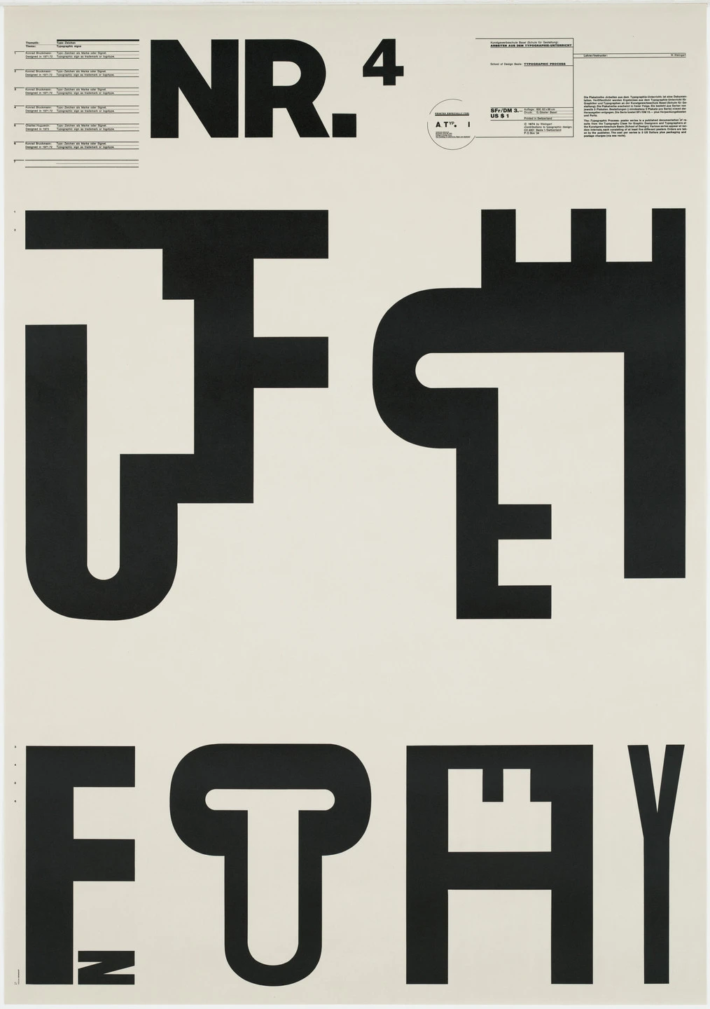
9. Swiss Style (International Typographic Style)

Developed in Switzerland in the 1950s, this highly influential design style was built on the modernist principles of the Bauhaus. It sought a universal, objective, and rational approach to design, believing that clear communication should always be the primary goal.

Key Figures: Armin Hofmann, Josef Müller-Brockmann.

Key Characteristics:

  • Grid System: Unwavering commitment to a mathematical grid for layout, creating order and unity.
  • Sans-Serif Typography: Almost exclusive use of clean sans-serif fonts like Helvetica and Univers, often set flush-left and ragged-right.
  • Objectivity: Rejected decoration and personal expression in favor of objective photography and clear, concise information.
  • Negative Space: Used ample white space as an active and important element of the design.

Modern Applications: Its principles are the foundation of modern web design, UI/UX, and corporate branding. It conveys clarity, professionalism, and trustworthiness.

swiss graphic design style example

A poster rooted in Swiss Style principles — clean typography, a strict grid, and precise alignment bring clarity and order to this rational, minimalist vision of visual communication’s future. Generated using Mew.Design.

Famous Work: Josef Müller-Brockmann’s concert posters, which masterfully use typography and geometric forms.

-> Learn the principles in our guide to the Swiss Style.

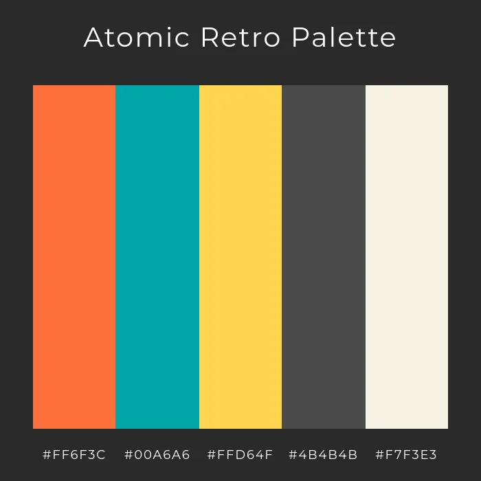
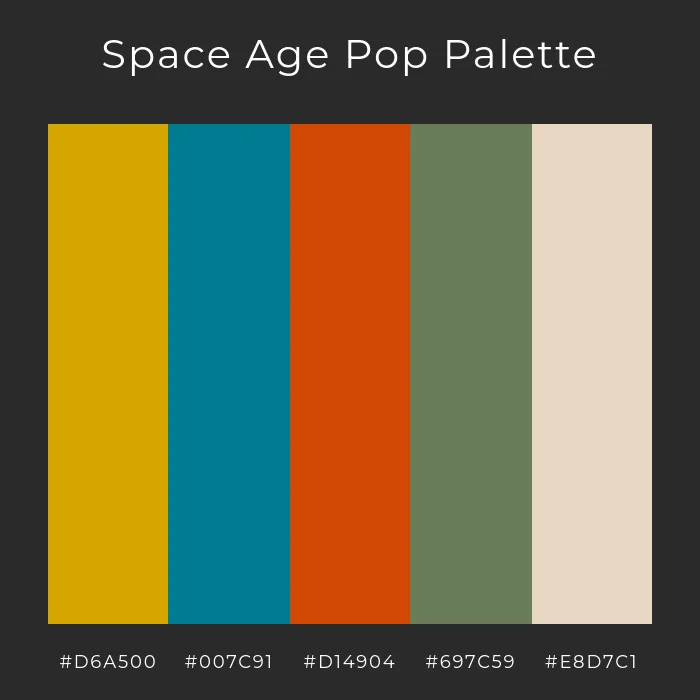
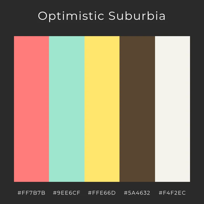
10. Mid-Century Modern

A broad design movement that became popular in the post-World War II era, roughly from 1945 to 1965, the Mid-Century Modern graphic design style reflected the era’s optimism, consumerism, and fascination with new technologies. It is known for being friendly, accessible, and charmingly retro.

Key Figures: Saul Bass, Paul Rand, Ray and Charles Eames.

Key Characteristics:

  • Playful & Organic: Characterized by clean lines mixed with gentle, organic curves.
  • Asymmetry: Compositions were often asymmetrical yet balanced.
  • Illustrative: Featured friendly, often quirky illustrations and icons.
  • Color Palette: Used a distinct palette of bright, optimistic colors (like mint green, atomic orange, and turquoise) contrasted with earthy tones.

Modern Applications: Evokes a sense of nostalgia and retro charm. Perfect for illustration, branding for startups, and packaging that wants to feel friendly and accessible.

mid century modern graphic design style example

A charming Mid-Century Modern packaging design with playful illustrations, retro colors, and friendly typography—blending vintage warmth with contemporary appeal. Generated using Mew.Design.

Famous Work: Saul Bass’s iconic movie posters and title sequences (e.g., Anatomy of a Murder).

-> Discover the charm of Mid-Century Modern Design.
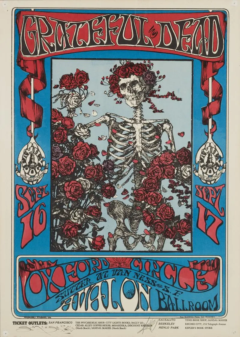
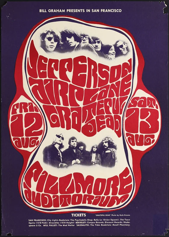
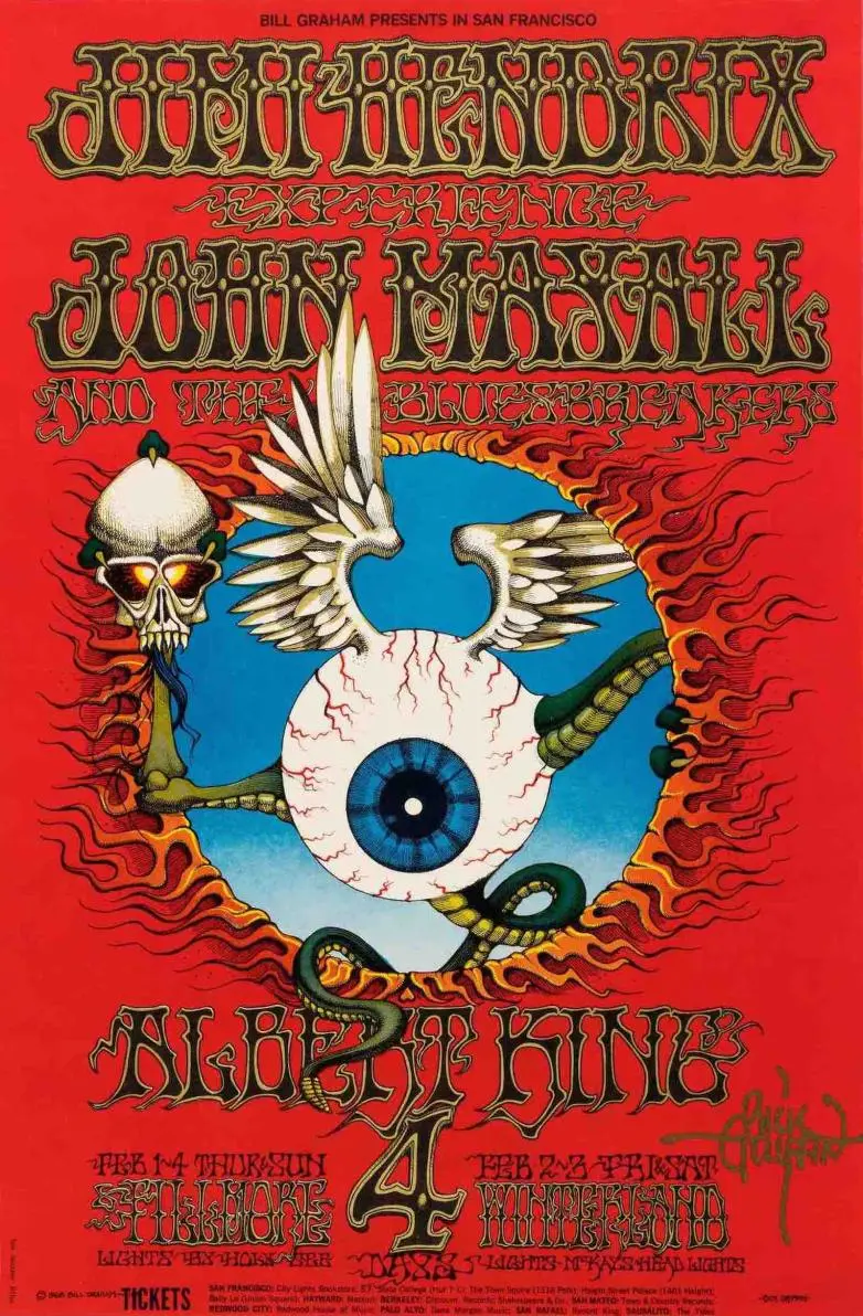
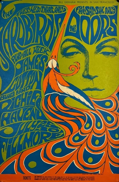
11. Psychedelic

Emerging from the 1960s counter-culture movement, Psychedelic design was a visual rebellion against the rigid modernism of the time, heavily influenced by psychedelic music and hallucinogenic experiences. It aimed to create a visual representation of an altered state of consciousness.

Key Figures: Wes Wilson, Victor Moscoso, Peter Max.

Key Characteristics:

  • Distorted Visuals: Featured swirling, melting, and abstract shapes that created a mind-bending effect.
  • Illegible Typography: Hand-drawn lettering that was often distorted to the point of being unreadable, becoming part of the overall image.
  • Vibrating Colors: Used intense, high-contrast, and often clashing color combinations to create a sense of vibration.

Modern Applications: Used for music festival posters, album art, and brands that want to convey a creative, free-spirited, or mind-expanding vibe.

psychedelic graphic design style example

A mind-bending psychedelic poster with swirling forms, vibrating colors, and warped typography—capturing the spirit of a cosmic music experience. Generated using Mew.Design.

Famous Work: The concert posters for venues like The Fillmore in San Francisco.

-> Understand the rebellious spirit of the Psychedelic Style.

12. Pop Art

The Pop Art design style began in the 1950s and exploded in the 1960s, challenging fine art traditions by incorporating imagery from popular culture like advertising and comic books. It blurred the lines between high and low art, celebrating the mundane and the commercial.

Key Figures: Andy Warhol, Roy Lichtenstein.

Key Characteristics:

  • Mass Culture Imagery: Used images from advertising, comic books, and everyday consumer goods.
  • Bold & Vibrant: Employed bright, saturated colors and bold outlines.
  • Repetition: Often repeated images within a single work to reflect mass production.
  • Ben-Day Dots: Roy Lichtenstein famously used dots to mimic the look of commercial comic book printing.

Modern Applications: This style remains powerful in advertising, editorial illustration, and fashion for creating bold, ironic, and eye-catching visuals.

pop art graphic design style example

A bold Pop Art–inspired ad bursting with comic flair, saturated color, and punchy repetition—celebrating the everyday with ironic, high-impact style. Generated using Mew.Design.

Famous Work: Andy Warhol’s Campbell’s Soup Cans series.

-> Learn how Pop Art continues to influence modern design.

Modern & Contemporary Styles

As technology advanced and culture fragmented, the strict rules of modernism gave way to more diverse, personal, and sometimes rebellious types of graphic design. These contemporary styles reflect the complexity of our modern world, from extreme simplicity to layered chaos.

13. Postmodernism

Emerging in the late 1970s and 1980s, the Postmodern design style was a direct, often playful, rebellion against the rigid rules and perceived seriousness of modernism and the Swiss Style. It declared that design could be expressive, decorative, and eclectic, breaking free from the “form follows function” mantra.

Key Figures: Wolfgang Weingart, April Greiman, Paula Scher.

Key Characteristics:

  • Rule-Breaking: Intentionally broke grids, mixed typefaces, and layered elements in a seemingly chaotic way.
  • Eclectic: Freely mixed historical styles and different aesthetics together.
  • Expressive & Playful: Favored collage, bold colors, and expressive, decorative forms.

Modern Applications: Its influence is seen in designs that are expressive, layered, and unconventional. Zine culture, experimental posters, and brands with a rebellious identity often draw from postmodern principles.

postmodernism graphic design style example

A rule-breaking Postmodern zine cover bursting with layered type, clashing styles, and collage chaos—where design defies order in favor of expression. Generated using Mew.Design.

Famous Work: The experimental typography of Wolfgang Weingart and the early digital work of April Greiman.

-> Explore the rule-breaking freedom of Postmodern Design.

14. Minimalism

While its roots are in modernism, Minimalism as a distinct graphic design style became dominant in the late 20th and early 21st centuries. It is a philosophy of “less is more,” believing that a message can be more powerful when all non-essential elements are stripped away, leaving only pure, focused content.

Key Figures: Influenced by pioneers like Ludwig Mies van der Rohe (architecture) and adopted by designers like Dieter Rams (product design).

Key Characteristics:

  • “Less is More”: The core philosophy is to strip away all non-essential elements.
  • Negative Space: Uses generous white or empty space as a primary design element to create focus and elegance.
  • Simple Color Palette: Often monochromatic or uses a very limited and deliberate set of colors.
  • Clean Typography: Relies on a single, well-chosen sans-serif typeface.

Modern Applications: Dominant in tech (Apple), luxury branding (Chanel), architecture, and UI/UX design. It conveys sophistication, confidence, and clarity.

minimalism graphic design style example

A minimalist tech homepage using clarity, whitespace, and restraint to communicate precision and elegance—where every element serves a purpose. Generated using Mew.Design.

Famous Work: The branding and product design of Apple under Steve Jobs and Jony Ive.

-> Master the art of simplicity with our Minimalism guide.

15. Maximalism

A direct reaction against the restraint of minimalism, the Maximalist has emerged in recent years as a celebration of excess, individuality, and bold expression. It operates on a “more is more” philosophy, creating rich, immersive visual experiences.

Key Figures: This is a contemporary trend rather than a formal movement, with figures like designer Camille Walala and artist Hassan Hajjaj embodying its spirit.

Key Characteristics:

  • “More is More”: Fills the space with rich layers of elements, colors, and textures.
  • Eclectic & Bold: Mixes different styles, patterns, and typefaces in a single composition.
  • Vibrant Colors: Uses a fearless, saturated, and often unconventional color palette.

Modern Applications: Perfect for brands that want to appear bold, energetic, and unconventional. Common in fashion, event promotion, and hospitality design.

maximalism graphic design style example

A riot of color, type, and pattern—this Maximalist poster turns visual chaos into a bold fashion statement that refuses to be ignored. Generated using Mew.Design.

Famous Work: Recent advertising campaigns for brands like Gucci or the vibrant identity work for music festivals.

-> Dive into the vibrant world of Maximalist Design.

16. Grunge

Born from the 1990s alternative rock and grunge music scene, this graphic design style was a visual rejection of the clean, polished corporate aesthetic of the 1980s. It embraced a raw, unrefined, and often chaotic look that felt more authentic and human.

Key Figures: David Carson, Neville Brody.

Key Characteristics:

  • Distressed Textures: Incorporates grainy photos, torn paper, stains, and gritty backgrounds.
  • Chaotic Layouts: Rejects grids in favor of layered, messy, and seemingly random compositions.
  • Unconventional Typography: Uses overlapping, distorted, and sometimes illegible typefaces.

Modern Applications: Used to convey a raw, edgy, and anti-establishment attitude. Still seen in music, fashion, and youth-focused branding.

grunge graphic design style example

Grunge isn’t about perfection — it’s about emotion, texture, and rebellion. This design leans into that raw energy to create a cover that feels as gritty and authentic as the music inside. Generated using Mew.Design.

Famous Work: David Carson’s groundbreaking work for Ray Gun magazine.

-> Understand the rebellious spirit of Grunge Style.

17. Brutalism

In digital design, Brutalist emerged in the mid-2010s, inspired by the raw, unadorned concrete forms of Brutalist architecture. It’s a rugged, often uncomfortable style that prioritizes raw function and honesty over traditional aesthetics.

Key Figures: Pascal Deville, creator of the influential archive brutalistwebsites.com, helped define and popularize the digital movement.

Key Characteristics:

  • Raw & Unfinished: Often looks like unstyled HTML with raw text links and system fonts.
  • Stark & Clashing: Uses bold, often clashing colors and stark, high-contrast typography.
  • Rejection of Convention: Deliberately ignores traditional design principles of beauty and user-friendliness to make a bold statement.

Modern Applications: Used by art collectives, portfolios, and fashion brands that want to appear edgy, honest, and anti-corporate.

brutalism graphic design style example

A poster that channels Brutalist graphic design’s defiance of conventional beauty — a raw, disruptive visual that aligns with underground art culture and post-digital rebellion. Generated using Mew.Design.

Famous Work: The websites of designers and studios that embrace this raw aesthetic, like the Balenciaga website.

-> Explore the raw power of Brutalist web design.

18. Organic / Hand-drawn

As a direct response to the cold precision of digital tools, the Organic or Hand-drawn graphic design style emphasizes a human touch, imperfection, and authenticity. It’s less a specific historical movement and more a timeless philosophy that values the artist’s hand in creating a warm and personal connection with the audience.

Key Figures: Contemporary lettering artists like Jessica Hische and illustrators whose work defines brands like Mailchimp have championed this aesthetic.

Key Characteristics:

  • Imperfect Lines: Embraces the natural wobble and variation of hand-drawn lines and illustrations.
  • Natural Textures: Often incorporates paper, watercolor, or sketch-like textures.
  • Custom Typography: Features hand-lettering or friendly, accessible script fonts.
  • Earthy & Approachable Colors: Tends to use a softer, more natural color palette.

Modern Applications: Ideal for brands wanting to appear authentic, sustainable, and friendly. It’s perfect for artisanal food packaging, coffee shops, wellness apps, and children’s products.

organic graphic design style example

A packaging concept that channels the Organic graphic style — handmade, earthy, and heartfelt — designed to appeal to conscious consumers and coffee lovers who value authenticity. Generated using Mew.Design.

Famous Work: The illustrative and friendly branding of Mailchimp and the approachable illustrations used by Headspace.

-> Inject humanity into your work with the Hand-drawn Style.

19. Abstract

The Abstract graphic design style is rooted in early 20th-century fine art movements and uses form, color, and texture to create a mood rather than a literal representation. It communicates on an emotional and sensory level, freeing the design from the constraints of realism.

Key Figures: Historically influenced by artists like Wassily Kandinsky. In graphic design, Paul Rand is a master who used abstract forms for corporate identity.

Key Characteristics:

  • Non-representational: Does not attempt to depict an object realistically.
  • Focus on Composition: Relies on the interplay of shapes, lines, and colors to create a visual experience.
  • Evokes Emotion: Aims to create a feeling or convey an idea through visual sensation.

Modern Applications: Widely used in branding (especially for tech and consulting firms), packaging, and posters where a unique and thought-provoking image is desired.

abstract graphic design style example

A vibrant play of abstract shapes and layered colors that captures the spirit of innovation and emotional expression — a design that invites viewers to explore ideas beyond the literal and embrace creative freedom. Generated using Mew.Design.

Famous Work: Paul Rand’s iconic logos for IBM, ABC, and UPS, which use simple abstract shapes to create memorable identities.

-> Learn how to use Abstract forms in your designs.

20. Geometric

A timeless style with roots in many movements, the Geometric graphic design style relies on the visual power of simple shapes like circles, squares, and triangles. It creates a sense of order, stability, and technological precision.

Key Figures: The principles were central to Bauhaus and Swiss Style masters like Josef Müller-Brockmann.

Key Characteristics:

  • Shape-Based: Compositions are built primarily from circles, squares, triangles, and hexagons.
  • Order & Pattern: Often uses repetition and symmetry to create complex and visually pleasing patterns.
  • Clean & Modern: The use of sharp lines and clear shapes gives it a clean, logical, and modern feel.

Modern Applications: Extremely versatile. Used for logo design, packaging patterns, posters, and web design to create a sense of order, technology, and stability.

geometric graphic design style example

A precise composition of geometric shapes and sharp lines that embodies clarity, order, and technological sophistication. Generated using Mew.Design.

Famous Work: The pictograms and visual identity system created by Otl Aicher for the 1972 Munich Olympics.

-> See how Geometric design creates structure and beauty.

Digital & UI/UX Styles

The dawn of the personal computer and the internet opened a new frontier for visual communication. The following types of graphic design were born from the screen, created specifically for the interactive, pixel-based world of user interfaces, websites, and digital experiences. These styles prioritize usability, interactivity, and the unique properties of the digital medium.

21. Y2K Revival

The Y2K graphic design style is a recent trend fueled by nostalgia for the aesthetics of the late 1990s and early 2000s. It’s a form of retro-futurism, reinterpreting the “techno-utopian” optimism of the early internet age, a time of chunky hardware, dial-up modems, and a fascination with a digital future that seemed just around the corner.

Key Figures: A trend popularized by a new generation of designers on social media platforms like TikTok and Instagram.

Key Characteristics:

  • Early CGI Aesthetics: Features low-poly 3D models, metallic sheens, and bubble-like forms.
  • Translucent & Iridescent Elements: Mimics the look of translucent plastic hardware (like the iMac G3) and holographic textures.
  • Futuristic Typography: Uses chunky, often metallic or chrome-effect fonts.
  • Bright, Acidic Colors: A palette of shiny blues, silver, hot pink, and lime green is common.

Modern Applications: Heavily used in fashion branding, music (album art and tour visuals), and social media marketing targeting Gen Z.

y2k graphic design style example

A vibrant Y2K design with translucent plastics, metallic sheens, and chunky chrome fonts, capturing early internet nostalgia and retro-futuristic optimism. Generated using Mew.Design.

Famous Work: The visual identity and merchandise for musicians like Olivia Rodrigo and Charli XCX often incorporate strong Y2K elements.

-> Explore the retro-futurism of the Y2K Revival.

22. 3D Design / CGI

3D design uses modern software to create images and animations with depth, texture, and realism that were once impossible. It has moved from a niche special effect to a mainstream aesthetic that blends the real and the virtual.

Key Figures: This field is driven by studios and individual artists. Beeple (Mike Winkelmann) brought daily CGI art to mainstream attention, while studios like Man vs Machine create cutting-edge 3D motion graphics for global brands.

Key Characteristics:

  • Depth & Realism: Creates a tangible sense of depth and dimension.
  • Lifelike Textures: Can mimic real-world materials (like metal, glass, fabric) with incredible accuracy.
  • Fantastical Imagery: Allows for the creation of imaginative characters, environments, and abstract forms.

Modern Applications: Ubiquitous in branding for tech companies, product mockups, motion graphics, and advertising to create eye-catching, high-production-value visuals.

3d graphic design style example

A striking 3D design that blends lifelike textures and depth with imaginative, futuristic forms — delivering a polished visual that bridges reality and digital creativity. Generated using Mew.Design.

Famous Work: Apple’s fluid and detailed product launch animations are a prime example of high-end commercial 3D design.

-> Discover the immersive world of 3D Design.

23. Skeuomorphism

A popular style in early digital design, especially in the 2000s, Skeuomorphism aimed to make new technology feel familiar and intuitive. This type of graphic design achieved this by making digital interface elements mimic their real-world counterparts in look and feel.

Key Figures: Scott Forstall, former Senior VP of iOS at Apple, was a major proponent of this style in early iPhone software.

Key Characteristics:

  • Real-World Imitation: Digital elements are designed to look like physical objects (e.g., a notepad app that looks like a paper pad, a trash can icon that looks like a real bin).
  • Textures & Shadows: Uses realistic textures, gradients, and drop shadows to create a sense of depth and tangibility.

Modern Applications: While largely replaced by Flat Design in UI, its principles are still used in game design and for icons where immediate recognition is crucial.

skeuomorphism graphic design style example

A tactile app interface that brings digital elements to life by mimicking real-world textures and shadows — embodying familiarity and intuitive design through rich skeuomorphic details. Generated using Mew.Design.

Famous Work: The original interface of Apple’s iOS (up to iOS 6), with its realistic-looking Notes, Calendar, and “slide to unlock” button.

-> Revisit the era of Skeuomorphic Design.

24. Flat Design

Flat Design rose to prominence in the early 2010s as a direct reaction against skeuomorphism. It embraces the two-dimensional nature of the screen, focusing on simplicity, clarity, and usability above all else.

Key Figures: Pioneered by Microsoft with their Metro Design Language and popularized globally by Apple with the release of iOS 7.

Key Characteristics:

  • Two-Dimensional: Strips away all 3D effects like drop shadows, gradients, and textures.
  • Simplicity & Clarity: Uses simple shapes, bright solid colors, and clean.
  • Focus on Usability: Aims to create clean, easy-to-navigate user interfaces.

Modern Applications: The dominant style for modern websites, mobile apps, and software interfaces.

flat design graphic design style example

A crisp and minimal splash screen that strips away complexity — showcasing Flat Design’s clarity, bright colors, and straightforward usability for a seamless digital experience. Generated using Mew.Design.

Famous Work: The dominant style for modern websites, mobile apps, and software interfaces.

-> Explore our complete guide to Baroque-inspired Design.

25. Liquid / Abstract Flow

This hyper-modern graphic design style is defined by its fluid, amorphous, and dynamic shapes. It often uses gradients and a sense of movement to create visuals that feel organic, energetic, and futuristic.

Key Figures: As a recent trend, it’s defined more by creative agencies and tech companies than single figures.

Key Characteristics:

  • Amorphous Shapes: Uses flowing, liquid-like forms that defy rigid geometry.
  • Gradients & Color: Often employs vibrant gradients to give the shapes life and dimension.
  • Sense of Movement: The compositions feel dynamic and in motion.

Modern Applications: Popular with tech startups, creative agencies, and brands that want to appear innovative, adaptable, and on the cutting edge.

liquid graphic design style example

A dynamic blend of flowing shapes and vibrant gradients — this design pulses with movement and energy, embodying the futuristic and adaptable spirit of modern tech innovation. Generated using Mew.Design.

Famous Work: The web design and branding for companies like Stripe, which often use fluid gradients and abstract background shapes.

-> See how Liquid design creates a sense of flow.

26. Glitch Art

Glitch Art deliberately uses digital errors and artifacts for aesthetic purposes. It emerged from a fascination with technology’s imperfections, turning data corruption, pixelation, and digital noise into a compelling visual language.

Key Figures: Early pioneers like Ant Scott (Beflix) explored this aesthetic, which was later popularized by countless digital artists on platforms like Tumblr and Instagram.

Key Characteristics:

  • Corrupted Aesthetic: Features distorted images, pixelation, and color bleeding.
  • Digital Noise: Incorporates elements that look like static or data errors.
  • Futuristic & Dystopian: Can evoke feelings of a futuristic, tech-saturated, or even dystopian world.

Modern Applications: Perfect for music events, tech conferences, and brands in the gaming or cybersecurity space that want an edgy, digital-native look.

glitch art graphic design style example

A raw collision of pixelation, distortion, and digital noise — this glitch art poster channels tech’s imperfect beauty, evoking a futuristic world where chaos and control collide. Generated using Mew.Design.

Famous Work: The aesthetic is prominent in music videos like A$AP Rocky’s “L$D” and in the title sequences for shows like Mr. Robot.

-> Explore the distorted beauty of Glitch Art.

27. Holographic / Iridescent

This recent graphic design style mimics the effect of light refracting through a prism or hologram. It creates shimmering, multi-colored metallic textures that feel both futuristic and ethereal.

Key Figures: A trend-driven style popularized by fashion houses and design studios on social media.

Key Characteristics:

  • Shimmering Textures: Uses gradients that shift between multiple pastel and neon colors.
  • Metallic Sheen: Often has a metallic or pearlescent finish.
  • Futuristic Feel: Evokes a sense of high technology and fantasy.

Modern Applications: Popular in fashion, beauty packaging, tech branding, and social media graphics to create a trendy, eye-catching, and magical effect.

holograpic graphic design style example

A shimmering dance of pastel and neon gradients with metallic sheen — this iridescent design captures a futuristic elegance that feels both magical and modern. Generated using Mew.Design.

Famous Work: Seen widely in Nike’s marketing for futuristic sneakers and on packaging for brands like Fenty Beauty.

-> Discover the futuristic shine of Iridescent Design.

28. Claymorphism

An evolution of 3D design for UI, the Claymorphism design style uses smooth, rounded, clay-like graphics. It creates a soft, light, and tactile feel, as if the UI elements are inflated and touchable.

Key Figures: This style was popularized by a wave of UI/UX designers on creative platforms like Dribbble and Behance.

Key Characteristics:

  • Soft & Puffy 3D: Features smooth, rounded shapes that look like soft clay.
  • Inner & Outer Shadows: Uses subtle inner and outer shadows to create the illusion of being inflated.
  • Light & Minimal: Often set against a simple, light-colored background.

Modern Applications: Used in user interfaces for mobile apps and dashboards to create a friendly, simple, and tactile user experience. claymorphism graphic design style example

Soft, puffy shapes and subtle shadows come together to create a tactile, friendly interface — this Claymorphism design invites users to engage with a light, approachable digital experience. Generated using Mew.Design.

Famous Work: While still emerging, it’s widely seen in conceptual UI designs on Dribbble and is beginning to appear in fintech and health app interfaces.

-> Learn about the soft and tactile feel of Claymorphism.

29. Glassmorphism

A popular UI trend, Glassmorphism design mimics the look of frosted glass. It adds depth and hierarchy back into interfaces by layering translucent elements over colorful, blurred backgrounds.

Key Figures: The style was heavily popularized by Apple’s design team.

Key Characteristics:

  • Frosted Glass Effect: The signature element is a background blur, creating a translucent, frosted glass look.
  • Layered Depth: Objects float on top of one another, creating a clear visual hierarchy. [
  • Subtle Border: A light, 1px border is often applied to the translucent object to help it stand out from the background.

Modern Applications: Widely used in modern user interfaces for dashboards, mobile app cards, and website elements to create a light, airy, and futuristic feel.

glassmorphism graphic design style example

A translucent frosted glass card layered over vibrant colors — this Glassmorphism UI design creates depth and clarity with a light, futuristic aesthetic perfect for modern dashboards. Generated using Mew.Design.

Famous Work: Apple’s macOS Big Sur interface, the iOS control center, and elements of the Microsoft Fluent Design System.

-> Explore the latest UI trend: Glassmorphism.

Frequently Asked Questions (FAQs)

What is the difference between Art Deco and Art Nouveau? The easiest way to remember is that Art Nouveau is all about flowing, organic, and nature-inspired curves (think vines). Art Deco is about sharp, symmetrical, and machine-inspired geometric shapes (think skyscrapers).

Is minimalism still a popular design style? Yes. Minimalism remains one of the most popular and timeless styles, especially in digital design, corporate branding, and luxury markets. Its focus on usability and clarity makes it incredibly effective.

How many graphic design styles are there? There is no definitive number. Styles are constantly evolving, blending, and re-emerging. This guide covers the most significant and recognizable ones, but designers are always creating new visual languages.

Can a brand use more than one design style? Generally, consistency is key for a strong brand identity. However, a brand can have a core style and use elements from a complementary secondary style for specific campaigns or sub-brands, as long as it feels intentional and not chaotic.

Conclusion

Graphic design styles are the powerful visual tools we use to tell stories, evoke emotions, and build lasting connections. From the historic elegance of Art Nouveau to the clean functionality of Flat Design, each style offers a unique way to communicate. Understanding these options is the first step to building a truly compelling brand.

🚀

Ready to Design a Graphic?

At Mew Design, we specialize in translating brand identity into compelling visual styles. Whether you’re drawn to timeless minimalism or bold maximalism, our AI design agent can help you craft a look that truly connects.

Generate Your Style with Mew Design