20 Creative DIY Calendar Ideas for 2026 [+AI Prompts]
A calendar is more than just a grid of dates; it is a canvas for your life. When you choose to DIY your calendar, you transform a mundane tool into a personal gallery—a collection of cherished memories, a showcase of artistic flair, or a highly functional planner tailored to your specific goals. Unlike mass-produced store-bought options, a custom calendar reflects your intention. Every month becomes an opportunity to tell a story, celebrate a milestone, or find daily inspiration.
Here are 20 creative DIY calendar ideas to personalize your year, along with a guide on how to generate them instantly using AI.
How to DIY Your 2026 Calendar with AI
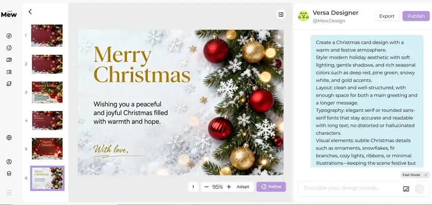
You don’t need complex design software to create a professional-looking calendar. Mew Design is a specialized AI calendar generator that distinguishes itself from standard AI tools through six core features:
- Natural Language Design: Simply describe your vision (e.g., “A vintage botanical calendar page for April 2026”) to generate layouts.
- Zero Text Hallucinations: Guarantees 100% accurate spelling for titles, dates, and holidays.
- Pro Mode Series: Generates a cohesive 12-month calendar series in a single click, maintaining consistent style across the year.
- Real-World Knowledge: Automatically populates correct dates, days of the week, and holidays for 2026.
- Conversational Editing: Allows you to refine designs via chat (e.g., “Change the font color to blue”).
- Asset Integration: Seamlessly integrates your uploaded photos or logos into professional frames.
Here is how to create your custom calendar in four simple steps:
- Describe or Upload: Type a prompt describing your theme. You can generate a single month to test a style, or use Deep Mode to generate the entire year at once.

- Generate the Calendar: Click generate. The AI analyzes your request and creates a professional layout, automatically placing the correct dates for 2026.

- Refine with Chat: Need to make a change? Click the Refine button in the bottom-right corner of the image you want to tweak. For example, ask the AI to “make the Sunday column red” or “add a specific anniversary date.”

- Export and Print: Once you are happy with the design, export it in high resolution. It is ready to be printed at home or sent to a professional print shop.

Best Practice:
Mew Design acts as your AI design agent, dynamically orchestrating multiple tools to generate professional 2026 calendars. It can use imgGenTool to create visually rich layouts, codeDesign for structured long-text content, and knowledge search to ensure dates, holidays, and annotations are accurate.
For best results, you can guide the agent directly in your prompt. For example: “Please use imgGenTool to generate this calendar” to prioritize visual quality, or “Please provide 3 different design variations” to explore multiple styles before finalizing your layout.
20 DIY Calendar Ideas to Inspire Your 2026
Here are twenty unique concepts to help you create a meaningful custom 2026 calendar, featuring specific content angles and actionable advice.
1. The “Year in Review” Family Calendar
This is the quintessential personalized photo calendar. Instead of random photos, curate a “Year in Review” theme where each month features a memory from the same time last year. It becomes a beautiful timeline of growth, perfect for grandparents.
- Content Tip: Use a photo of last year’s snowy backyard for January, and a beach shot from last July for this July. It creates a “then vs. now” timeline that beautifully illustrates how much your children or family have grown over the last 12 months.
- Why it works: It turns your calendar into a family yearbook that celebrates the passage of time.

Prompt: Create a calendar page for January 2026. Add the family photo I uploaded. Style: Classic white with gold borders. Clean, elegant typography. Ratio: 4:5
2. The Pet Personality Planner
Go beyond cute snapshots by capturing your pet’s unique quirks. This calendar celebrates the humor and joy animals bring to our daily lives by theming the visuals around their personality traits.
- Content Tip: Match your pet’s “mood” to the month. Is February a “lazy” month? Use a photo of them sleeping in a funny position. Is October spooky? Use AI to generate an illustration of your cat wearing a wizard hat or your dog as a pumpkin.
- Why it works: It captures the specific character of your pet, making you smile every time you check the date.

Prompt: A custom pet calendar page for October 2026. Visual: A cute cat wearing a small witch hat sitting on a pumpkin. Style: Whimsical cartoon illustration. Orange and black border.
3. Minimalist Typography Calendar
For the design-conscious, less is more. A minimalist calendar focuses on bold, clean numbers and ample negative space. It functions as a piece of modern art for your office, keeping the focus strictly on the date without visual clutter
- Content Tip: Use the extra white space to write down only your three most important “Big Rocks” or goals for the month. This keeps your focus sharp and prevents the overwhelm of a crowded to-do list.
- Why it works: It reduces visual noise, helping you focus on your top priorities.

Prompt: A minimalist monthly calendar for 2026. Design: Black and white only. Huge, bold Helvetica font for the month name. Grid is simple lines. No illustrations.
4. Vintage Travel Poster Series
Turn your wall into a window to the world. Create a vintage style calendar where each month features a retro travel poster of a dream destination. Think grainy textures, muted colors, and 1950s typography advertising Paris in spring or the Alps in winter
- Content Tip: Curate the destinations based on your dream itinerary for 2026. Feature ski destinations like the Swiss Alps in winter months and coastal towns like Amalfi in the summer. It serves as a visual vision board for your travel goals.
- Why it works: It acts as a daily reminder of the adventures waiting for you, keeping you motivated.

Prompt: Curate the destinations based on your dream itinerary for 2026. Feature ski destinations like the Swiss Alps in winter months and coastal towns like Amalfi in the summer. It serves as a visual vision board for your travel goals.
5. Seasonal Recipe Calendar
This is functional decor for the kitchen. It solves the eternal question of “what’s for dinner?” by providing seasonal inspiration right on your wall.
- Content Tip: Match recipes to seasonal produce to encourage sustainable eating. Feature a hearty root vegetable stew in November and a light berry salad in June. You can even scan handwritten recipe cards from your grandmother to add a sentimental touch.
- Why it works: It combines meal planning with decor, encouraging you to cook with the seasons.

Prompt: A recipe calendar page for November 2026. Visual: Watercolor illustration of a roasted turkey and vegetables. Text: Includes a small recipe card sidebar. Style: Rustic farmhouse.
6. Kids’ Art Gallery
Declutter your fridge and preserve your child’s creativity professionally. This makes a fantastic gift for relatives who want to see what the grandkids are creating.
- Content Tip: Scan the artwork rather than photographing it for better quality. Organize the art by color—use “cool” colored drawings (blues, purples) for winter months and “warm” colored art (reds, yellows) for summer to give the calendar a cohesive flow.
- Why it works: It validates your child’s creativity and creates a permanent archive of their artistic development.

Prompt: A colorful calendar page for May 2026 designed to frame a child’s drawing. Background: Crayon texture and playful doodles. Large empty space in the center for uploading artwork.
7. Daily Affirmations & Motivation
Turn your calendar into a mental health tool. Instead of just tracking dates, use it to set the emotional tone for your month using powerful typography.
- Content Tip: Choose affirmations that counter seasonal slumps. In January, focus on “New Beginnings.” In highly stressful months like December, use calming quotes like “Peace over Perfection.” This helps align your mindset with the rhythm of the year.
- Why it works: It integrates mindfulness into your daily planning routine, offering emotional support.

Prompt: A motivational calendar for January 2026. Feature the quote ‘Fresh Start’ in bold, modern typography. Background: Abstract geometric shapes in calming sage green and cream.
8. Botanical & Garden Planner
Perfect for plant lovers, this calendar acts as a visual guide for the gardening year, featuring illustrations of flora that blooms in that specific month.
- Content Tip: Use the captions or notes section to add gardening reminders specific to that month, such as “Plant tulip bulbs” in October or “Prune roses” in February. It makes the beautiful botanical illustrations functionally useful.
- Why it works: It helps gardeners stay organized while bringing the beauty of the outdoors inside.

Prompt: A botanical calendar page for March 2026. Visual: Detailed vintage botanical illustration of daffodils and tulips. Style: Cream paper background, elegant serif font.
9. Corporate Brand & Industry Events
For businesses, a company branded calendar is a year-round touchpoint. The key to getting clients to hang it up is making it useful, not just promotional.
- Content Tip: Pre-fill the calendar with important industry dates, tax deadlines, or major conferences relevant to your clients. This transforms it from a piece of marketing swag into an essential reference tool for their office.
- Why it works: It provides genuine utility to your clients, keeping your brand top-of-mind every day.

Prompt: A corporate wall calendar for 2026. Header: Includes placeholder for [Company Logo]. Style: Professional, clean lines, navy blue and white. Mark standard US Holidays.
10. The “Instax” Photo Collage
Life is messy and wonderful, and sometimes one photo isn’t enough. This layout captures the “b-roll” of your life—the candid, unposed moments that define your year.
- Content Tip: Use this format to tell a micro-story for the month. For a vacation month, don’t just use one landscape shot; use a collage of the food, the ticket stubs, and the funny selfies to capture the full vibe of the trip.
- Why it works: It takes the pressure off finding one “perfect” shot and allows you to celebrate the small, authentic moments.

Prompt: A photo collage calendar for June 2026. Layout: Three frames that look like Polaroid photos scattered at the top. Background: Corkboard texture. Date grid at the bottom.
11. Zodiac & Astrology
Tap into the mystical trend. A zodiac calendar dedicates each month to its corresponding star sign, featuring constellation maps, horoscope traits, and mystical color palettes (deep blues, purples, and golds).
- Content Tip: Highlight the start of each zodiac season (e.g., “Leo Season Begins”) and major astrological events like Mercury Retrograde directly on the dates. It serves as a fun guide for friends who follow astrology.
- Why it works: It connects your daily schedule with your personal interests in spirituality and the cosmos.

Prompt: An astrology calendar page for February 2026 (Aquarius). Visual: Gold constellation lines on a deep navy blue starry background. Mystical and elegant style.
12. Adult Coloring Calendar
Create an interactive relaxation tool. An outline-style calendar features intricate black-and-white line art—like mandalas or cityscapes—that you color in yourself. It turns your calendar into a monthly stress-relief activity.
- Content Tip: Choose intricate designs like mandalas or cityscapes. Keep a set of colored pencils near the calendar and color in a small section every day you complete a habit (like drinking water or exercising) as a visual habit tracker.
- Why it works: It turns your calendar into a daily mindfulness ritual and visual progress bar.

Prompt: A coloring book style calendar for 2026. Visual: Intricate black and white mandala pattern at the top. The user can color it in. Clean date grid below.
13. Dark Academia Aesthetic
This style is perfect for students, writers, or anyone who loves a moody, intellectual vibe. It turns a study space into a sanctuary with leather textures and deep colors.
- Content Tip: Pair the moody visuals with literary quotes from classic authors like Oscar Wilde or Virginia Woolf. It reinforces the scholarly atmosphere and provides intellectual inspiration.
- Why it works: It creates a cozy, focused atmosphere that encourages reading and study.

Prompt: A Dark Academia aesthetic calendar for October 2026. Visual: An old library with leather books and a candle. Colors: Deep brown, forest green, and gold.
14. Couples’ Love Story
A romantic gesture that documents your journey together. This makes for a thoughtful anniversary or Valentine’s gift that celebrates your relationship.
- Content Tip: Mark your specific relationship milestones directly on the dates—not just “Anniversary,” but “First Date,” “The day we got the dog,” or “First apartment move-in.” It celebrates the unique history you share.
- Why it works: It serves as a daily reminder of your shared love and the life you are building together.

Prompt: A romantic calendar page for February 2026. Layout: Heart-shaped photo frame for a couple’s photo. Add the photo I uploaded in the frame. Background: Soft pink watercolor wash. Highlight Feb 14th.
15. The “Ugly” Sweater Calendar
Inject some humor into your year with a kitschy, texture-based design. This is perfect for lighthearted environments.
- Content Tip: This is great for an office or community board where you want to keep things fun. You can even organize a real “Ugly Sweater Day” to match the calendar’s theme in December or July (Christmas in July).
- Why it works: It brings a smile to your face and fosters a sense of fun and community.

Prompt: A funny calendar page for December 2026. Background: A knitted pattern that looks like an ugly Christmas sweater (red and green reindeer). Font looks like cross-stitch.
16. Watercolor Landscapes
A soft, artistic choice that acts as changing wall art. It keeps your room looking fresh and open by matching the visual mood to the season.
- Content Tip: Select landscapes that match the energy you want for that season. Choose calm, still lakes for stressful months to induce relaxation, and vibrant, bright meadows for spring months to induce energy.
- Why it works: It uses color psychology to subtly influence the mood of your room throughout the year.

Prompt: A watercolor calendar for August 2026. Visual: A serene beach scene with soft waves and sand. Style: Artistic, loose brushstrokes, calming blue and beige tones.
17. Cyberpunk & Sci-Fi
Designed for gamers and tech enthusiasts, this style fits perfectly into an RGB-lit setup with neon lights and digital glitches.
- Content Tip: Mark the release dates of major video games, tech conventions, or sci-fi movie premieres. It transforms the calendar into a “hype tracker” for your favorite hobbies.
- Why it works: It matches the aesthetic of modern gaming setups, making the calendar feel like part of the gear.

Prompt: A cyberpunk style calendar for 2026. Visual: Futuristic city street with neon pink and blue lights. Font: Digital glitch style. Dark background.
18. Digital Desktop Wallpaper
Not all calendars need to be printed. Design a digital desktop wallpaper calendar to organize your computer screen. You can create 12 backgrounds where the calendar grid is integrated into the artwork, keeping your desktop clean and functional.
- Content Tip: Organize your desktop icons around the calendar grid. Use the “negative space” in the artwork to group your folders (e.g., “To Do” folders on the left, “Archive” on the right) for a clean digital workspace.
- Why it works: It provides organization without physical clutter, perfect for minimalists.

Prompt: A digital desktop wallpaper calendar for 2026. Aspect ratio 16:9. Visual: Minimalist mountain vector art. Small, unobtrusive calendar grid on the right side.
19. The “Bucket List” Challenge
Make 2026 a year of action. A bucket list calendar includes a monthly challenge or goal at the top of the page, such as “Read a new book,” “Try a new hiking trail,” or “Cook a new recipe.”
- Content Tip: Don’t just list a goal; schedule it. If the challenge for July is “Host a BBQ,” circle a specific Saturday in July as the target date. Writing it down drastically increases the likelihood of it happening.
- Why it works: It moves goals from “someday” to “today,” encouraging active living.

Prompt: A bucket list calendar for January 2026. Text at top: ‘Challenge: Hike a new trail’. Visual: Illustration of hiking boots and a map. Style: Adventure vector art.
20. Abstract Geometric Art
If you prefer modern design, an abstract calendar uses shapes, lines, and colors to create composition. It focuses on the aesthetic balance of the page rather than specific illustrations, making it a versatile choice for any room.
- Content Tip: Coordinate the color palette with your room’s decor. If your office has yellow accents, generate a calendar with mustard and grey geometry. It ensures the calendar feels like a deliberate part of your interior design.
- Why it works: It provides a clean, modern look that enhances your room’s aesthetic without demanding attention.

Prompt: An abstract geometric calendar for 2026. Visual: Bauhaus style composition with circles and triangles. Colors: Mustard yellow, grey, and black. Clean grid.
Final Words
Designing a custom 2026 calendar gives you the opportunity to organize your year exactly how you want it. Whether you are building a sentimental photo archive to share with family or a sleek tool to boost your productivity, the result is something uniquely yours. With AI tools like Mew Design, the technical hassle of grids and formatting is removed, leaving you with the fun part: pure creativity. Start planning your year today.
FAQs About DIY Calendar
What is the best paper for printing DIY calendars?
For a professional feel, use matte or semi-gloss cardstock (between 170-250 gsm). This weight is sturdy enough to hang on a wall without curling but flexible enough for spiral binding.
Can AI generate the calendar dates correctly?
Yes. Advanced AI calendar generators like Mew Design possess real-world knowledge. They automatically place dates, days of the week, and holidays for 2026 correctly, so you never have to manually type in numbers.
How do I bind my DIY calendar?
You have several options: use a simple binder clip for a minimalist hanging look, take your pages to a local print shop for professional spiral binding, or punch holes and use a nice ribbon for a rustic, handmade feel.
Is it cheaper to make my own calendar?
Generally, yes. Creating a digital file with a free AI calendar maker and printing it locally is often much more affordable than buying high-end boutique calendars, plus it offers far more personalization and sentimental value.