240+ Christmas Card Sayings, Messages, and Greetings for 2026
Get inspired by sweet, funny, classic, modern, and heartfelt sayings — plus ready-to-use Mew Design prompts so you can generate beautiful Christmas cards in minutes.

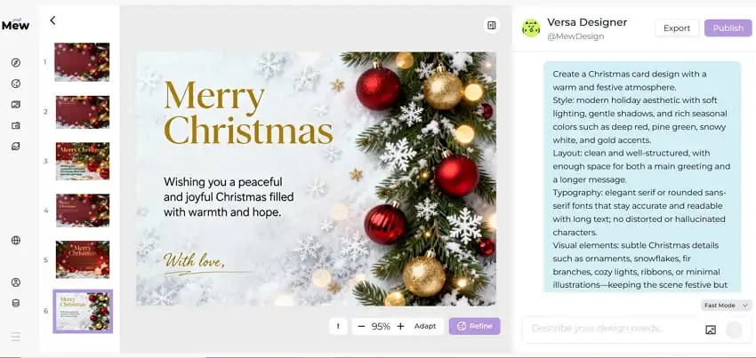
Generated using mew.design.
Key Takeaways
- Match tone to the recipient: formal for bosses/clients, playful for friends, sentimental for family.
- Short and specific usually reads as more sincere — aim for 1–3 sentences plus a signature.
- Add at least one personal touch per card (a memory, next-year plan, or a specific thank-you).
- Use AI design tools like Mew Design to create on-brand, print-ready layouts and to iterate quickly on tone, imagery, and typography.
Christmas cards make small gestures feel special. The right combination of wording and design turns a simple card into a keepsake — one that might be displayed on a mantel or pinned to a corkboard.
This guide collects 240+ messages across 20 thoughtfully named categories so you can find the tone and phrasing that fits each recipient.
And if you’d like to turn these Christmas card sayings into something beautifully designed and uniquely yours, there’s an easy way to do it.
Design Your Christmas Cards for Free With Mew Design AI
Section titled “Design Your Christmas Cards for Free With Mew Design AI”Creating a meaningful Christmas card shouldn’t stop at choosing from the same templates everyone else is using. This is where Mew Design comes in.
It’s an AI design agent that turns natural-language descriptions into fully designed Christmas cards—letting you create something personal, expressive, and truly your own. Instead of scrolling through fixed layouts, you can describe the mood, colors, illustration style, and even add long written messages without worrying about AI text distortion or “text hallucination.”
Whether you want a warm family greeting or a playful card for friends, this AI Christmas card generator helps you shape your ideas into a polished, print-ready design.
Best Practice:
When designing Christmas cards with Mew Design, treat it as your AI design agent that can orchestrate multiple tools in a single workflow. For example, it can use imgGenTool to generate festive illustrations, codeDesign for long-form messages or layered text layouts, and knowledge search to ensure holiday facts or greetings are accurate and well-structured.
For optimal results, guide the agent directly in your prompt. For example, add “Please use imgGenTool to create this Christmas card” to prioritize visual quality, or “please provide 3 different design variations” to explore multiple card styles before finalizing your holiday greeting.
01 Classic Christmas Card Sayings
Section titled “01 Classic Christmas Card Sayings”Classic cards are timeless — suitable for acquaintances, neighbors, and family. These lines are broadly appropriate and pair well with elegant, traditional layouts.
- We wish you a Merry Christmas and a Happy New Year!
- Season’s greetings and best wishes for the coming year.
- Wishing you peace, love, and joy this holiday season.
- From our home to yours, happy holidays and warm wishes.
- May your days be merry and bright all winter long.
- Warmest thoughts and best wishes for a wonderful Christmas.
- May you enjoy a season filled with comfort and joy.
- Sending warm holiday wishes to you and yours.
- Wishing you all the joys of the season and happiness throughout the year.
- Merry Christmas — may your home be filled with love.
- Have a holly, jolly holiday and a bright New Year.
- Hoping your holidays are peaceful and bright.

Generated using mew.design. Prompt: Classic Christmas card: family portrait [upload your family photo as source image], script headline ‘We wish you a Merry Christmas and a Happy New Year!’, evergreen border, warm golden bokeh.
02 Nondenominational Christmas Greetings
Section titled “02 Nondenominational Christmas Greetings”Use these when you want to celebrate the season without religious wording — ideal for coworkers, diverse friend groups, and acquaintances.
These inclusive holiday greetings speak to warmth and togetherness without specific religious references. They work well for offices, neighbors, and anyone who prefers secular language. Choose a clean typeface and neutral imagery to match the tone.
- Happy holidays and best wishes for the New Year.
- Wishing you joy and peace this holiday season.
- Warm holiday greetings from our family to yours.
- Here’s to cozy moments and happy memories.
- Sending seasonal cheer and warm wishes.
- May your holidays be bright and your New Year joyful.
- Cheers to good times and grateful hearts.
- Wishing you a festive season full of warmth.
- Best wishes for a happy, healthy holiday season.
- May your days be merry and your heart be light.
- Season’s greetings — enjoy every peaceful moment.
- Celebrating the season with gratitude and joy.
“Clean nondenominational holiday card: white background, sans-serif headline ‘Wishing you joy and peace this holiday season’, small illustrated pine sprig, lots of white space.”

Generated using mew.design. Prompt: Create a clean yet festive nondenominational holiday card image. White background with soft gradient lighting; elegant sans-serif headline “Wishing you joy and peace this holiday season.” Detailed pine sprig illustration with a few red winter berries for a gentle pop of color. Minimal gold foil-style highlights, overall airy layout with generous whitespace to maintain sophistication.
03 Cute Christmas Messages & Merry Christmas Wishes
Section titled “03 Cute Christmas Messages & Merry Christmas Wishes”Sweet, playful messages for photo cards, kids’ mailed notes, or any card that leans on charm rather than formality.
Cute messages pair perfectly with photos of children or pets, or with whimsical illustrations. Use rounded fonts, pastel or candy-color palettes, and playful layouts to amplify the charm.
- Have a holly jolly Christmas!
- Snow much fun — Merry Christmas!
- All I want for Christmas is you.
- If kisses were snowflakes, I’d send you a blizzard.
- Pawsitively delightful holiday wishes!
- Santa’s favorite little helper sends love.
- Warm cocoa, cozy socks, and holiday hugs.
- Jingle all the way — enjoy every merry moment.
- Snowflake kisses and candy-cane wishes.
- Wrapped up in love — Merry Christmas!
- Tiny lights, big smiles — happy holidays!
- Giggles, glitter, and holiday cheer.

Generated using mew.design. Prompt: Cute Christmas card: pastel red and green palette, playful handwritten font ‘All I want for Christmas is you’, small illustrated snowman and candy cane, signature area at the bottom.
04 Heartfelt Sentimental Christmas Wishes
Section titled “04 Heartfelt Sentimental Christmas Wishes”Messages that feel handwritten and personal — ideal for close family members and lifelong friends.
Sentimental lines are for when you want to say something meaningful but concise. These phrasing options read well in a soft script or with a candid photograph. Consider adding a short personal memory to make it uniquely yours.
- Thinking of you this Christmas and wishing you all the best.
- The greatest gift is time with the people we love.
- Grateful for you this holiday season and always.
- Our hearts are fuller because of you — Merry Christmas.
- Wishing you peace, love, and time to rest this season.
- May this holiday bring treasured memories and warm moments.
- Holding you close in thought this holiday season.
- Thankful for your friendship and the memories we share.
- May your home be filled with love and laughter.
- Sending you hugs and the warmest holiday wishes.
- This season, I’m thankful for you — Merry Christmas.
- May you find joy in every quiet moment this holiday.

Generated using mew.design. Prompt: Sentimental card using a candid family photo, warm grain filter, script text ‘Thinking of you this Christmas and wishing you all the best.’ Add soft vignette and space for a personal handwritten line.
05 Faith-Based Religious Christmas Greetings & Bible Verses
Section titled “05 Faith-Based Religious Christmas Greetings & Bible Verses”For recipients who celebrate the spiritual meaning of Christmas — includes Bible verses and reverent blessings.
Religious cards honor the sacred side of the holiday. These messages range from brief blessings to scripture quotes and suit traditional layouts with nativity imagery or candlelit backgrounds.
- Glory to God in the highest. Merry Christmas.
- May the light of Christ fill your heart this season.
- Rejoice — a Savior is born. Wishing you a blessed Christmas.
- May God’s peace and love be with you this Christmas.
- Celebrate the miracle of Christ’s birth — Merry Christmas.
- May His grace bring you peace and joy this season.
- “For unto us a child is born…” — Merry Christmas.
- Wishing you blessings and abundant joy this Christmas.
- Let the joy of the Lord be your strength this season.
- May the miracle of Christmas renew your hope.
- God bless you and yours this holiday season.
- Praying you feel God’s love and presence this Christmas.

Generated using mew.design. Prompt: Religious Christmas card: elegant gold and white, serif headline ‘Glory to God in the highest, and on earth peace’, small nativity illustration, signature [your name here] at bottom.
06 Short Modern Christmas Messages
Section titled “06 Short Modern Christmas Messages”Short, punchy phrases for minimalist cards, gift tags, or quick notes.
Short greetings work beautifully on modern, minimalist cards or as part of busy photo layouts. Their impact comes from typography — choose strong, simple fonts and plenty of negative space.
- Merry everything and a happy always.
- Cheers to the New Year!
- Stay cozy. Stay bright.
- Love, light, and holiday cheer.
- Have yourself a merry little Christmas.
- Warm wishes — now and always.
- Peace. Love. Joy.
- Joyful days and cozy nights.
- Sparkle on.
- Eat, drink, be merry.
- Holiday vibes only.
- Cozy wishes, happy days.

Generated using mew.design. Prompt: Short modern Christmas card with a clean but visually engaging aesthetic. Soft off-white background with subtle paper texture or a gentle warm gradient, giving depth instead of a flat white surface. Bold sans-serif headline “Peace, love, and holiday cheer” positioned with balanced modern layout.Add a small abstract snowflake icon with geometric lines, slightly embossed or metallic-ink inspired, creating subtle dimensionality.
07 Funny Holiday Messages
Section titled “07 Funny Holiday Messages”For playful friends and family who appreciate a laugh — use sparingly with more formal recipients.
Funny Christmas card sayings let your personality shine. Keep the humor light and avoid anything that could embarrass sensitive recipients; a playful pun typically lands well. Pair with bright, bold typography.
- Don’t get your tinsel in a tangle! Merry Christmas!
- I put so much thought into your gift it’s now out of stock.
- ‘Tis the season for stretchy pants and dessert.
- Christmas calories don’t count — eat up!
- May your holidays be less awkward than your family photos.
- Santa saw your browser history. Merry Christmas?
- Hope your gifts are better than your wrapping.
- Let’s hope Santa brings us more patience this year.
- Naughty or nice? Asking for a friend.
- May your batteries not be included this year.
- Warning: this card contains high levels of holiday cheer and dad jokes.
- I can’t brie-lieve how cheesy this card is.

Generated using mew.design. Prompt: Funny Christmas card: bright festive colors, playful headline ‘Don’t get your tinsel in a tangle!’, illustrated Santa hat and confetti, signature area included.
08 Family Christmas Card Messages
Section titled “08 Family Christmas Card Messages”Messages specifically tailored for close family — warm, personal, and sometimes nostalgic.
Family cards often reference shared traditions or inside jokes. A short update about the year or a mention of upcoming plans adds real sentiment. Use warm tones, classic layouts, or a multi-photo collage.
- From our family to yours — Merry Christmas!
- Grateful for all the moments we shared this year.
- Family, food, and festive fun — happy holidays!
- Can’t wait to celebrate together — see you soon!
- Wishing our loved ones joy and good health.
- May our home be filled with laughter and light.
- To family near and far — Merry Christmas.
- Our hearts are warmer because of family like you.
- Making memories with the people we love most.
- Snuggles, cookies, and family time — happy holidays!
- So grateful to have you at our table this year.
- Love from our house to yours this holiday season.

Generated using mew.design. Prompt: Family Christmas card: cozy home illustration, headline ‘Warmest thoughts and best wishes to our cherished family’, room for long message, signature area included.
09 Christmas Greetings for Friends
Section titled “09 Christmas Greetings for Friends”Casual, upbeat messages for your social circle — great for group photos or witty layouts.
Friend cards can be lighthearted or deeply appreciative depending on your bond. Mentioning shared plans or inside jokes lends authenticity. Use dynamic, modern layouts and bold type for energy.
- Cheers to another year of laughs — Merry Christmas!
- So glad we made it through another year together.
- Here’s to cozy nights and good company.
- Happy holidays — let’s make more memories next year.
- You make every season brighter — Merry Christmas!
- Wishing you love, laughter, and holiday wine.
- To the best friend anyone could ask for — happy holidays.
- See you under the mistletoe? (Maybe.)
- Let’s eat, drink, and be merry together soon.
- Thanks for being my person this year.
- Holiday hugs and lots of love.
- Friends like you are the best gift.

Generated using mew.design. Prompt: Friends Christmas card: playful design, bright colors, headline ‘Happiest holidays to you and yours’, small gift and ornament illustrations, signature area included.
10 Baby’s First Christmas & New Parents’ Wishes
Section titled “10 Baby’s First Christmas & New Parents’ Wishes”Sweet, celebratory messages that highlight a family’s new arrival during the holiday season.
Baby’s first Christmas cards are joyful keepsakes. Soft pastels, delicate type, and a focus on tiny details (tiny socks, first ornaments) work beautifully. Add a birth month/year for extra memory value.
- Baby’s first Christmas — pure magic.
- Our hearts are fuller this year — Merry Christmas.
- Tiny toes, big joy — happy first Christmas.
- Celebrating our little miracle this Christmas.
- First ornaments, first memories — happy holidays.
- The best gift is our new little one.
- Santa has never been so excited!
- Making first Christmas memories with baby.
- Snuggles and soft lullabies — Merry Christmas.
- Our family grew by tiny feet and big love.
- A season of firsts — Merry Christmas from our growing family.
- Baby’s first Noel — love and joy to you.

Generated using mew.design. Prompt: Baby’s first Christmas card: soft pastel colors, cute baby animal illustration, headline ‘Our hearts are fuller this Christmas with our newest little blessing’, signature space included.
11 Corporate Holiday Greetings
Section titled “11 Corporate Holiday Greetings”Professional, polished lines for clients, partners, vendors, and colleagues.
Christmas cards for business should strike a balance between warmth and professionalism. Keep it concise and brand-consistent (logo, color palette). Consider including a short note of thanks or a 1-line business update.
- Season’s greetings from the [Company Name] team.
- Wishing you continued success in the coming year.
- Thank you for your partnership — happy holidays.
- Warm holiday wishes and our sincere thanks.
- Wishing you a prosperous and joyful New Year.
- Grateful for your trust and collaboration this year.
- Happy holidays — looking forward to 2026 together.
- Best wishes for a restful holiday season.
- From our team to yours — season’s greetings.
- Appreciating our partnership this holiday season.
- Warmest thanks for a successful year — happy holidays.
- Wishing you peace, joy, and continued growth.

Generated using mew.design. Prompt: Professional business Christmas card: clean layout, headline ‘Season’s greetings from the crew at Mew Design’, body content ‘Dear users, Thank you for your trust and partnership throughout the year. We look forward to creating beautiful designs with you.’, handwritten signature ‘Yang’, position ‘CEO & Design Expert’, subtle holiday icon.
12 Pet-Friendly Christmas Messages
Section titled “12 Pet-Friendly Christmas Messages”Playful and affectionate lines for animal-lovers — perfect for pet photo cards or shelter fundraising.
Pet holiday cards are increasingly popular. Use a bright photo of the pet, a pun if you like, and bold, friendly typography. These messages are great for family cards or for sharing with fellow pet parents.
- Have a Meow-y Christmas and a Happy Mew Year!
- Happy Howlidays from our pack to yours.
- Paws, treats, and holiday cheer!
- Santa Paws is coming to town.
- Fur-ever grateful for your love — Merry Christmas.
- Wishing you walkies and winter snuggles.
- May your holiday be paws-itively perfect.
- From our pet to your family — happy holidays!
- Hope your stockings are full of treats.
- Purrs, tail wags, and holiday hugs.
- Furry friends make holidays brighter.
- Deck the paws with boughs of holly!

Generated using mew.design. Prompt: Pet Christmas card: playful illustration of dog in Santa hat, headline ‘Have a Meow-y Christmas and a Happy Mew Year!’, signature space included.
13 Holiday Quotes, Song Lyrics & Christmas Sayings
Section titled “13 Holiday Quotes, Song Lyrics & Christmas Sayings”Famous lines and lyrical phrases that carry nostalgia or cinematic holiday feelings.
Quotes and lyrics bring instant recognition and emotion. Make sure you have the right to use longer copyrighted text if reproducing it; short lines or properly credited excerpts usually work fine. Use stylized typography for visual impact.
- “May your days be merry and bright.” — lyric-friendly line.
- “Have yourself a merry little Christmas.” — classic lyric.
- “The best way to spread Christmas cheer is singing loud for all to hear.” — Elf
- “There’s no place like home for the holidays.” — familiar line.
- “God bless us, every one!” — A Christmas Carol
- “It’s beginning to look a lot like Christmas.” — classic lyric.
- “I will honor Christmas in my heart…” — Dickens.
- “Christmas isn’t just a day, it’s a frame of mind.” — quote.
- “May your heart be light.” — lyric-friendly phrase.
- “The joy of brightening other lives.” — seasonal sentiment.
- “Although it’s been said many times and many ways…” — classic send-off.
- “Baby, it’s cold outside.” — lyric snippet (short excerpt).

Generated using mew.design. Prompt: Christmas quotes card: elegant script headline ‘May your days be merry and bright’, soft snowflake background, ample white space, signature area at bottom.
14 Winter Wonderland & Seasonal Greetings
Section titled “14 Winter Wonderland & Seasonal Greetings”Lines and visuals that lean heavily into snow, fireside moments, and seasonal imagery.
Winter-themed cards capture the atmosphere of the season — snow, pine, warm lights. Choose textures (felt, kraft, linen) and palettes (deep blues, soft whites) to evoke cozy seasonal feelings.
- May your Christmas be wrapped in warm winter light.
- Wishing you snowy walks and cozy nights.
- Hope your season sparkles like fresh snow.
- Warm fires, warm hearts — happy holidays.
- May your home be full of winter wonder.
- Snowflakes and hot cocoa wishes to you.
- Wishing you a white and wonderful Christmas.
- May your days be as bright as winter mornings.
- Cozy up and enjoy the season.
- Let it snow — and let your heart be light.
- Winter warmth and joyful moments to you.
- From snowy mornings to candlelit nights — Merry Christmas.

Generated using mew.design. Prompt: Cozy winter Christmas card: warm tones, headline ‘Wishing you cozy nights and bright mornings this holiday season’, small illustration of fireplace and cocoa, signature space included.
15 Minimalist & Aesthetic Christmas Card Sayings
Section titled “15 Minimalist & Aesthetic Christmas Card Sayings”For recipients who prefer a restrained, modern aesthetic with refined wording.
Minimalist cards rely on typography and white space. Let the message be the hero: short, evocative phrases in a refined font. Use subtle texture and a single accent color for elegance.
- Joy in small things.
- Warm wishes. Simple joys.
- Quiet moments, full hearts.
- Merry and minimal.
- Light, love, and calm.
- Slow down. Enjoy.
- Peaceful holidays.
- Bare branches, bright hearts.
- Small lights, big love.
- Subtle joy this season.
- Soft wishes for cozy days.
- Less is more — happy holidays.

Generated using mew.design. Prompt: Minimalist card: white background, thin black line pine sprig, small centered text ‘Quiet moments, full hearts.’, embossed paper texture, signature area included.
16 Trendy Millennial & Gen Z Christmas Phrases
Section titled “16 Trendy Millennial & Gen Z Christmas Phrases”Short, meme-friendly, and social-first phrases suited to younger recipients and social posts.
These lines speak the language of social media and trending culture. Use vibrant color, sticker-style graphics, or Y2K gradients. Keep them short for easy shareability on Instagram or as e-cards.
- Merry Christmas — vibes only.
- Sleigh all day.
- Cozy fit, holiday lit.
- Sending you warm AF wishes.
- Merry everything, happy always.
- Festive AF — enjoy!
- Holiday check: cookies, naps, joy.
- Sleighin’ it this season.
- Big cheer energy.
- Catch flights, not feelings — unless it’s for dinner.
- XO, hot cocoa, repeat.
- Decked out and ready to scroll.

Generated using mew.design. Prompt: Gen Z card: neon ‘Sleigh all day’ headline, Y2K gradient background, sticker icons (cocoa, tree), Instagram-ready square layout, signature space included.
17 Long-Distance Christmas Messages & Missing-You Greetings
Section titled “17 Long-Distance Christmas Messages & Missing-You Greetings”Thoughtful lines for those separated by miles — warm, comforting, and longing in tone.
Long-distance messages focus on connection despite distance. Consider a postcard or map motif and add a promise or plan for the coming year. A photo of a shared memory often hits the right emotional note.
- Missing you this holiday season — counting the days.
- Distance can’t dim my holiday wishes for you.
- Sending hugs across the miles this Christmas.
- Wish we could be together — thinking of you.
- Holding you close in spirit this holiday.
- From afar, with love — Merry Christmas.
- May our memories warm you tonight.
- Sending a little home across the miles.
- Can’t wait to reunite in the New Year.
- Across the miles, you’re in my heart.
- Holiday wishes from our home to yours — far but near in thought.
- Seasons change, but our friendship remains — miss you.

Generated using mew.design. Prompt: Long-distance card: vintage postcard motif, connecting dotted line on a map, headline ‘Missing you this holiday season — counting the days’, room for a handwritten note [Dearest, The map says we are miles apart, but my heart feels you right here. The holidays aren’t the same without your laughter, but I’m marking every sunrise that brings me closer to seeing you again. Untitl then, sending you all my love across the distance] and signature.
18 Romantic Christmas Wishes for Couples & Partners
Section titled “18 Romantic Christmas Wishes for Couples & Partners”Intimate, loving lines for spouses, partners, and significant others.
Romantic cards can be playful or deeply intimate. Add a personal promise or a shared memory to make it meaningful. Choose soft photographic treatments or elegant type for a romantic feel.
- You are my favorite gift — Merry Christmas.
- All my love this holiday and always.
- Cozy nights and you — my perfect season.
- To many more holidays with you.
- Home is wherever you are — Merry Christmas.
- Kisses under the mistletoe and love always.
- You make every season sweeter.
- Warmth, laughter, and you — happy holidays.
- So grateful for another year together.
- Our love lights up this season.
- Let’s make this holiday our best one yet.
- Together is my favorite place to be — Merry Christmas.

Generated using mew.design. Prompt: Couples card: golden-hour silhouette photo, script text ‘You are my favorite gift — Merry Christmas.’, film-grain texture, soft lens flare, signature area included.
19 Youth & Tween/Teen Holiday Greetings
Section titled “19 Youth & Tween/Teen Holiday Greetings”Age-appropriate, lively, and colorful phrases for school-age kids and teens.
These messages are playful and trendy without being overly childish. Consider bold colors, hand-drawn doodles, or sticker aesthetics that kids and teens will love.
- Snowball fights and hot cocoa — Merry Christmas!
- Hope Santa brings everything on your list.
- Elf-approved holiday wishes.
- Cookies, lights, and lots of fun!
- May your holidays be full of giggles and gifts.
- Santa says you’ve been awesome — enjoy!
- Keep believing — magic is real.
- Big hugs and candy-cane wishes.
- Adventure, sweets, and holiday cheer.
- Have the most sparkly Christmas!
- Reindeer games and joyful days.
- Wishing you the best stocking surprises.

Generated using mew.design. Prompt: Tween card: bold cartoon elves, playful rounded fonts, headline ‘Cookies, lights, and lots of fun!’, confetti background, signature space included.
20 Gratitude, Thank-You & Appreciation Holiday Messages
Section titled “20 Gratitude, Thank-You & Appreciation Holiday Messages”Ideal for showing appreciation — for teachers, donors, clients, or friends who made your year better.
Gratitude-driven cards can be warm and polished or personal and handwritten. These lines are perfect for including a short note of thanks about the past year’s support or a small highlight.
- Grateful for you this holiday season.
- Thank you for your kindness and support this year.
- With gratitude and warm wishes for the holidays.
- Thanks for being part of our story — happy holidays.
- Your friendship is a gift we cherish.
- Appreciation and warm wishes from our family to yours.
- Thank you — wishing you a joyful holiday.
- We’re grateful for your support this past year.
- Warm thanks and holiday cheer to you.
- Your generosity made our year brighter — thank you.
- Sending thanks and holiday blessings.
- Thank you for being you — happy holidays.

Generated using mew.design. Prompt: Thank-you card: textured cream background, elegant serif text ‘Grateful for you this holiday season’, subtle holly illustration, space for a handwritten note [With warmest wishes and heartfelt thanks for your kindness and generosity. Wishing you a beautiful holiday season filled with joy and cherished moments. Thank you for being part of my lift.].
Best Practices — Tips & Tricks for Writing & Sending Christmas Cards
Section titled “Best Practices — Tips & Tricks for Writing & Sending Christmas Cards”Below is an expanded guide with practical, actionable advice you can use right away — including how to use AI (like Mew Design) effectively.
1) Tone & Audience: match tone to relationship
Section titled “1) Tone & Audience: match tone to relationship”- Close family / partners: sentimental, specific memories, short personal update.
- Friends: casual, funny, or personal inside jokes.
- Business / clients: concise, professional, and appreciative. Avoid politics or overly personal references.
- Diverse recipients: choose nondenominational greetings if unsure about religious preferences.
2) Length & Structure
Section titled “2) Length & Structure”- Aim for 1–3 sentences for most recipients. Example structure: friendly opener → one specific line (memory/thanks) → closing line + name.
- For long-form updates (family newsletter), limit to a short paragraph and keep tone light.
3) Personalization tips that make cards memorable
Section titled “3) Personalization tips that make cards memorable”- Add one specific detail (e.g., “Loved our coastal hike in June”) to show the card wasn’t generic.
- When mailing to families, list names (e.g., “Anna, Mark & little Ella”) instead of just “The Smiths.”
- Use a short handwritten P.S. — a small extra line often feels very intimate.
4) Timing & mailing
Section titled “4) Timing & mailing”- Domestic mail: send 2–3 weeks before Christmas (mid-December usually works).
- International: send 4–6 weeks ahead.
- For late senders, a New Year card or “thinking of you” postcard is still appreciated.
5) Design & legibility
Section titled “5) Design & legibility”- Contrast matters: ensure text reads clearly over photos or textured backgrounds.
- For photo cards, pick one strong photo (portrait or lifestyle) rather than a collage of many small photos which can feel cluttered.
- Choose font sizes that can be easily read at card size (avoid tiny script for long lines).
6) Photo tips
Section titled “6) Photo tips”- Lighting: natural, soft light works best (golden-hour or overcast day).
- Outfits: coordinate color families but avoid being too matchy-matchy.
- Composition: candid shots often feel warmer than staged poses.
7) Print & materials
Section titled “7) Print & materials”- Paper stock matters: matte or textured cotton stocks feel premium and photograph well; glossy can be shiny but shows fingerprints.
- Consider envelope color, return address printing, and postage aesthetics (stamps can add charm).
8) Etiquette: who to send to & addressing
Section titled “8) Etiquette: who to send to & addressing”- Send cards to those who matter to you, not out of obligation.
- For formal cards, include titles (Dr., Prof.) where appropriate.
- For household mixes (different last names), list names individually if possible.
9) Using AI (like Mew Design) to create custom cards — practical workflow
Section titled “9) Using AI (like Mew Design) to create custom cards — practical workflow”- Start with a seed message: pick one of the sayings above that matches tone.
- Choose a style template: classic, cute, minimalist, photo-card, watercolor, etc. Mew Design will generate multiple layout options.
- Refine visually: adjust color palette, font pairings, and image placement. Replace AI stock imagery with your photo where possible.
- Personalize text: add a short handwritten P.S. in the final export (you can import handwriting or write directly after printing).
- Proofread carefully: AI suggestions are fast but check spelling, names, and dates.
- Print & export: get print-ready PDFs from Mew Design; request bleed, crop marks, and proof copies when ordering large runs.
10) Accessibility & inclusivity
Section titled “10) Accessibility & inclusivity”- Use accessible font sizes for older recipients.
- Include nondenominational options for mixed-belief groups.
- For multilingual audiences, consider bilingual lines (short English + short second language).
11) Efficiency hacks for mass sending
Section titled “11) Efficiency hacks for mass sending”- Use mail-merge to personalize name lines and short PS lines.
- Export a single template and generate variants with Mew Design (change photo, headline) to speed up production.
- Order a small print test before committing to a large print run.
What should I write in a Christmas card for family?
Keep it warm and personal — mention a memory, express gratitude, and close with a wish (2–3 lines is perfect). Example: “Thinking of you this Christmas — grateful for the time we spent together this year. Love, [Name].”
How do I write Christmas card messages for friends?
Be conversational — a funny line or a memory plus plans for next year works well. Example: “Cheers to more coffee dates and road trips in 2026. Merry Christmas!”
What are some short Christmas greetings for cards?
Try: “Peace. Love. Joy.” / “Warm wishes.” / “Merry everything and a happy always.”
How do I write a professional or business holiday greeting?
Keep it concise and appreciative. Mention the partnership and wish success in the new year. Example: “Thank you for your partnership this year — wishing you a successful 2026.”
Can I use song lyrics or quotes in my card?
Short excerpts (a line or two) are generally fine; avoid long copyrighted passages without permission. Always credit the source for famous quotes or lyrics if space allows.
What if I’m late sending cards?
Send a New Year card or a “thinking of you” note — recipients still appreciate the gesture.
How should I sign Christmas cards?
Sign by hand if possible. A typed message with a handwritten signature is still more personal than a fully printed, unsigned card.
How far in advance should I order/print cards?
Plan for 2–3 weeks domestic and 4–6 weeks international shipping; add extra time for custom printing or large batches.
What’s a tasteful way to wish someone with different beliefs?
A: Use nondenominational greetings such as “Happy holidays” or “Wishing you a peaceful season.”
How do I personalize mass mailings quickly?
Use mail-merge with a spreadsheet of names and brief personalized fields (e.g., “PS: Can’t wait to see you in June!”) and export merged PDFs for printing.
How can AI help me design Christmas cards?
AI (Mew Design) can quickly produce layout options from a single prompt, suggest color palettes and typography, auto-fit your message to a card layout, and produce print-ready files. Use AI to prototype multiple looks and then refine manually for the best results.
Are there etiquette rules about who to send cards to?
Send to people you have meaningful connections with; it’s not required to reciprocate with everyone. For formal relationships, use more neutral language.
What are good messages for grieving recipients?
Keep it gentle and empathetic: “Thinking of you this holiday season — sending love and quiet comfort.” Avoid overly cheerful language.
How do I choose the right photo for a card?
Pick high-resolution photos with soft, flattering lighting. Candid moments often feel more authentic than stiffly posed shots.


